Washi Tape review

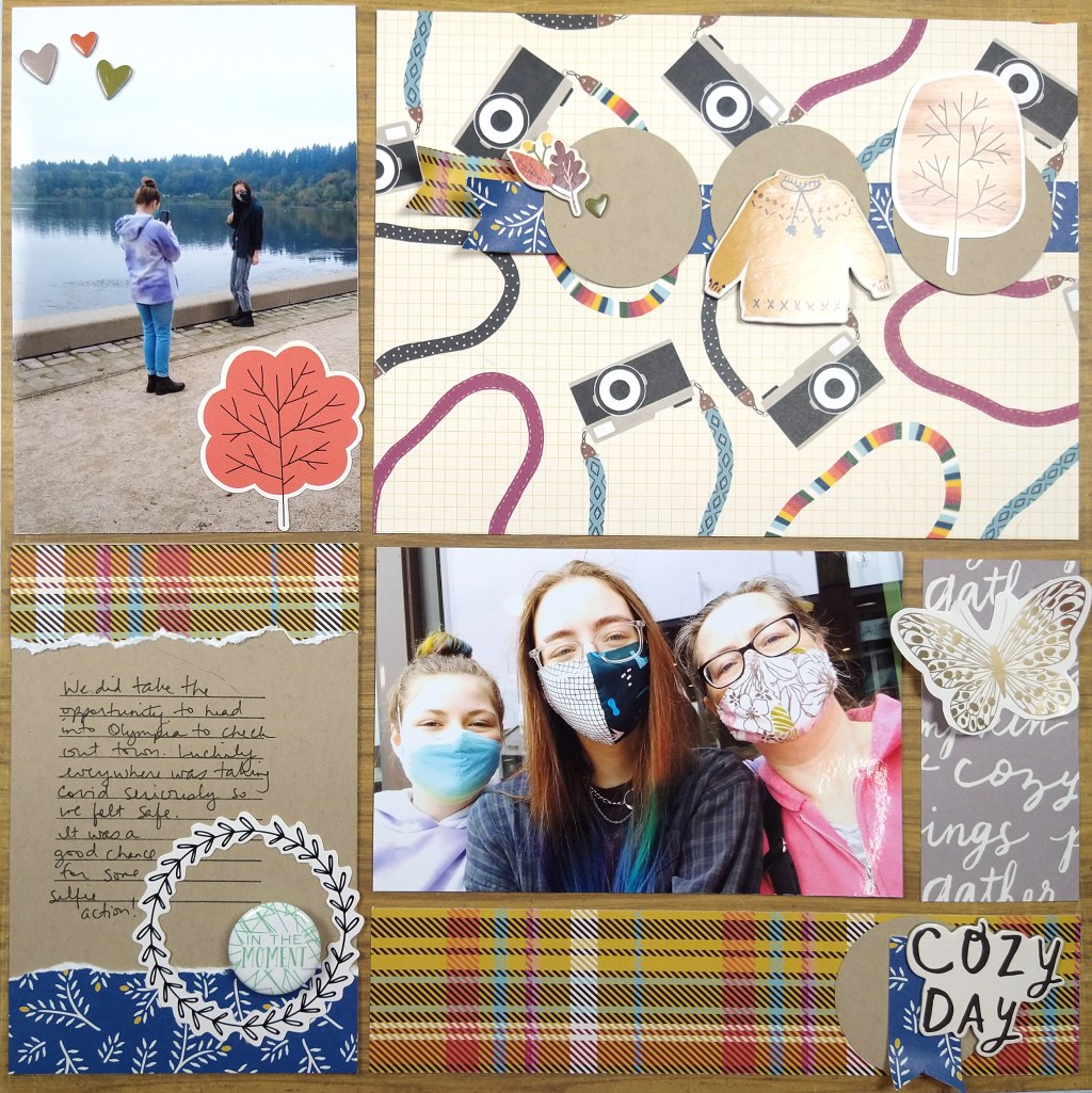
I was contacted by a company called Grabie.cc with an opportunity to review washi tape for them. They discovered me via my YouTube channel and reached out to me as a way to help promote their young company. After looking over their website I decided I would do the review for them. The did send me a free pack of washi to use for the review; though I will readily admit that the several hours it took me to create and then edit the video comes no where near to actual compensation! I did it because the company claims some philosophy that resonated with me: art as therapy, production of produsts with a zero waste mindset and connecting community. I know anyone can say anything they want on the internet, so I hope these philosophies hold true.

I’ll give you just the gist here, but the video goes into more details. I was generally satisfied with my product thought there was some stickiness inconsistency. Really that is the whole story! So take a look at some photos of everything.

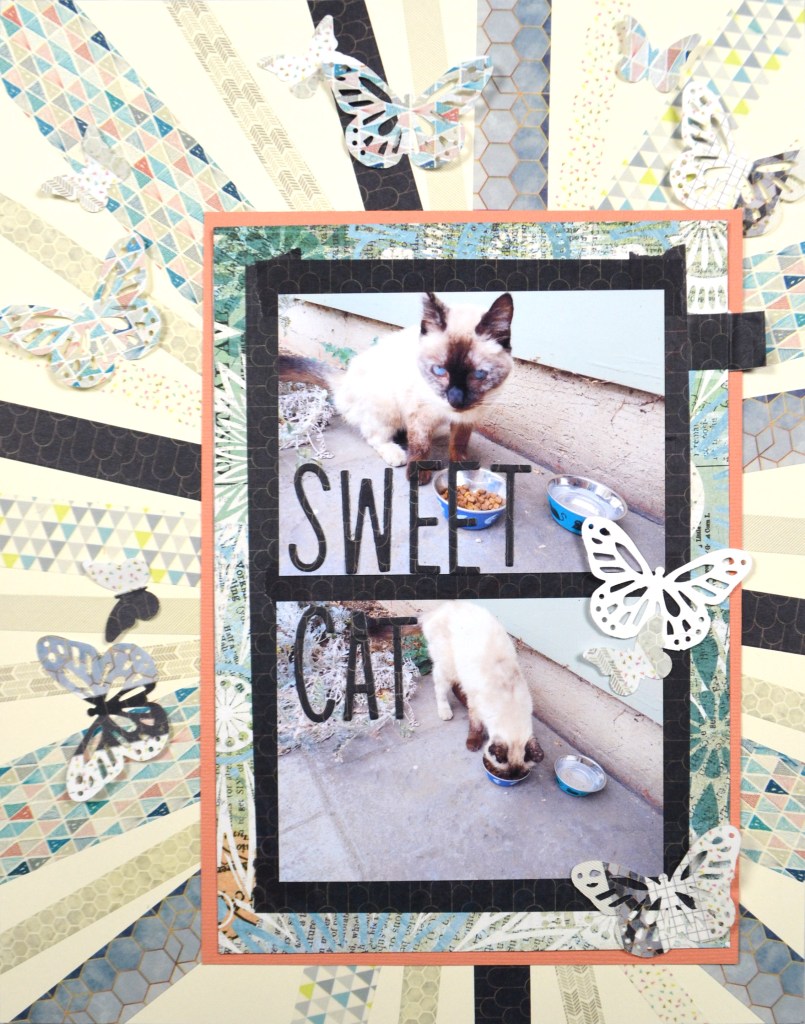
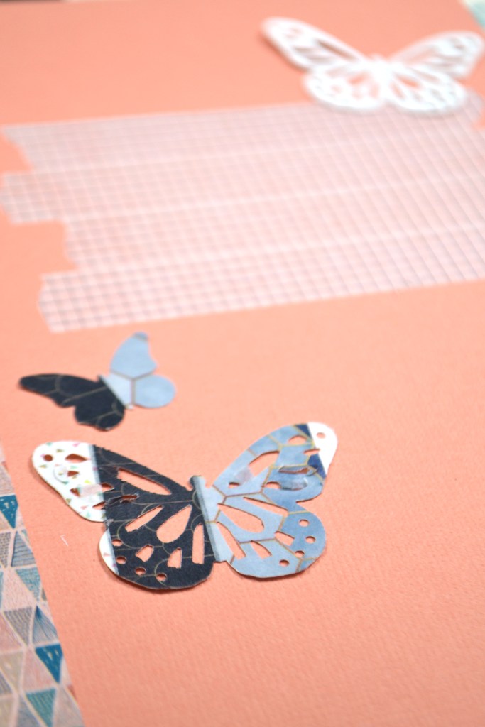
When using this washi as I normally would it all worked out nicely. It was easy to lift and move early on in creating (there was some residue left if I waited until later to move it). I was able to write on it. I could punch through it to create embellishments. All in all it was nice to work with. And the patterns on some of the pieces were designed to line up so that you could get continuous pattern if you applied the tape in adjacent rows. Nice!

Grabbie has some other interesting products that I’m going to check out. Perhaps you want to check them out as well.

Forgery on the Fourth, April ’22

As a design team member over at the Counterfeit Kit Challenge group I play along with as many of our monthly inspiration challenges as I can. The FOF — Forgery on the Fourth — project is definitely one I enjoy! I like getting creative to create my own embellishments. So let’s go ahead and dive in to what I have for you this month.

We are working with this kit from Papers and Beyond called Follow Your Bliss as our inspiration.

Did you notice the wood rimmed button flair in that kit? Well that is where I got my idea.

You can see how I went about creating my forgery in video form, or keep reading for the quick photo version.

I’ve done this technique before in this DIY embellishment video, but at the time I was mimicking metal brad flairs. That technique totally translated into this technique. I used a 1/2 inch punch and a 3/4 inch punch to create rings. The top layer is the decorative layer and the three solid colors are the thickness/filler layers to create depth and texture. Finally, the large punch was used to create solid base circles. With the smaller punch I punched images out of scraps of patterned paper. Then it was just a matter of layering them all up.

I did choose to top them off with a layer of Nuvo drops in clear for that domed flair effect, but that is optional. If you do the Nuvo, let them dry over night.

That is it! While it took a little bit of time, it wasn’t hard to create these little embellishments. Next time I may speed up the process by creating cut files in the Cricut to do all the circle & ring cutting for me. That way I could also get thinner rings as well. That would make them more button-like. So, while these aren’t exact replicas of wood button flair, I really like how the came out!

Of course the CKC blog has more forgery examples to check out. I hope this gave you some ideas on how you can create forgeries of your favorite products with supplies you already have on hand. Don’t forget to show off your stuff over on the CKC Facebook group, or tag us on Instagram @counterfeitkitchallenge or use #counterfeitkitchallenge.

Forgery on the Fourth, March ’22

As a design team member over at the Counterfeit Kit Challenge group I play along with as many of our monthly inspiration challenges as I can. The FOF—or Forgery on the Fourth—project is definitely one I enjoy! So let’s go ahead and dive in to what I have for you this month.

We are working with this kit from Citrus Twist, called Life Crafted “Weekender” as our inspiration. The second photo shows a close up of the daisy embellishments sprinkled in the kit. I decided I needed to create forgeries of those!

I started with a PinkFresh stencil that is actually designed for slimline cards. It is a multilayer stencil that adds lots of details.

I didn’t need the full stencil, just individual flowers. Looking at the packaging I noticed 4 flowers total that had that classic daisy shape. So I located those on my stencil and marked them with some flags of Post-It Notes.

Using a small blending brush from Gina K and 4 inks, two in yellow and two in browns (various manufactures!) I proceeded to blend JUST the main flower heads. That meant I did not need to use two of the stencils from the set since those were for the leaves/stems. Two of the stencils were for flower petal details and two were for flower center details. Once done I had this sheet of flowers.

The mess on the right side of the paper is me testing inks and cleaning my brush to switch colors. The pencil tick marks are there to help me line up the 4 different stencils in the correct place each time. I did one pass with the stencil, then shifted it over on my paper and did one more pass. Then I rotated the stencil 90 degrees and did two more passes that direction for a total of 16 flowers. Since the flowers are small it didn’t take long at all. A little bit of fussy cutting and I have myself a pile of pretty petals to play with!

Hope this helps you look at your stencils in a new light. They don’t have to be used “as is” and can be shifted to your needs!

Of course the CKC blog has more forgery examples to check out. I hope this gave you some ideas on how you can create forgeries of your favorite products with supplies you already have on hand. Don’t forget to show off your stuff over on the CKC Facebook group, or tag us on Instagram @counterfeitkitchallenge or use #counterfeitkitchallenge.

Forgery on the Fourth, Feb ’22

As a design team member over at the Counterfeit Kit Challenge group I play along with as many of our monthly inspiration challenges as I can. The FOF project is definitely one I enjoy! So let’s go ahead and dive in to what I have for you this month.

We are working with this kit from Coca Daisy and is called Denim & Blush from Feb 2021 as our inspiration.

Did you notice the the small tickets tucked behind the enamel dots, or the leafy die cuts/stamped images up near the top of that kit? Well that is where I got my ideas for this month’s forgeries.

You can see how I went about creating my forgeries in video form where I highlight a couple of tips for bulk stamping & die cutting for mass embellishment or card piece production.

Here is just a quick peek at how my items turned out. The tickets were really easy to make. I bet the picture will give you enough info on how it worked out. The greenery was stamped and die cut on solid cardstock and on lightly painted watercolor paper. I will add more color when I get to using those.

Stamp & die sets used:

  • Avery Elle: Sending Flowers stamp & die
  • Photoplay Paper: Exclusive from an online class

Of course the CKC blog has more forgery examples to check out. I hope this gave you some ideas on how you can create forgeries of your favorite products with supplies you already have on hand. Don’t forget to show off your stuff over on the CKC Facebook group, or tag us on Instagram @counterfeitkitchallenge or use #counterfeitkitchallenge.

What is hybrid scrapbooking?

For 2022 I’m starting on a once a month adventure of incorporating more hybrid scrapbooking into my memory keeping. So what exactly is hybrid scrapbooking? It is the process of using digital scrapbooking supplies to turn them into physical items and then using them to complete a physical layout. If you do a photo collage in an app and then print and use that photo collage as in on a layout, technically you are hybrid scrapbooking. Even using a cut file on your electronic die cutting machine could be considered hybrid as well. My intentions are to use the collection of digital scrapbook kits that I have purchased over the years. I have a backlog of these files because I thought I would turn into a mainly digital scrapbooker at some point. However, the need to use physical items matters so much to my experience of creating art that I can’t go fully digi. However, I can get some of the benefits of digi and use them in my physical layouts.

I’ll start you off with the layout process video I created this month.

In the video I mention the benefits of hybrid as I create. Here I can just easily list them.

  1. You don’t have to have lots of space to store a ton of supplies! You just need a stack of paper and a printer to turn the digi items into physical items. (An electronic die cutter is super helpful, but I’ll cover that in a bit.)
  2. You can use only the pieces of an embellishment pack that you actually like. No leftover unwanted bits.
  3. You can resize items to a smaller size if you like (going larger usually doesn’t work well due to the pixel nature of digital graphics.)
  4. You can duplicate and create as many of the same element that you love.
  5. If you mess up an item, you can always print a new one!

While there are real good things about using digital elements, there are some cons as well.

  1. If you are a 12×12 scrapper, an investment in a 12×12 printer OR the flexibility to design 12×12 layouts using 8.5×11 papers is critical.
  2. It takes more time to select and then print your products as opposed to just pulling out some items and getting to work.
  3. If you want to create embellishments, an electronic die cutter is going to be a life saver. Otherwise you are going to become the fussy cutting champ of all time. A machine is yet another money, time and tech know-how investment.

I’m hear to help with that last point! I have a tutorial for you on one way to use your Cricut machine to take some digital scrapbook die cuts and create physical die cuts.

And here is a look at the final result.

What do you think? Can you tell that I printed most of these products myself?

Let me know what you think about hybrid scrapping!

Mini Kit + Pocket Page Ideas

Hello everyone. I’m here with the Counterfeit Kit Club’s Mini Kit and project for the month of September 2020. You can quickly see my whole process in the video below or keep reading for the text and photo version.

Our inspiration kit (Vivid by {Not} Just for Boys kit club) shown below had a strong fall theme vibe.

When I was pondering this project I was in the process of cleaning my scrap space. While doing that I came across this bin that contained the extra photos, paper scraps and previous fall themed layout I had created a couple of month back.

Admittedly this gave me a huge head start on creating a page kit for this month’s mini. If you think I cheated, I promise all you would need to do to get to this same point is choose a base pattern paper or cardstock, plus 3-4 pattern paper scraps in various sizes. Then grab 6-10 embellishment pieces in various sizes to support your theme and you are done. Simple as that. Really.

Here I chose a base woodgrain paper, 5 pattern paper scraps, 1 cardstock and literally 12 individual embellishment pieces. The woodgrain, plaid and use of blue comes from our inspiration piece. The other imagery I chose to support my page theme (cameras + together/cozy)

Once I had a narrow palette of supplies to work with, my layout came together quickly. I think about this style of layout as a “pocket page” layout without the actual pockets. (You could also just call it a grid layout). I love the idea of pocket pages for ease but I feel too constrained by the pocket numbers and orientations. So I started my layout with the base page + photos. I trimmed my photos, and in fact all the pocket elements, down by 1/4″ in both height and width to give that gap that pockets have.

The open areas around the photos now become other “pockets.” The top right was very large and could have been broken down into several pockets, but I left it large for more visual impact to those cameras since this layout is about selfies. The journal pocket on the bottom left is 6×4″ (or rather 5.75×3.75″ once trimmed down.) The gray strip started at 2×4″ before trimming and the lower plaid is 2×8″ before trimming.

Sprucing up each pocket with limited embellishments helps the whole page feel cohesive. I also repeat elements, such as circles, blue, and plaid, in a visual triangle to pull everything together. Approaching a layout this way is super straightforward. It gives you the ease of pocket pages without the constraints. And with this design you could include way more photos than I did! Just so much flexibility here.

I hope you were inspired by how easy it can be to put together a quick page kit as well as a quick layout!

September Forgeries

I admit that I am a forger. Luckily since it is just craft supplies that I forge, I am innocent of any crimes! Take a look at the items I was inspired by. The kit inspiration we are using this month over at CKC is the “Vivid” kit by {Not} Just for Boys kit club from September 2020.

Here you can see the whole kit plus two close-ups. Notice all the frames? And how about those three little tassels? I’m going to recreate those and it is easy. Check out the whole process on YouTube. That is the best way to see everything, including how to use the Frame Punch Board to create frames. For photo tutorial on the tassels, keep reading.

You can follow along on this photo tutorial to create simple little tassels. I used literal bakers twine here from the kitchen section of my grocer, but any light weight twine or embroidery floss will work.

The punch board pictured far left is a tool made by We R Memory keepers and it is one of my favorites in my stash. It eliminates most :thinking” needed to cut simple frames. Learning to use it is not too hard, but you do have to pay attention to the steps, so checking out my video above is the best way.

Now go forge some craft supplies. But if you get arrested, don’t mention my name 😉

10 Ways to Use Nuvo Drops

I love to play and experiment with products. Sometimes it goes terribly wrong and sometimes I am super surprised at the results. Once a month I share one particular product that I’ve played with and at least 10 ideas for putting it to use. I don’t share the disasters of course. Of what I do share some of the ideas are more inviting than others. See which ideas you like! (Keep reading for the quick photo version.)

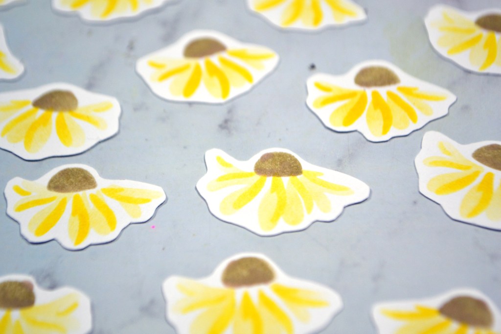
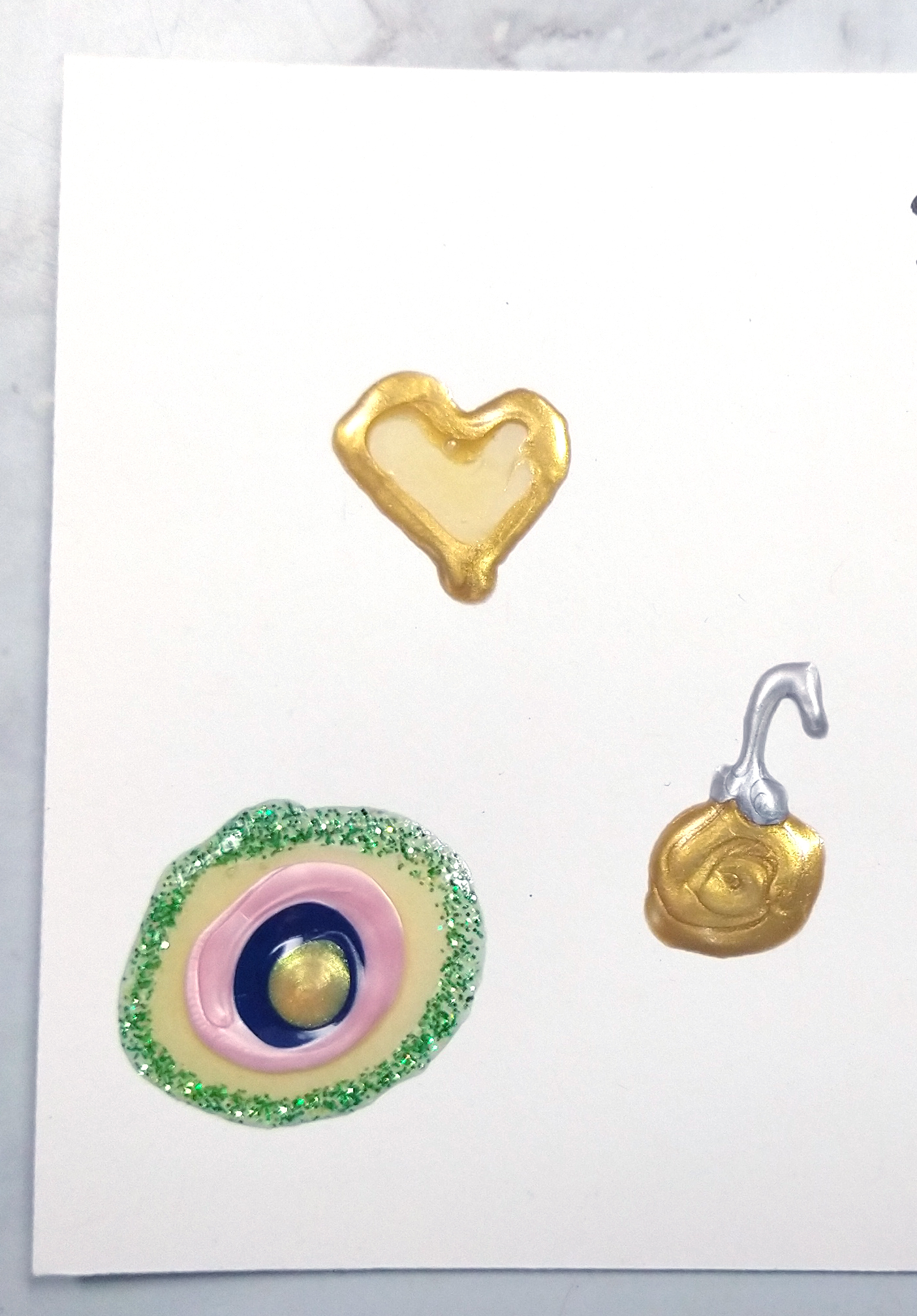
  1. While you can do all the enamel style dots your heart desires, why not try other shapes? Go ahead and mix and match colors while you are drawing. And don’t forget you can draw fun things too. I once drew a fork and knife as embellishments to a scrapbook layout.
  2. If you just draw a rectangle around an items like a photo or embellishment cluster, then you have a frame. Or doodle it up for fun borders.
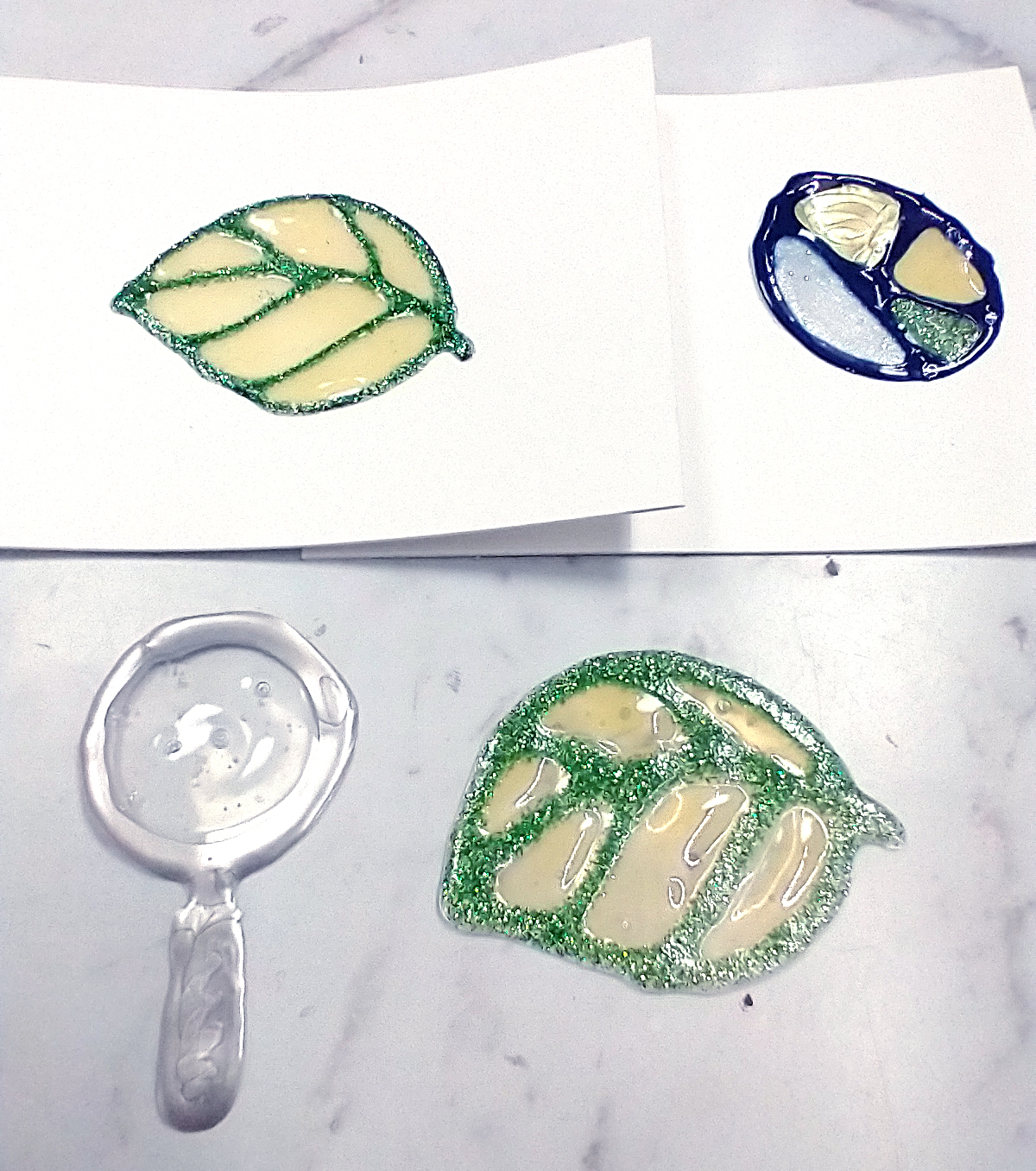
  3. Two important things to note here. First did you know you can draw with Nuvo drops on a non-stick craft mat (or sheet of plastic packaging, or a glass mat) and then pop the pieces off the mat for a stand-alone embellishment. Second some of the drops dry clear or translucent. You can put these to use for a stained glass look or for mimicking actual glass.
  4. Have you ever thought about writing with your drops? You can do titles, greetings or word embellishments. You can just free draw or you can use this tip: Cover a printed sheet of words with clear plastic. Then trace the words onto the plastic. Let dry 24-48 hours (more is better). And then you can add these words to your projects. You could also write with a pencil or stamp in a light colored ink directly on your project and then trace over with an opaque style drops (most of them ARE opaque. Jewel drops are an exception, as well as clear colors. Glitter drops have a clear base with colored glitter so you may be able to see through parts of the image is you use the glitter drops.)
  5. Likewise you can create your own puffy alphas in the same way. I prefer tracing for this so that my letters are consistently shaped and sized.
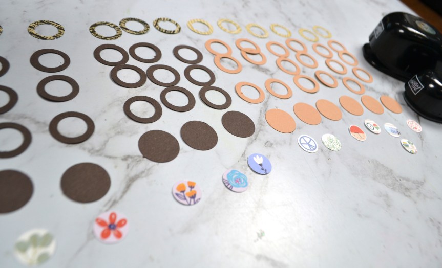
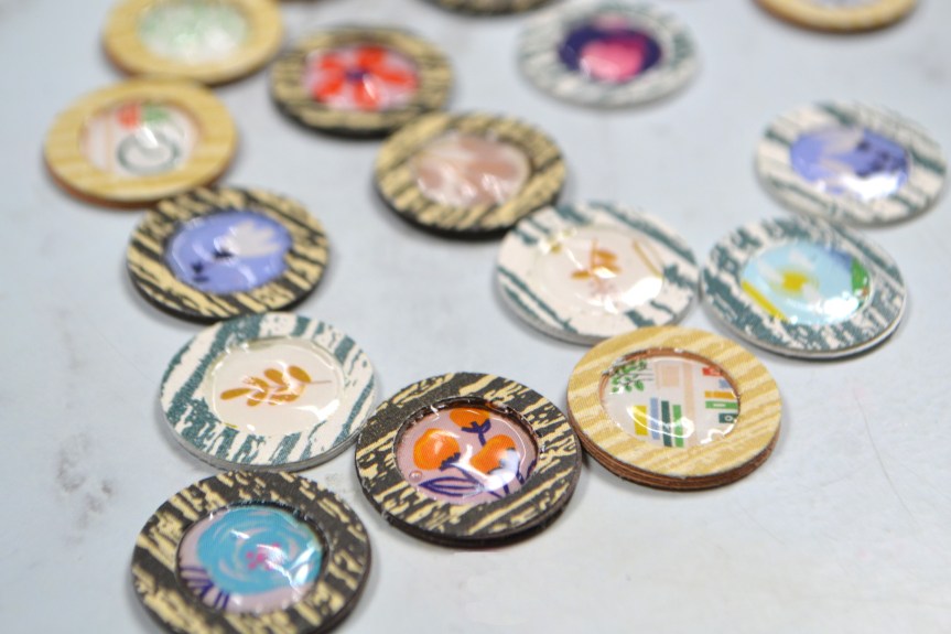
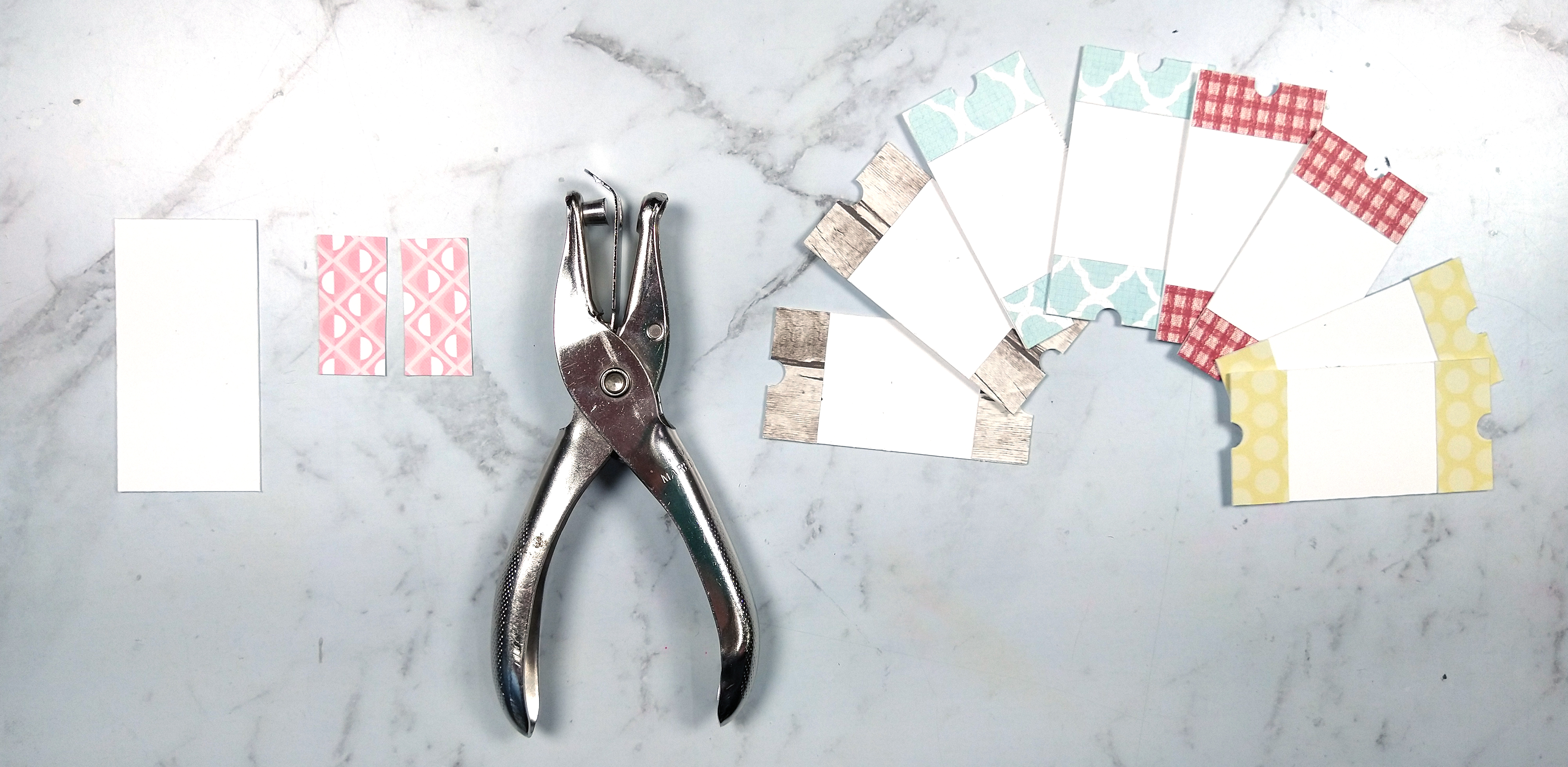
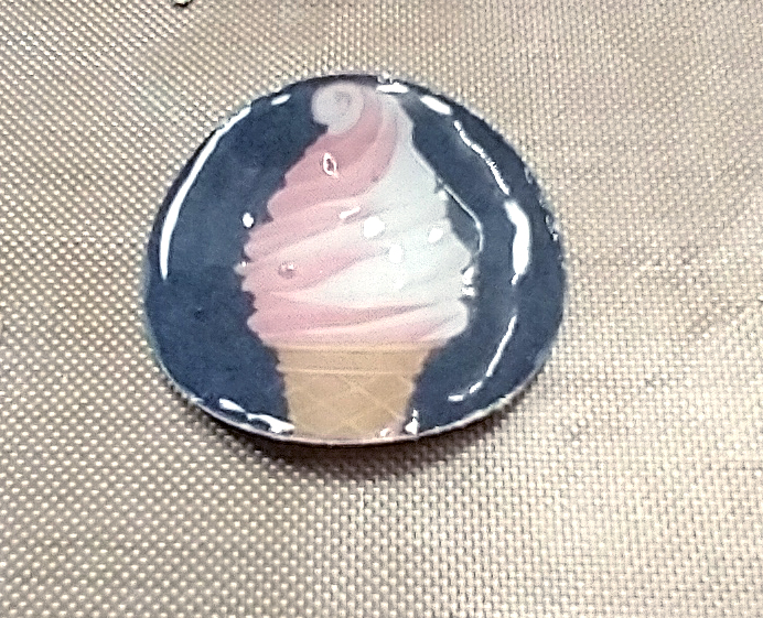
  6. You can make your own flair-badge type embellishments. Punch out an image from some patterned paper and top with Morning Dew (clear!) Crystal drops for an epoxy-like finish.
  7. If you do the same thing with very small punches then you get a “fancy” style enamel dot look. Just be sure to put temporary adhesive down on a craft mat. Stick your punches to the adhesive and THEN cover with your drops. This will prevent your pieces from sliding around and requiring you to touch them. That just ruins the drop’s finish.
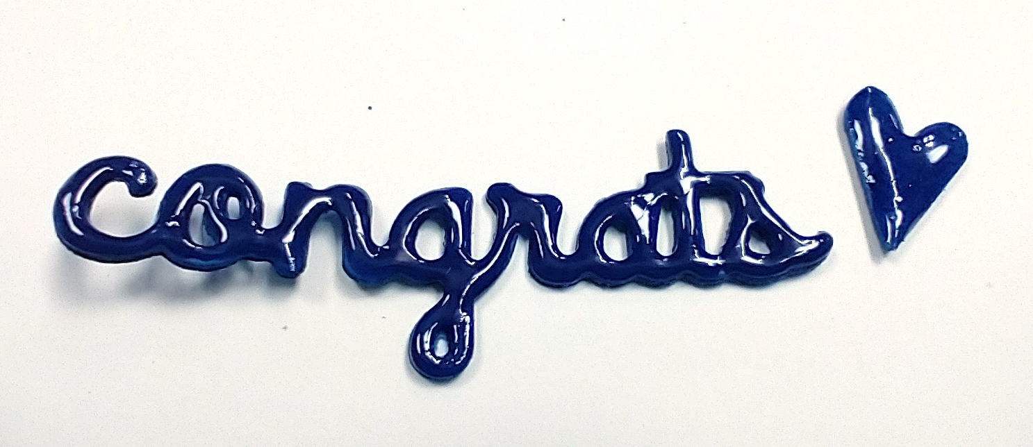
  8. A further idea here is to replicate acrylic pieces. You need to punch or die cut three layers of cardstock. Glue the layers together and then top with your clear drops. The added thickness of the multiple layers makes it look more like acrylic.
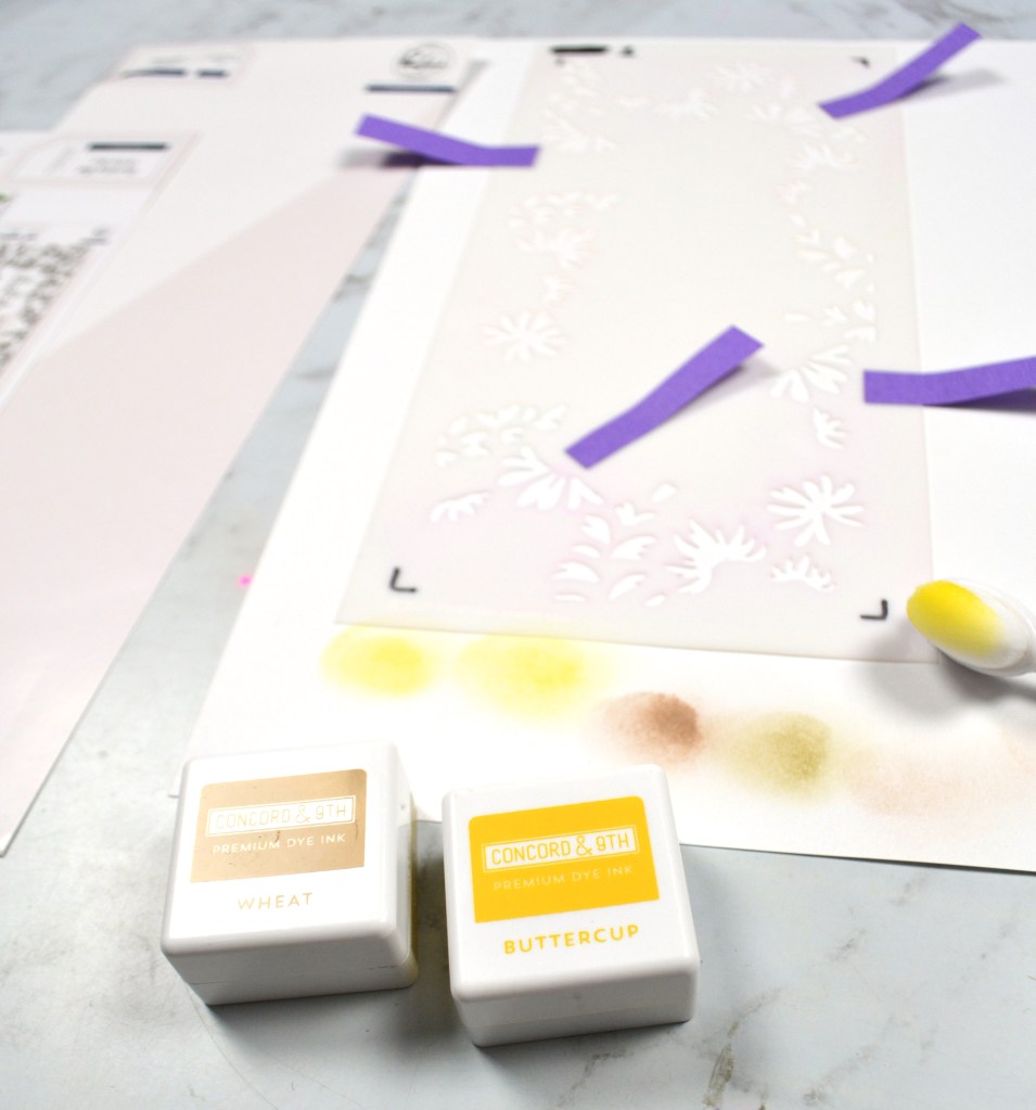
  9. Go ahead and use your drops through various stencils. You can mix and match colors of drops, use a mask under the stencil to keep an open portion and even combine multiple ideas for added interest. Just don’t forget to wash your stencil immediately. If the Nuvo drops have a chance to dry and your stencils it will “clog” them up and ruin your stencil.
  10. Have you ever done a heat-embossing and ink resist technique? This is the same thing, only easier. Just draw/stencil/write an image onto your project. Let dry overnight and then apply water-based inks the next day. Be sure to buff your Nuvo shapes with a tissue just a bit to remove any excess ink. Then you are left with pretty, colorful designs.
  11. I know this is titled 10 ways, but here is a bonus 11th way. Just smear your products onto projects. This is much more mixed media vibe, but it can be oh so pretty. Here I’ve got a beach scene using opaque drops, glitter drops, and there at the bottom, stone drops. The stone drops have a sandy texture and when inked with brown will hold the color a little and actually look like sand.

Remember how I talked about disasters in the beginning? This is one of them
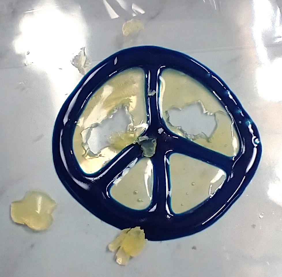
. I know I said I don’t share disasters, but this is a cautionary tale when trying these techniques. Let them dry ALL THE WAY before you mess with them. Otherwise they can stick to each other becoming inseparable blobs or they can stick to other things like the table and then pull themselves apart.

So other than that one precaution, go play with Nuvo drops! Were any of these a favorite? Do you have interesting ways you’ve used these drops? Leave me a comment. I’d love to hear from you.

Forgery time!

One of the projects I love over at CKC is the Forgery on the 4th. This lets us get creative and really see what we can make happen with our supplies. The more we create the simpler our crafty room stash can become as we turn back to some basic supplies.

Today I’m recreating a sheeter of pattern paper with flowing bursts of rich color.

And here is how it came out? What do you think? Personally I’m super pleased. I will tell you honestly when things aren’t working and this time around I am just plain happy with how things came out!

It really is hard to capture this process in words, so watching the video is going to give you the most helpful tips.

Watercoloring with stencils

I played along with the Mixed Media Frenzy group YouTube hop again this month. I’ve shared the whole process over on my channel. But if you want some quick tips on using stencils to get a watercolor look I can set you up with some photos here.

First off, my paper was prepped with gesso. This helps ink release and allows these effects to work to the fullest. For the coloring, I used layering stencils from Pink Fresh studio (available for purchase here). For each layer I used simple, different tips to create watercolor effects.

Layer One. Lightest color. Stencil on color. Give a hearty mist of water and tip paper to drip. This will eliminate most of the form of your stenciling and just leave a haze. You can always add detail back in with more stenciling. It is hard to see but there is a haze of color in the background.

Layer Two. Mid tone color. Stencil and give a gentle spritz with water. This will just fuzz out the images. Notice the largest leaf is all blurry?

Layer Three. First flowers. Stencil. Use a watercolor brush to paint over the image with just a little clean water. Stroke outside the lines of the image just a little. This gives a flowy watercolor look. I did add back more detail and depth with a light re-stenciling exactly over the same spots. Can you see the back layer of the flower has jagged edges and a lighter color? The front layer has crisper edges and richer color from the extra stencil work. When you know these little tricks you can get LOTS of dimension and interest.

Layer Four. Accent flowers. Stencil. Use paintbrush to just touch a spot of water to center. This pushes pigment out towards the edge of the image for a gradient look. Really look at those yellow flowers to see how the color changes across the image.

Layer Five. Final foliage layer in darkest shade. Stencil. Wet entire image with a watercolor brush, much like for the flowers. Except this time dab up excess water and ink with a tissue to really tone back the image. Don’t dab up all the water and ink or it’ll be like you didn’t do anything at all. Just a quick tap with the tissue will leave a “splotchy” image that adds texture more than anything. See how only parts of the leaves are fully clear? That adds a lot of texture.

Top off your new painting with some pen work to give just a touch of details and you now have a pretty watercolored background painting and you don’t have to know how to draw a single thing!