Moving through 2025 I want to provide more informational content. Starting off the year I want to take a look at Media Mats. I’m starting here since you will see me use inks, paints and sprays on my projects on a regular basis. You will also see the various mats I use to keep my space clean, make cleanup easier and help me get the job done faster.
I created a video explaining many things on these mats. However that video is now fixed and can’t be changed. In fact I have now thought of one idea I missed already! Here I have the opportunity to update and correct information based on feedback!
Let’s start with that video. I’ll move on to a chart that you can download for free. Finally I’ll share many details of each mat category and the various qualities.

Download this pdf chart.
Latest update: February 2, 2025
More Details
Paper Mats
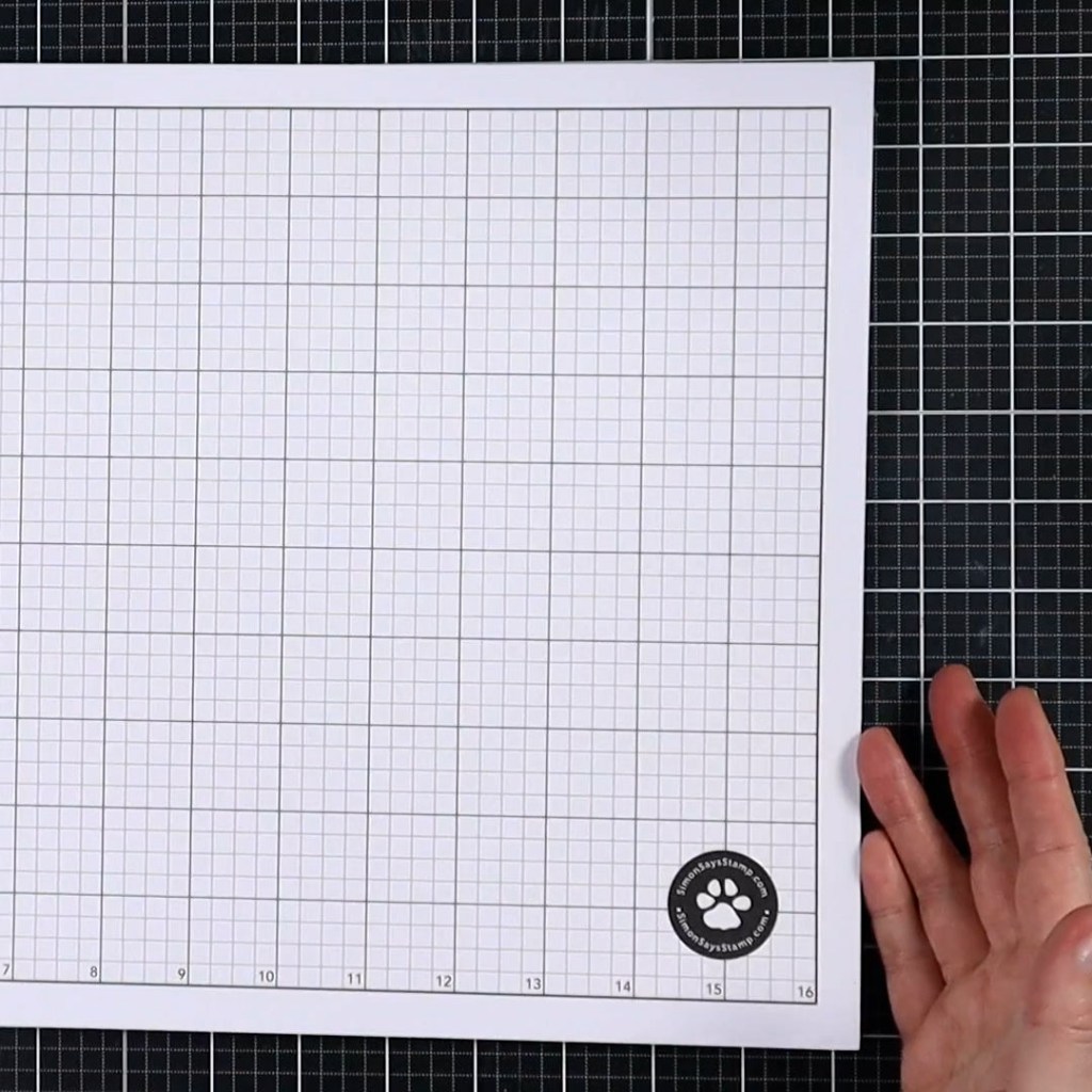
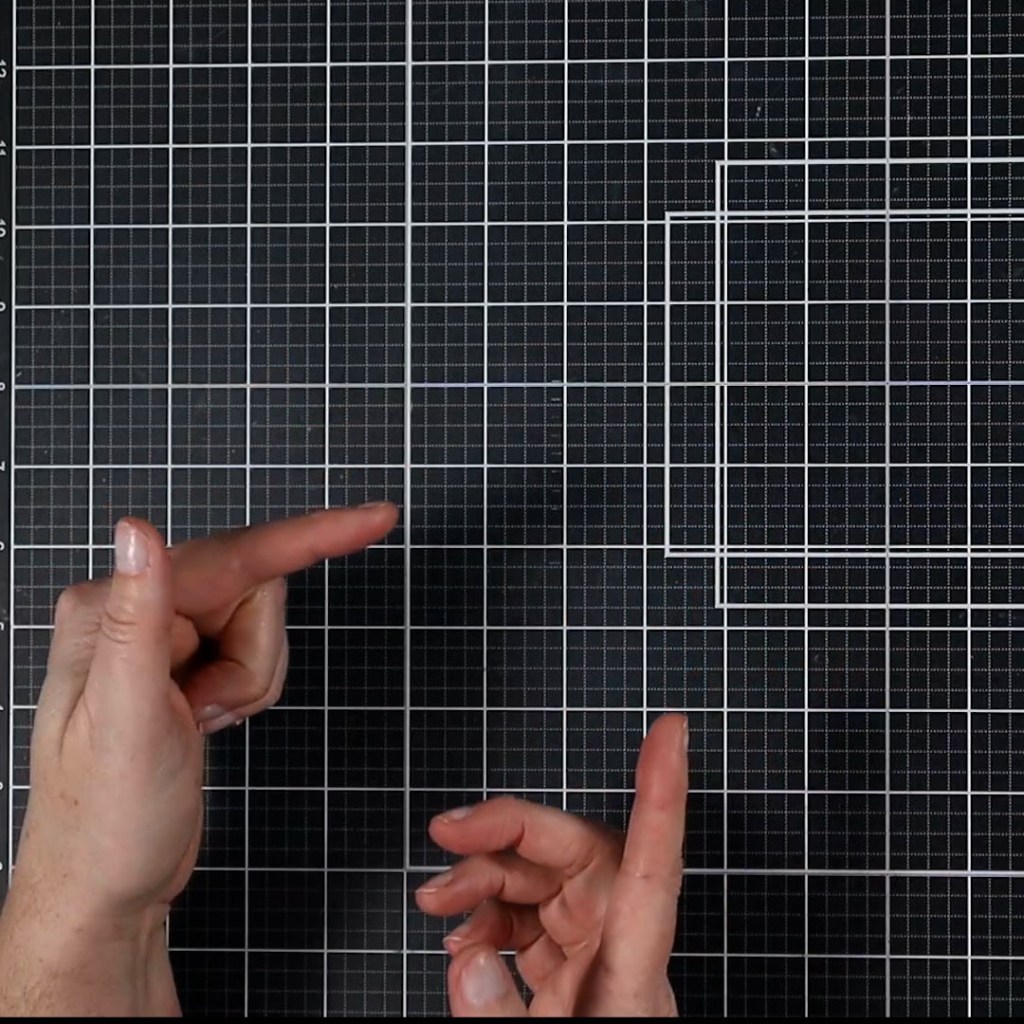
From scratch paper to specialty mats you can purchase. Paper sheets are a cheap and disposable way to make cleanup easier. Larger mats with grids can be purchased and the grids are very useful
★ Best uses: ink blending; catching messy mediums to throw away
Pros
- Free or cheap
- Readily available
- Disposable so no further cleaning is needed.
Cons
- Creates a lot of trash
- Can’t handle very wet mediums

Laminated Paper Mats
The provide many of the same qualities as glass mats at a fraction of the cost. However, getting larger sizes requires going to an office store. Sizes around 13in x13in are available for home use. Consider a machine like the Minc which can be used both for craft techniques and for medium-size lamination.
★ Best uses: any mediums; smaller projects
Pros
- Can be very inexpensive if you have a machine.
- Machines have other uses such as storage dividers, preserving memorabilia, die cutting shims, toner foiling, etc.
Cons
- Need a machine or access to an office supply store to make one for you.
- Not heat stable

Splat Boxes
Free when you repurpose a shipping box or pizza box.
★ Best uses: sprays and spatters
Pros
- No cleaning
- Good for sprays and splatters
- Free if you reuse a box!
Cons
- Needs to dry in between uses (or line with disposables such as paper towels)
- Bulky to store
- Not for most mediums

The Craft Mat
One of the original craft surfaces produced by Ranger with Tim Holtz. The original brown color lacked the ability to see the true color of mediums. A newer white version solves that.
★ Best uses: All mediums, smaller projects
Pros
- Reduces media waste (scrape it up and put it back in the jar)
- Slick surface is easy to clean. Plus it is easy to take to the sink for deeper cleaning.
- Great for paints & pastes
- Lightest weight
- Heat resistant (but thin!)
- Low cost
- Can have multiple on hand
- Cuttable to have multiple smaller mats
Cons
- Creases & cracks (store rolled up)
- Not big enough for scrapbook layouts
- Hard to tape things down to it due to it’s slick surface.
- Slips and slides around with movement like ink blending. Difficult to tape still due to that slick surface.

Silicone Mats
Likely originating in the kitchen industry. In my opinion, the most overrated of the bunch. Has a slightly grippy surface, but not grippy enough to keep things from slipping. Easy to take to the sink for cleaning.
★ Best uses: keep ink pads still when ink blending
Pros
- Repurpose from kitchen baking mats
- Affordable
- Cuttable to have multiple smaller mats
- Most mediums (except alcohol inks)
- Can work as a palette also
- Other uses: ink pad grips
- Good heat resistance for drying projects with a heat tool, or to protect surfaces while heat embossing.
Cons
- Not as grippy as marketed
- Picks up lint, dust, pet hair VERY easily and hard to clean that off. Store it inside a bag to keep it clean.
- Due to lint, often needs a hose down in the sink.

Photopolymer Mats
One of the most expensive options “per square inch” and limited uses. However, it is very good at what it does!
★ Best uses: ink blending & stenciling
Pros
- Most grippy
- Long lasting
- Fairly easy to clean.
- Now come in versions that offer stamps on one side and the grip mat property on the other.
Cons
- Expensive for its size
- Larger sizes not available (ie 12×12)
- Can’t use alcohol products (Sharpies included)
- Stains over time
- Picks up lint & dust VERY easily. Must clean often to maintain grip.
- Can’t handle heat or cutting.

Sticky Mats
Slightly better at hold power than photopolymer mats, but not nearly as long lasting. The sticky adhesive wears out over time. There may be ways to reapply adhesive but this requires some special products.
★ Best uses: ink blending & stenciling
Pros
- Holds things in place well
- Easy to find
- Fairly inexpensive
- Can repurpose other things like older Cricut mats
- Cuttable to have multiple smaller mats
- Can be large enough for scrapbook pages
Cons
- Sticky wears out quicker than you might think
- The mat itself can slide around. Can tape it down. (DON’T add tape to sticky zone.)
- Not great for pastes. (However, can mask off exposed sticky to use pastes anyway.)
- Must be wiped with a lint free cloth like a chamois.
- Store with plastic cover (usually included) to prevent collecting dust & lint.
Self-Healing Mats
Originally from the sewing industry for rotary cutters. Great size options. Decent price. Good for many mediums. Plus the added bonus of being able to use it as a light-duty cutting surface.
★ Best uses: general table protection
Pros
- Lots of size options
- Self healing (craft knives okay!)
- Helpful grids
- Light-ish weight
- General craft store availability (can also check sewing department for other brands)
- Heat resistant (not proof)
- Mid-range price
- Can be cut down to multiple other sizes.
Cons
- Not as smooth as glass (cleaning pastes is harder)
- Can gouge if cutting on it
- Few color options
- May cloud with alcohol cleaners and inks (but not too bad)
- Can stain depending on mat color

Glass Mats
My favorite of the bunch with one big downside as a YouTuber: it reflects lighting very easily. This is the heaviest of the bunch so best to set it and forget it.
★ Best uses: all mediums, cutting
Pros
- Reduces media waste (scrape it up and put it back in the jar)
- Long lasting
- Most have grids
- Knife resistant (check brand first, surface grid printing can interfere)
- Can be pretty
- Can have magnetic properties
- Very smooth for easy cleanup
- Heat resistant for heat embossing.
- No staining
Cons
- Expensive
- Heavy
- Can break if dropped. Best left in place
- Glare if filming
- Some adhesives need alcohol to remove.
- Due to it’s thickness, creates a lip on your work surface that can be irritating.