Forgery on the Fourth, April ’22

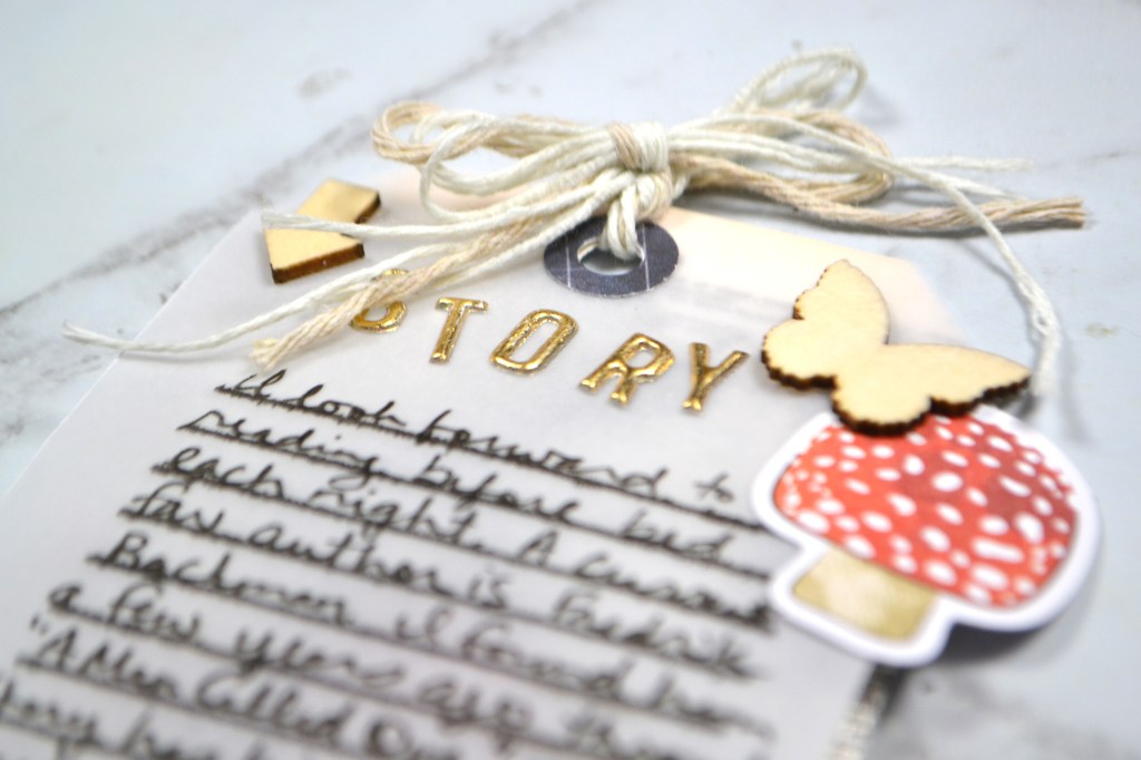
As a design team member over at the Counterfeit Kit Challenge group I play along with as many of our monthly inspiration challenges as I can. The FOF — Forgery on the 4th — project is definitely one I enjoy! So let’s go ahead and dive in to what I have for you this month.

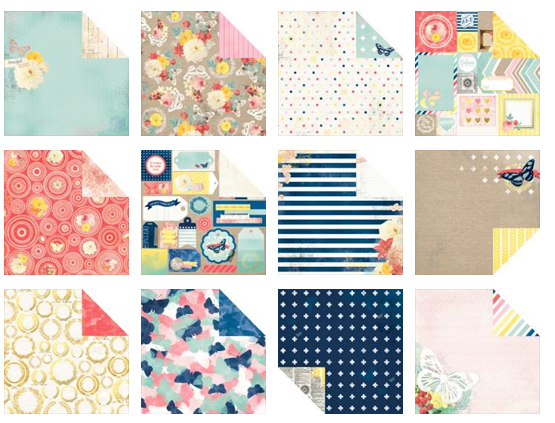
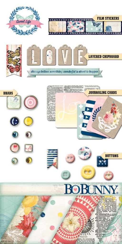
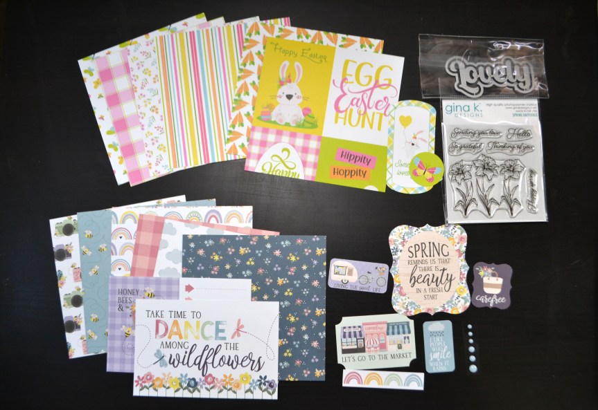
We are inspired by this kit from Scrapbook Doodle from back in 2015. The kit focuses on Bo Bunny’s Sweet Life collection.

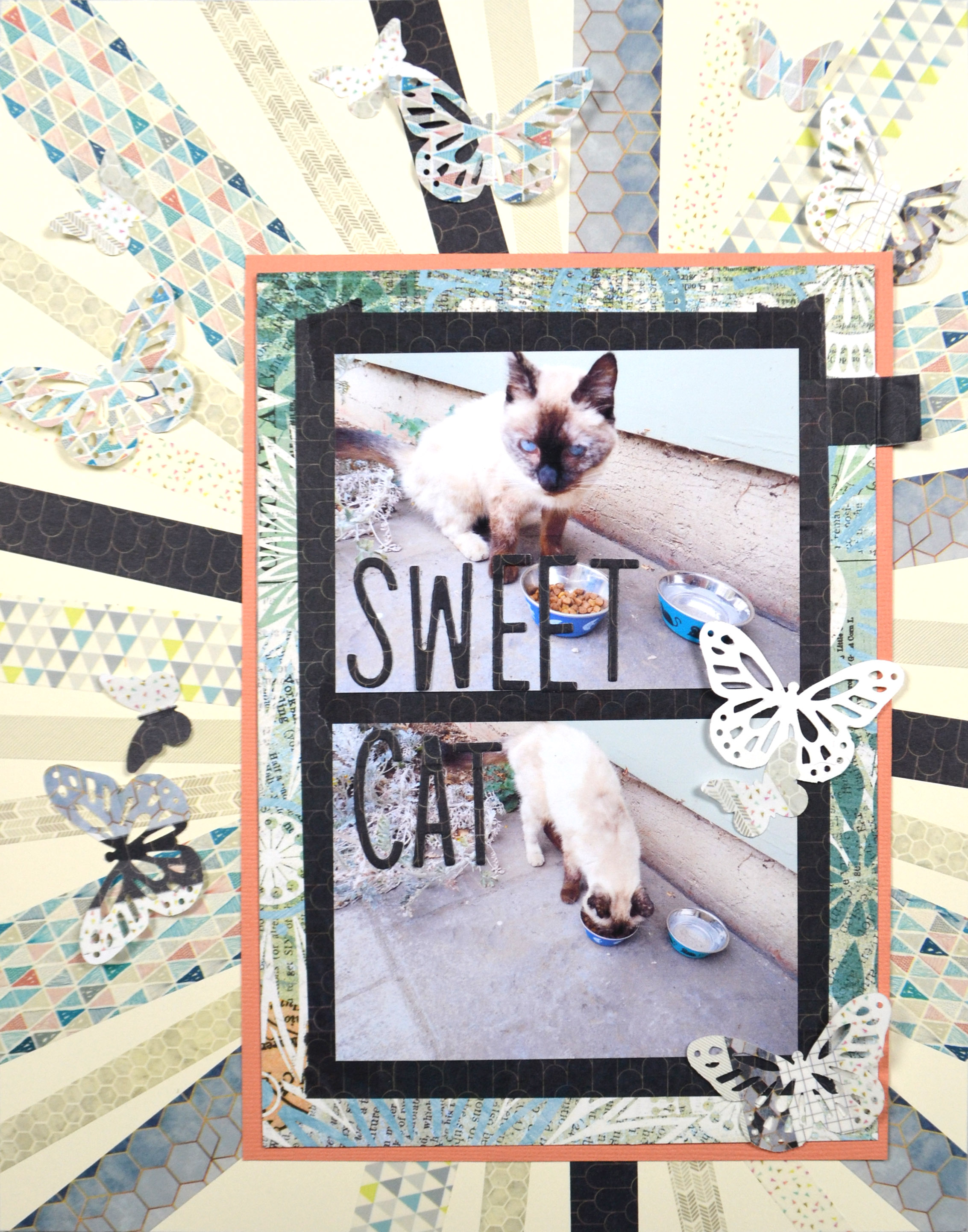
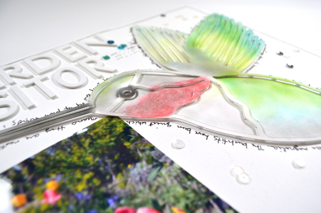
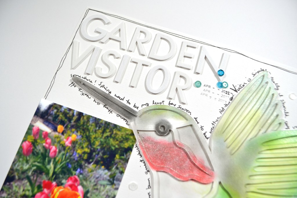
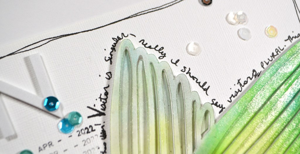
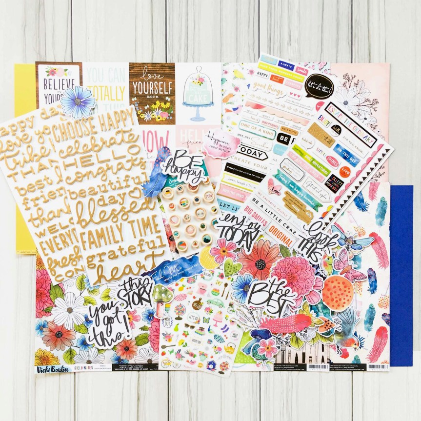
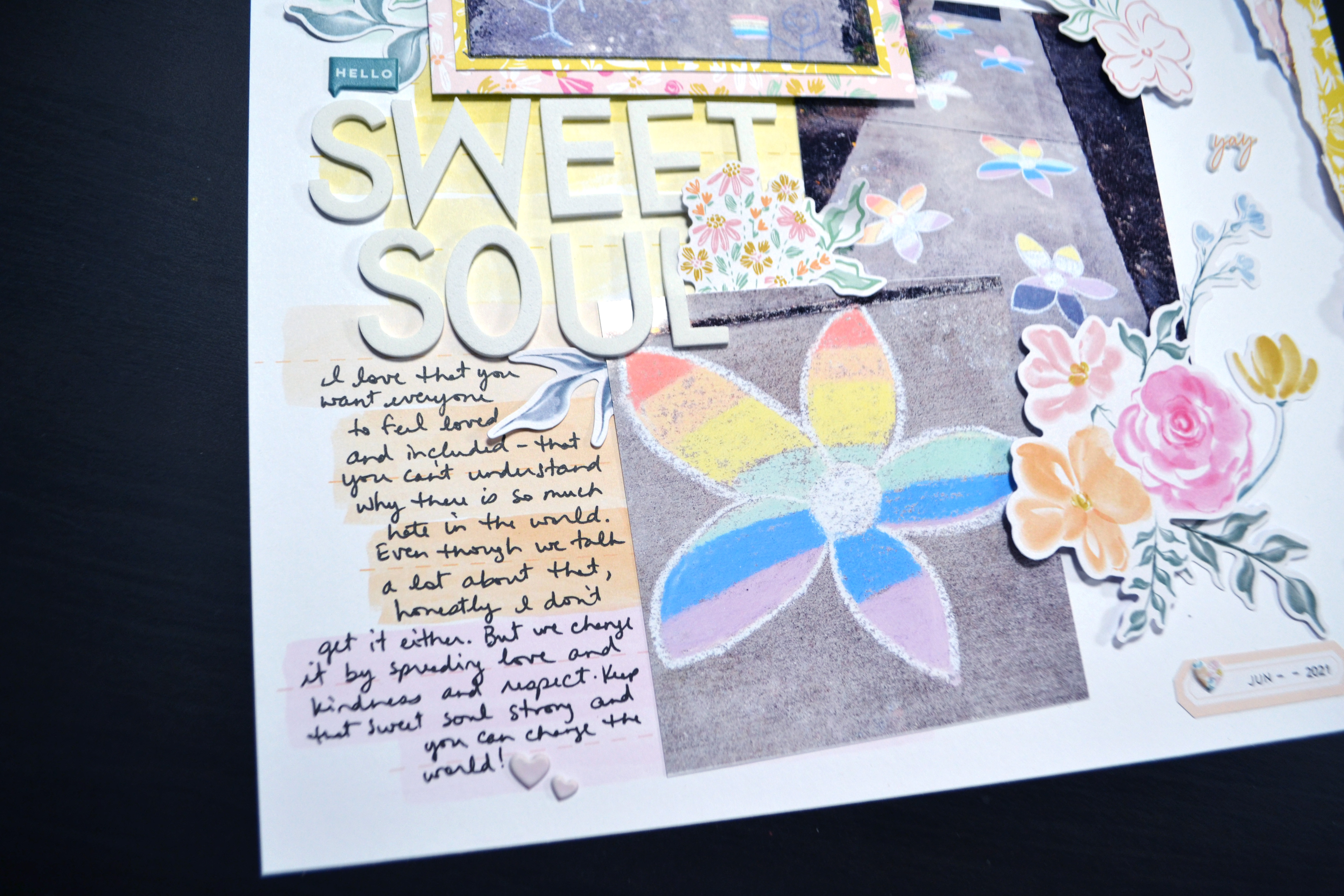
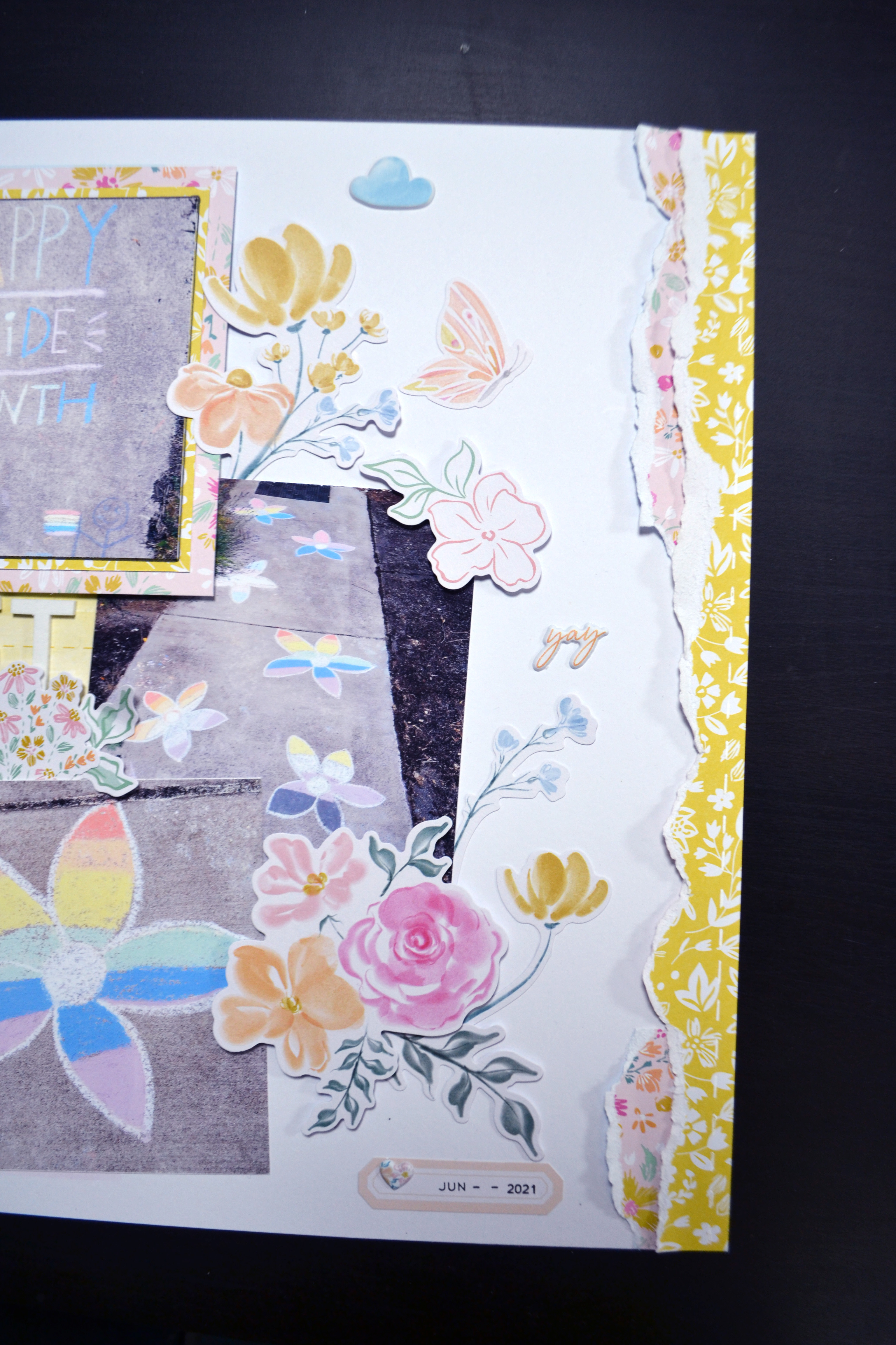
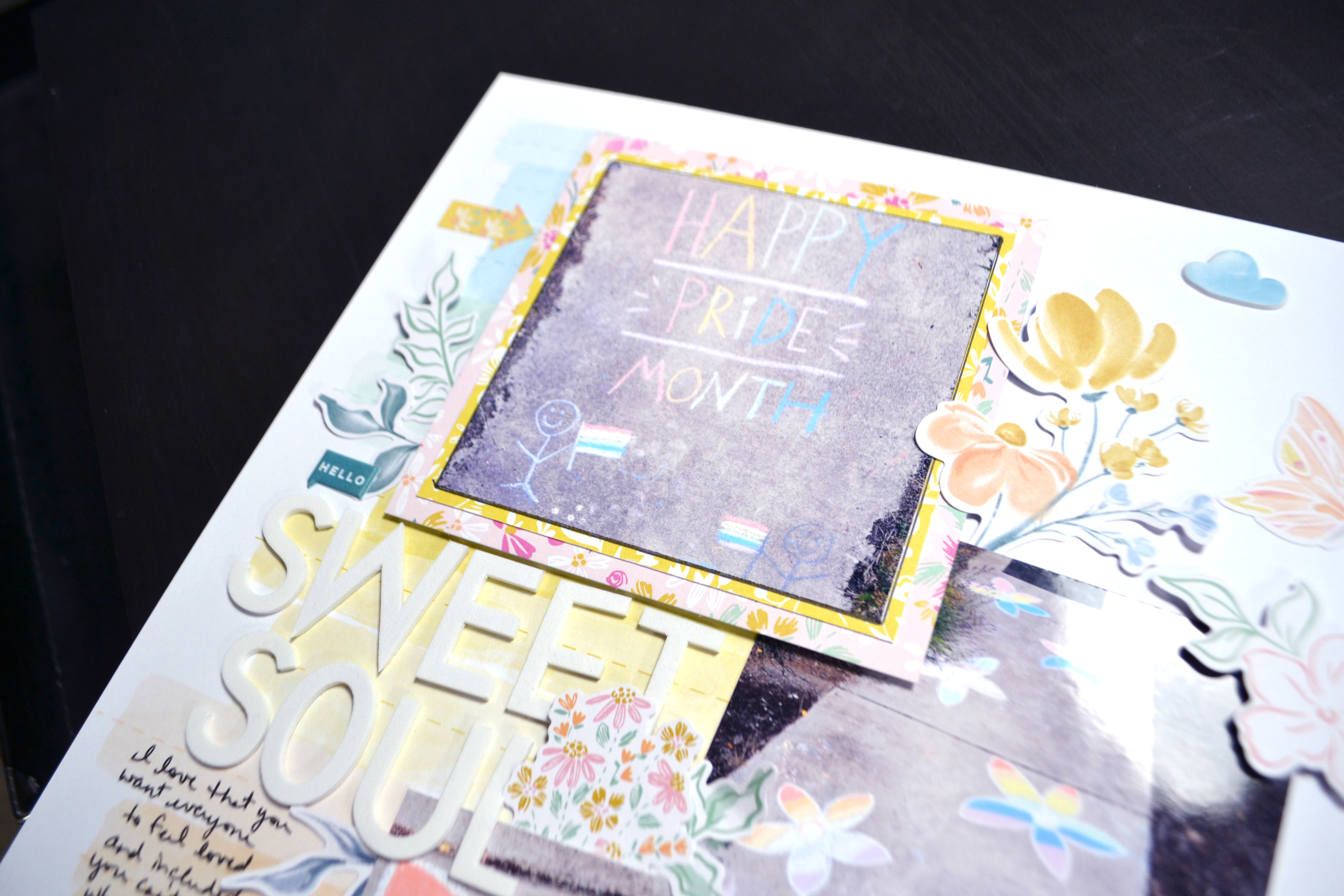
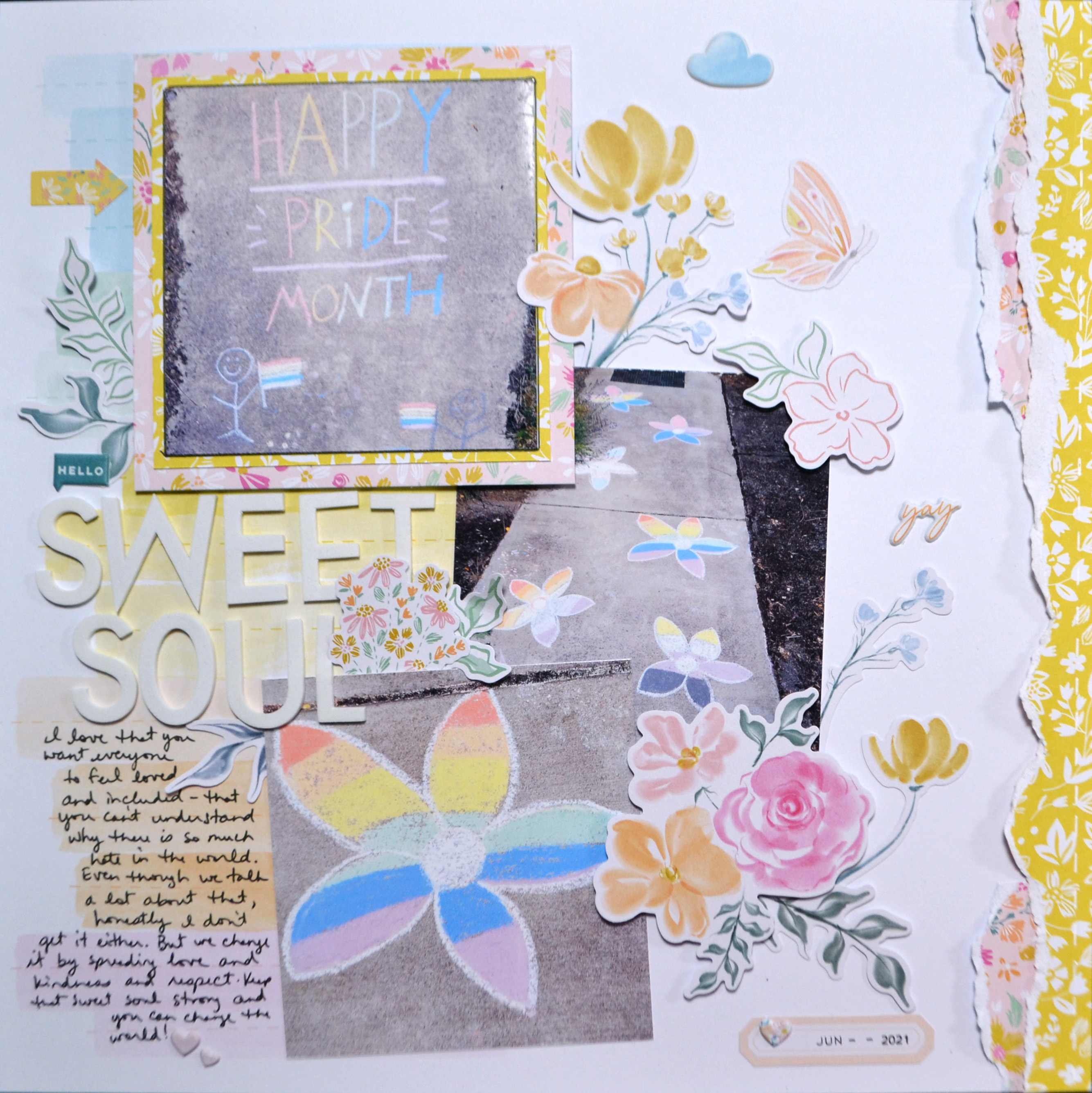
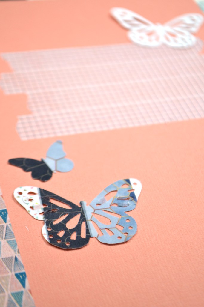
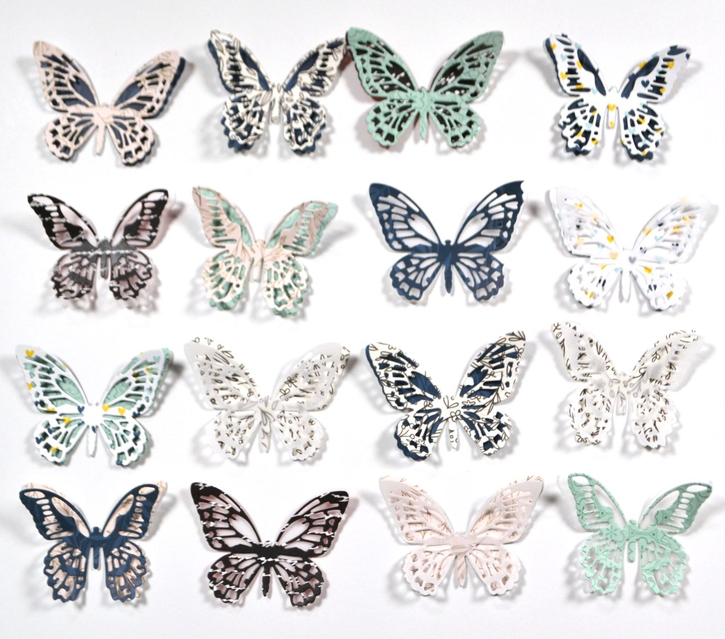
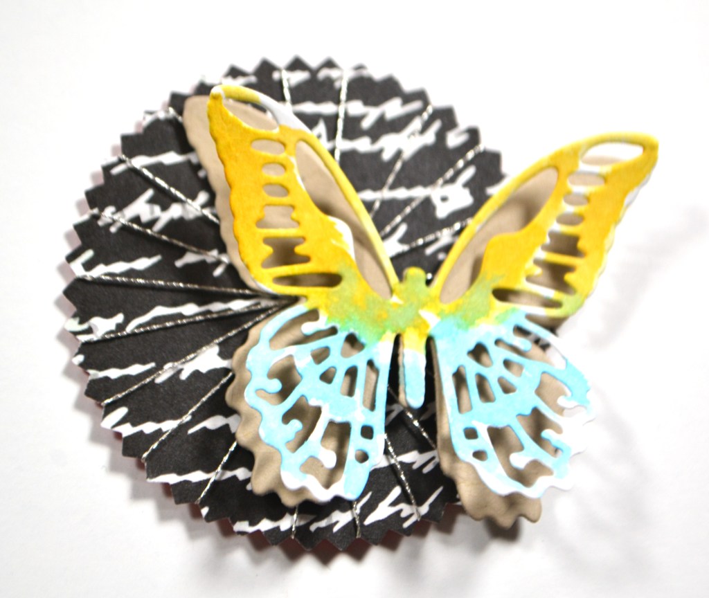
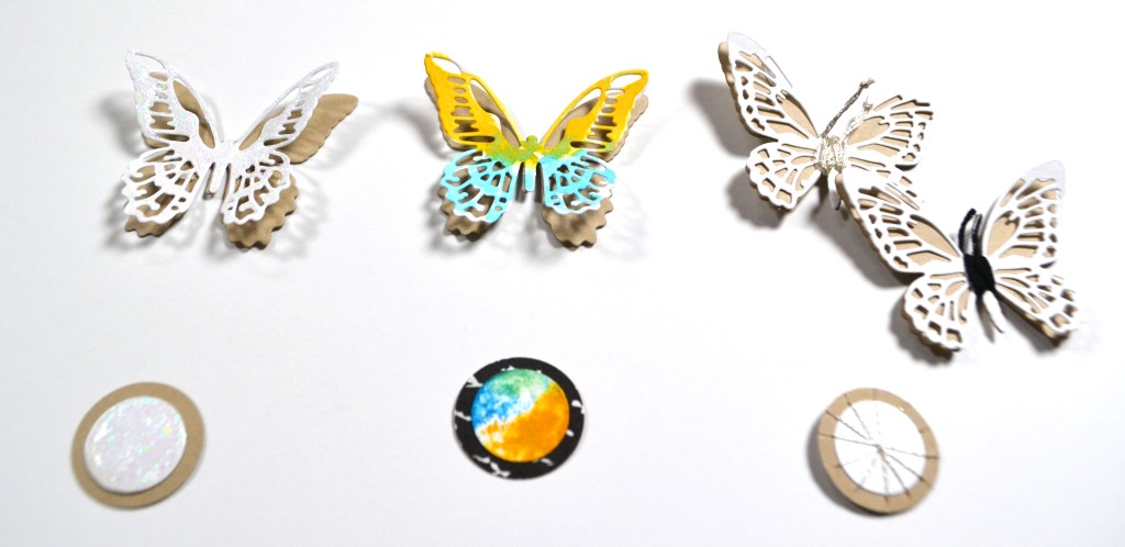
Diving deeper into the embellishment pack, I was drawn to the butterflies, especially the white on craft and the text print ones.

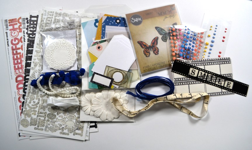
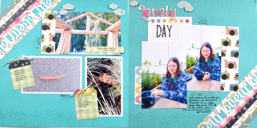
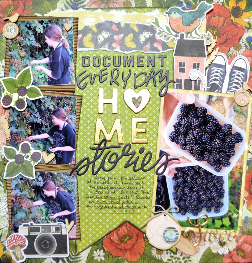
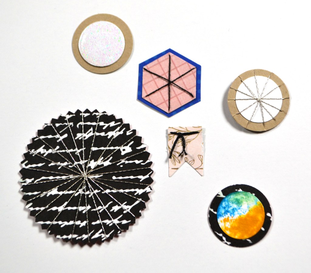
I pulled out my butterfly die set and got to work. As you’ll see from the below photos I went a bit wild with creating… not only butterflies but other shapes as well. See the whole process on YouTube, or keep reading for the short version.

Of course the CKC blog has more forgery examples to check out. I hope this gave you some ideas on how you can create forgeries of your favorite products with supplies you already have on hand. Don’t forget to show off your stuff over on the CKC Facebook group, or tag us on Instagram @counterfeitkitchallenge or use #counterfeitkitchallenge.

Kit Build: CKC, May ’22

I love kit building and I am on the design team for the Counterfeit Kit Challenge project. We take an inspiration kit each month and proceed to replicate it, or as we say, counterfeit it. This is a free, friendly group that helps inspire you to use up supplies you already own. We are not about needing to buy the latest and greatest thing (though we won’t stop you if you enjoy new crafty goodies😉 ).

This month’s inspiration was chosen by team member Kate and the kit comes from Scrapbook Doodle from back in 2015. The kit focuses on Bo Bunny’s Sweet Life collection. Along with our host Kate, we have guest designer Dawn playing along with this kit. So be sure to give them big thanks for taking care of us with their inspiration.

Since this kit was really the Bo Bunny Collection I did have a peek at their full line to see what other ideas I could come up with. Particularly I wanted to look at the B sides of the pattern papers and closer looks at some embellishments.

I knew from all this I wanted to incorporate striped pattern papers, buttons, and film strips. So lets look at the papers first. I was excited to incorporate old Basic Grey and Scenic Route papers along side brand new Simple Stories and Heidi Swapp. That is the joy of building your own kit!

For embellishing I pulled plenty of things straight from the inspiration: butterlies (or at least a way to create them!), enamel dots, flowers, tags and ribbons. Then I added in doilies, film strips and buttons (oops, the photo doesn’t include the buttons; trust me, I have them.)

There is a tradition over at CKC of titling our kits just like companies do. So I’m calling mine Life Past and Present for the mix of supplies I have incorporated. And hey, maybe I can even do some then & now layouts!

You can hear the thoughts that went into each choice in my video.

I hope you can follow along with the other designers and see how they interpreted their kits.

Here’s the full hop link list

Have fun kit building and don’t forget to show off your stuff over on the CKC Facebook group, or tag us on Instagram @counterfeitkitchallenge or use #counterfeitkitchallenge.

8.5 x 11 Scrapbooking?

So I’m new to this size and I want to share my adventure using it with you. First off, why use this size of layout? For me this came down to several reasons, in no particular order.

  • Scrapping myself more often means I have fewer photos and need less “real estate” on my layouts.
  • This size product is so easy to find and doesn’t hold a specialty item price tag (think binders and page protectors available at any office supply store.)
  • They can still fit in 12×12 albums if I don’t stick solely with this size or if I find it isn’t really working for me.
  • I’m exploring more hybrid by printing my own pattern papers and I don’t have a wide format printer (that pesky budget thing again)
  • This size album sits nicely on a shelf along side my 12×12 albums. I’ve explored other smaller sizes (6×6, 6×8) and the type-A side of me hated those albums squatting awkwardly on a shelf next to a jumbo 12×12 album.
  • Using that much less paper and plastic is that much more environmentally friendly. I know my hobby is a resource hog and is by no means environmentally friendly. But the whole reduce part of the r”educe, reuse, recycle” mantra is one I can focus on now. I’m already good at the “recycle” part, and the “reuse” part will have to be tackled another day.

There are some drawbacks to this size, but I’ll hold those thoughts for another post as I’m sure the list will grow over time! For now, here are a few of this size that I have done so far. Stay tuned for May 22 when I can reveal a new one that I made as a guest designer.

The one of the left is the most recent and I have a process video up for it. I’ll admit that this one could have used more real estate space but since I was using hybrid and printing my own, this is what I ended up with. In person it looks less crowded, but online I can see it is a very busy page! But that is me anyway, so I’ll go with it. The funny thing… they ALL have hidden journaling. So again, that real estate thing is rearing up. Hmm. Things to think about.

I’m curious to know how you feel about scrapbook sizes? What do you use now? Have you had any thoughts on other sizes? Let me know.

Freebie Friday, April ’22

I love learning, creating and sharing. That is why I offer freebies up to you each month. I have both a layout sketch (in printable pdf as well as editable psd) and an electronic cut file (in svg). This month I was inspired by the birds in my garden! You can see all the details in my reveal video, or read on for the short version.

Here is a closer look at the sketch and the project I created based on this sketch.

You may have noticed that I have a hummingbird cut file on the layout above. Sure enough, that is the cut file I have to offer you this month. My reveal video covers how I colored my hummingbird. Of course you could always back the bird with pattern papers.

Download the pdf sketch here, the psd version here, the cut file here or, head over to my Freebies Page to peruse the catalog of files I have offered in the past. And if you have any ideas for sketch or cut files, I’d love to hear your ideas. I can’t make promises but I can take suggestions!

SCT Sampler Kit Unboxing, April ’22

Getting my SCT Sampler kit in the mail each month is a bright spot. This small affordable package is just enough newness + surprise to keep me satisfied. This month the package contained the monthly die, which says Lovely, a Gina K stamp featuring daffodils, and collections from Echo Park and PhotoPlay. Take a look…

I always do a project when I open up my new goodies. Since I’ve been making so many cards lately, this time I felt like a layout was in order. I decided to go with a double pager since I had 5 4×6 photos to show off. I think this page is simple but pretty. I’ve used many things from the kit included mixing and matching the pattern papers, using the die as decorative elements as well as for my title, stamping as subtle border and creating some of my own embellishments.

Of course if you want more information you can watch my YouTube video to get a better look at the kit products and my project.

CKC Challenge #2, April ’22

It is challenge time over on the Counterfeit Kit Challenge blog. Our hostess for the month, Lisa was inspired by the large sentiment elements that are in the kit, especially the Vicki Boutin die cuts. So that lead straight into the second challenge…. go big with your title. Here is a peek at the entire inspiration kit again. See those phrase elements?

It was really easy for me to go big with my title. I’ve done it before and like the effect. The real challenge this time? I didn’t include many of the phrase elements into my kit! I build my kit around the inspiration of Vicki Boutin and Jen Hadfield and I had phrase’s from Jen. But I was really looking for the Vicki sized title pieces. So I did something I don’t normally do, I went and pulled more stuff for my kit. I grabbed more of the Fernwood collection and ended up pulling the puffy phrase sticker sheet to add to this kit/layout.

It feels a little like “cheating”, but you know what? What rule of the universe says I can’t grab something else to add in? There are no rules! So I got over it and did what I felt was right for this layout!

If you want to see the entire process, including a few tips on working with prhase stickers and some small design tips, you can see it all in action in this video.

I hope you can check out the other designers takes on this challenge! Don’t forget to show off your stuff over on the CKC Facebook group, or tag us on Instagram @counterfeitkitchallenge or use #counterfeitkitchallenge. We love to see your work!

New Pinkfresh

A couple of weeks ago I shared an unboxing of the two new Pinkfresh scrapbooking lines over on my YouTube channel. If you haven’t seen that, you can go check it out. Today I’m sharing the first layout using the Happy Heart line from that new release.

I was really pleased with how this layout turned out! Take a look at the closeups.

Not only is it a lovely layout, but it was super fast to pull together! I’m a fan of Pinkfresh products and I’m happy to share my love. I hope you’ll check them out if you aren’t already a fan.

It’s Challenge #1 time over at CKC

It is challenge time over on the Counterfeit Kit Challenge blog. Our hostess for the month, Lisa was inspired by an the date this challenge goes live. When she looked up “on this day in history” she discovered that Disneyland Paris (called Euro Disney when at first) opened its doors to the public on 12th April 1992. First off, lets take a look at the whole kit from Papers and Beyond called Follow Your Bliss.

Now let’s talk challenge. The idea here is to be inspired by Disney in some way. I went with the fairy tales aspect since I’m not a entrenched Disney fan (I like it fine and was a fan as a kid, but it doesn’t sit on a high shelf in my life). Right now I am reading a book that is filled with the fairy tales a grandmother tells her young granddaughter to teach her life lessons. However, this layout is about more than just this one book; it is about how I found this author and what I enjoy about his writing.

The journaling tag tucks behind the “My Happy Place” title card and actually covers up that gnome embellishment. It is a bit of a surprise to find that guy back there when the journaling is pulled out. You can see all the layout creation details below.

And here are a couple of closeups.

I hope you enjoy this challenge and think outside the box if you are not Disney inclined! Don’t forget to show off your stuff over on the CKC Facebook group, or tag us on Instagram @counterfeitkitchallenge or use #counterfeitkitchallenge

3 Products, 3 Card Designs

I’m hoping to help you expand the usefulness of some of your supplies. Today I’m using just 3 main products to create three different card designs. We’ll look at a few tips and tricks to expand the use of layered stencils and background dies. In fact I’ll confess, I only own one cover plate/background die!

Now, I’m going to show you some Easter cards today, but I want you to keep in mind that simple changes can turn these cards into just about any occasion. You’ll get the most tips and details from the video, but I’ll share the basics below.

For the embossing powder, it was used to:

  • As a basic stamped greeting
  • Edge the card front
  • Edge card elements (eggs in upper card)
  • Added as focal point accents (flower centers)
  • Create a focal point texture piece

The stencil was featured by:

  • Using a portion to create a “die cut” focal
  • Using it to decorate other elements (the eggs)
  • Using it in portions to decorate the background.

The cover plate die was also used in three ways:

  • As intended, as a background layer. The tone on tone gives it a special tone.
  • As a dry embossing texture (the video covers this technique!)
  • As a dry + heat embossing focal piece

I hope you found some interesting ways to stretch your supplies! I’d love to hear the ways you enjoy using background dies, stencils or embossing powders in your crafting.

Washi Tape review

I was contacted by a company called Grabie.cc with an opportunity to review washi tape for them. They discovered me via my YouTube channel and reached out to me as a way to help promote their young company. After looking over their website I decided I would do the review for them. The did send me a free pack of washi to use for the review; though I will readily admit that the several hours it took me to create and then edit the video comes no where near to actual compensation! I did it because the company claims some philosophy that resonated with me: art as therapy, production of produsts with a zero waste mindset and connecting community. I know anyone can say anything they want on the internet, so I hope these philosophies hold true.

I’ll give you just the gist here, but the video goes into more details. I was generally satisfied with my product thought there was some stickiness inconsistency. Really that is the whole story! So take a look at some photos of everything.

When using this washi as I normally would it all worked out nicely. It was easy to lift and move early on in creating (there was some residue left if I waited until later to move it). I was able to write on it. I could punch through it to create embellishments. All in all it was nice to work with. And the patterns on some of the pieces were designed to line up so that you could get continuous pattern if you applied the tape in adjacent rows. Nice!

Grabbie has some other interesting products that I’m going to check out. Perhaps you want to check them out as well.