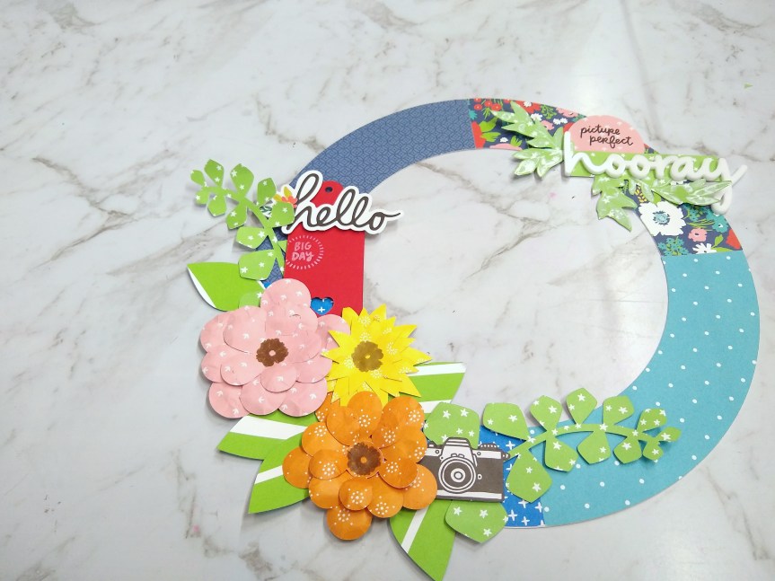
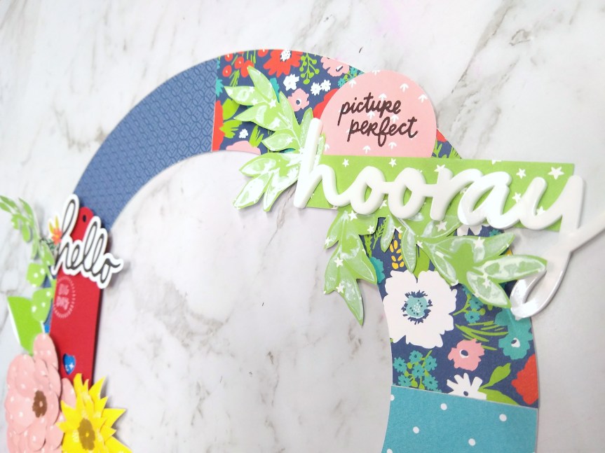
I’m was very happy to be invited to be the guest designer for September 2020 over at the Counterfeit Kit group. What they do is offer up a pre-made kit as inspiration and then participants build their own kits from their stash at home.
I love doing this project and I show you my thought process on my YouTube channel. So please check out my video! And since the group has a trend of naming their kits I shall call this one School in the Woods.
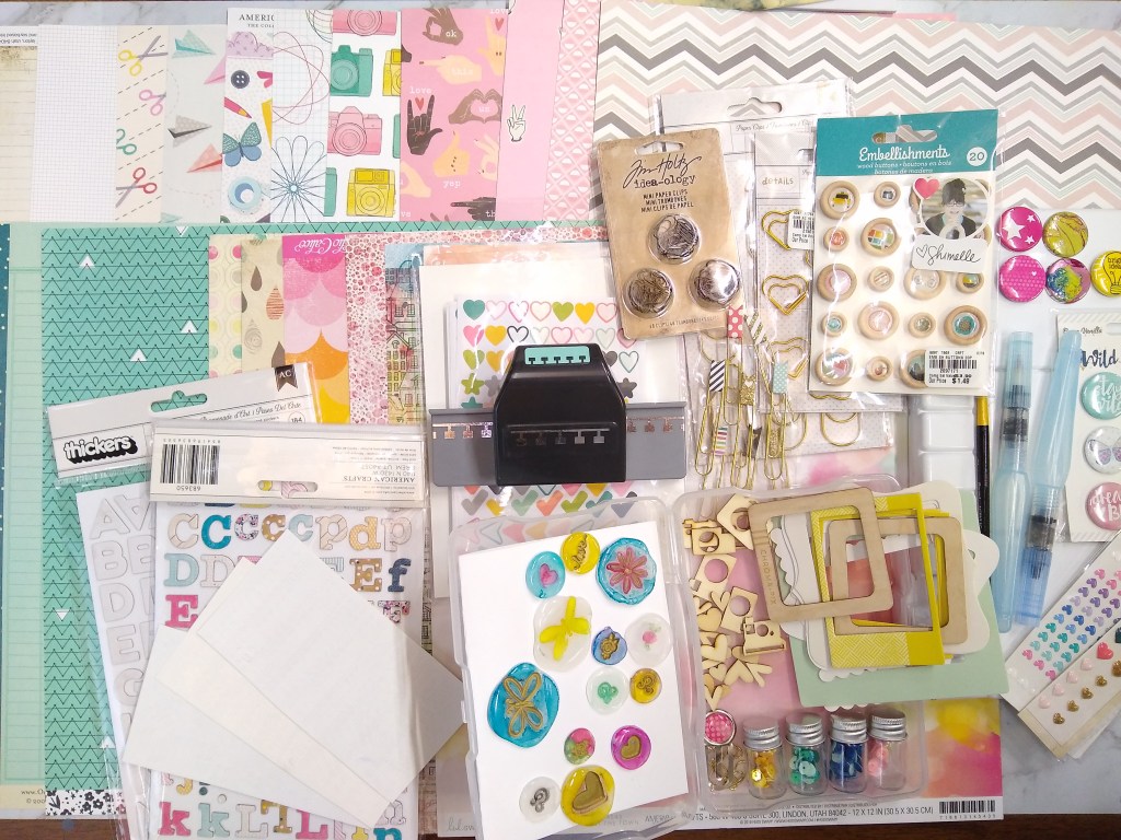
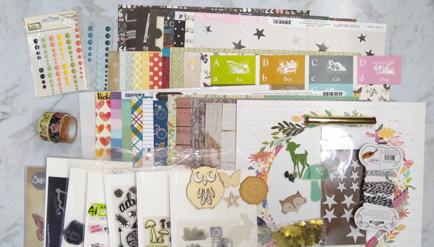
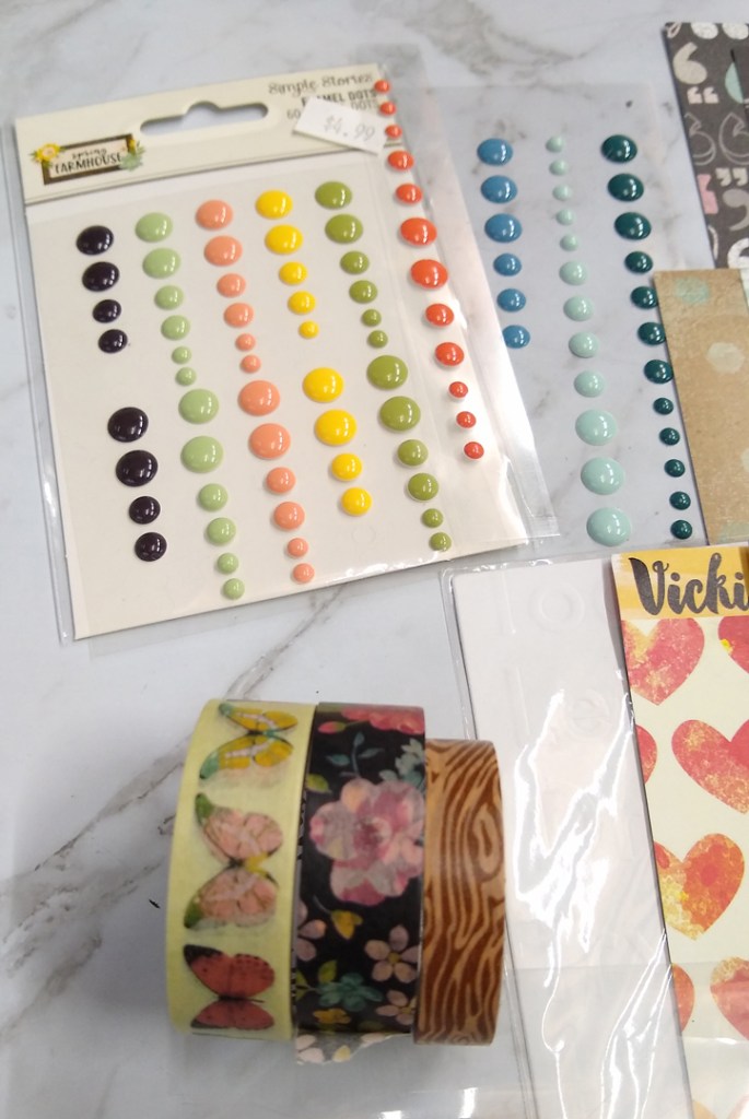
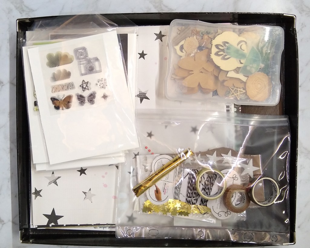
And if you prefer just the basics in visual format, I’ve got you covered. I used the inspiration of school, woodland, and fall themes as well as a softer primary color scheme with a dash of green to build this kit. Here are the still images…


Don’t forget to check out all the Master Forgers (the ongoing design team at CKC) for their takes on this month’s inspiration. Here is the hop list:
- Guest Designer – Misty Murphy –https://youtu.be/dULbwo_5E3I }}} That’s me!
- Cindy – http://cindyscreations-cinmfoster.blogspot.com/ }}} Our designer host for the month!
- Julene – http://julenebydesign.blogspot.com/
- Leslie –http://lcsmithsaved-outofthemire.blogspot.com/
- Lori – https://loriannie670.blogspot.com/
- Tara – https://kryptonite72-rambles.blogspot.com/
- Tina –http://tinasscrapcorner.blogspot.com/
- Tracey – https://3obsessions.blogspot.com/
- Laura – https://www.instagram.com/mrsp_scrapsandtea/
I’ll be back on the 4th, the 12th and the 18th with more goodness from this kit and challenge inspiration!