Welcome to September 2021 everyone. For me this year has flown by despite all the continuing troubles with covid. I thought for sure this would be another year that crawled by. Yet here we are. I hope you have all stayed safe and healthy. I send you extra wishes for continued health as we head back indoors with the chill of fall weather looming.
Lets get on to crafting, shall we? This month Master Forger Tina is our kit host and she has invited Tori Gaines as our guest designer!
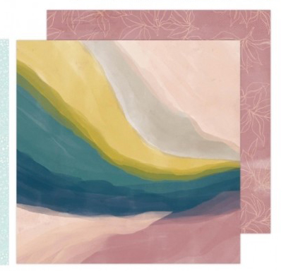
Tina has offered up this kit called Vivid from the {Not} Just for Boys kit club from September 2020 as our inspiration this month. Of course it is sold out at this point so counterfeiting this kit is a great option to get the vibe you are going for.
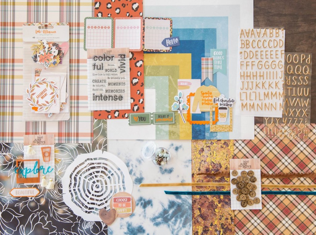
This kit includes
“Vivid” Paper:
- 1 piece 12×12 paper- Amy Tan-Late Afternoon “Make a Wish”
- 1 piece 12×12 paper- Amy Tan-Late Afternoon “Free Spirit”
- 1 piece 12×12 paper- Amy Tan-Late Afternoon “Warm & Cozy”
- 1 piece 12×12 paper- Heidi Swapp- Old School “Summerland”
- 1 piece 12×12 paper- Simple Stories-SN@P! Basics “Walnut/Cream Dot”
- 1 piece 12×12 paper- Heidi Swapp- Old School “True Blue”
- 1 piece 12×12 paper- Elle & Viv- Oxidation “7” (single sided)
- 1 piece 12×12 paper- Echo Park- Witches & Wiards “Letters”
“Vivid” Embellishments:
- Crete Paper “Magical Forest” Puffy Alpha Copper Foil Stickers-14 pieces
- 1 NJFB 3″ x 4″ Exclusive “Vivid” Stamp Set- 13 stamps
- 1 Amy Tan-“Late Afternoon” Ephemera Pack- 40 pieces
- 1 Jar NJFB “Vivid” Pearl Mix
- 3 Yards “Vivid” Trim (1 yard each of 3 colors)
- 1 Pack of NJFB Exclusive Acrylic Embellishments and 3 Mini Tassels
- 24 “Vivid” Textured Buttons
- 1 “Tree Slice” cardstock cut by Sophie Gallo
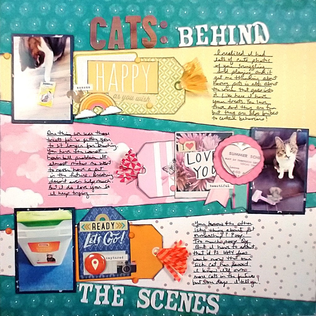
For the whole process of my kit build you can check out the video I made for this month.
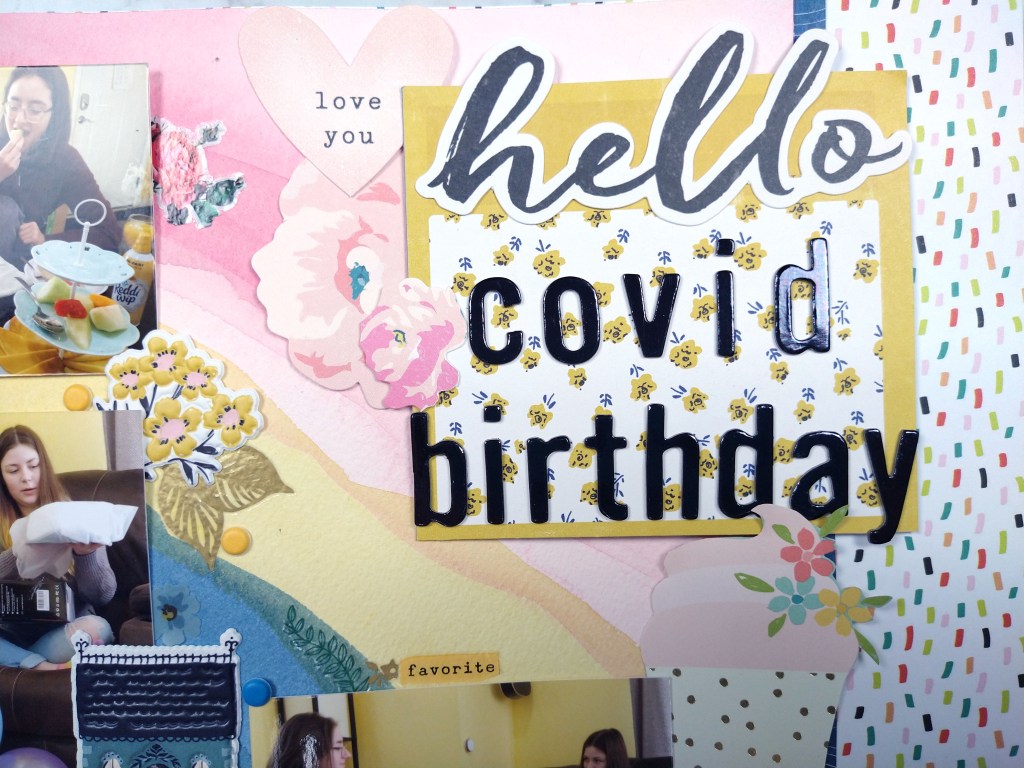
The first thing I noticed about the kit is the warm oranges and browns of the classic fall season imagery. Since these are not my favorite colors and I am just plain not ready for fall, I looked deeper at the kit for inspiration. The Heidi Swapp blue and yellow stripe/geometric paper caught my attention next. I know I have this paper in my stash… well at least I thought I did. When building my kit I just couldn’t find it. (I may have tucked it away in another project and since forgotten which project and where!) Despite not being able to find that paper I let the colors lead the way for me. And then I followed this inspiration kit’s path in terms of pattern. I found some plaids/checks, a bold floral, woodgrain and some watercolor textures. I then added a couple of supporting patterns to round out the choices.
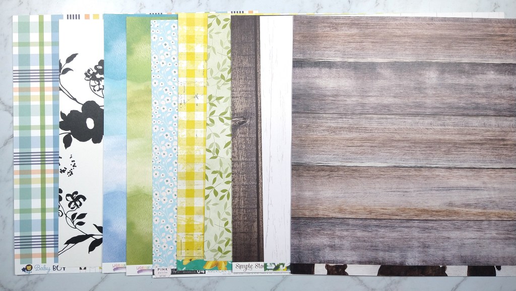
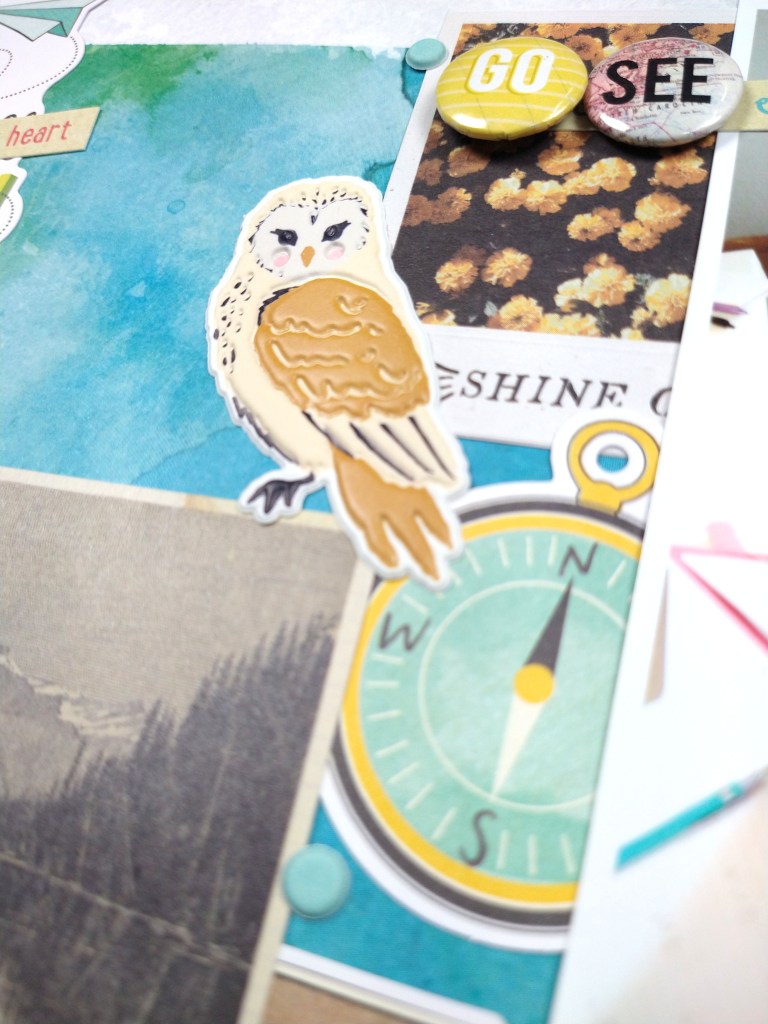
Moving on to embellishments I was inspired by the leafy die cuts, ribbon texture, wood texture buttons, and the log cut file. I decided to pull wood and cork elements and add in plenty of floral die cuts. It worked out that some of my leafy ephemera also had gold, which was included in the alpha from the inspiration kit. I also found some floral acetate that can take the place of the acrylics in the inspiration kit. Toss in a few natural fibers and some alphas and that topped off my kit.

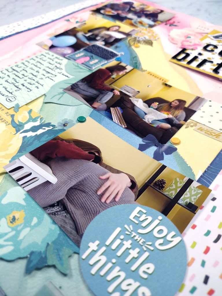
With this lighter, brighter take on this inspiration that clings to the remnants of summer, I’m calling this kit Last Hurrah.
Be sure to check out all the fun over at the Counterfeit Kit Club blog for challenges and inspiration to build and use your kit. Don’t forget to see the other design team members’ takes on this months inspiration. Be sure to leave extra love for Tori for being our guest designer this time around.
- Counterfeit Kit Challenge – http://counterfeitkitchallenge.blogspot.com/
- Guest Tori Gaines – https://www.instagram.com/tag1681/
- Cindy – http://cindyscreations-cinmfoster.blogspot.com
- Julene – http://julenebydesign.blogspot.com
- Juliet – https://www.instagram.com/julesd/
- Kate – https://kateblue.blogspot.com
- Leslie – http://lcsmithsaved-outofthemire.blogspot.com
- Tara – https://kryptonite72-rambles.blogspot.com
- Misty – https://craftysoup.com
- Tina – http://tinasscrapcorner.blogspot.com
- Tracey – https://3obsessions.blogspot.com
- Laura – https://www.instagram.com/mrsp_scrapsandtea/

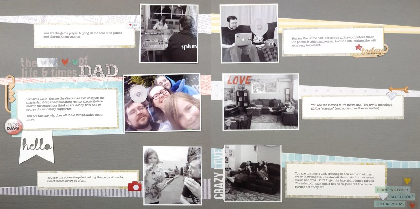


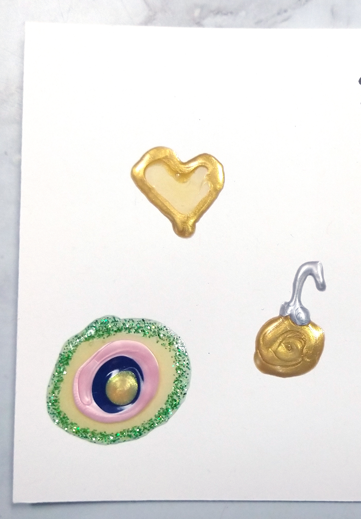 While you can do all the enamel style dots your heart desires, why not try other shapes? Go ahead and mix and match colors while you are drawing. And don’t forget you can draw fun things too. I once drew a fork and knife as embellishments to a scrapbook layout.
 If you just draw a rectangle around an items like a photo or embellishment cluster, then you have a frame. Or doodle it up for fun borders.
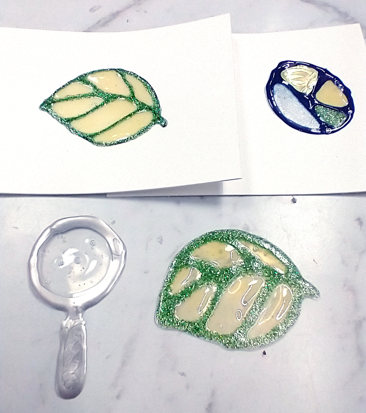 Two important things to note here. First did you know you can draw with Nuvo drops on a non-stick craft mat (or sheet of plastic packaging, or a glass mat) and then pop the pieces off the mat for a stand-alone embellishment. Second some of the drops dry clear or translucent. You can put these to use for a stained glass look or for mimicking actual glass.
 Have you ever thought about writing with your drops? You can do titles, greetings or word embellishments. You can just free draw or you can use this tip: Cover a printed sheet of words with clear plastic. Then trace the words onto the plastic. Let dry 24-48 hours (more is better). And then you can add these words to your projects. You could also write with a pencil or stamp in a light colored ink directly on your project and then trace over with an opaque style drops (most of them ARE opaque. Jewel drops are an exception, as well as clear colors. Glitter drops have a clear base with colored glitter so you may be able to see through parts of the image is you use the glitter drops.)
 Likewise you can create your own puffy alphas in the same way. I prefer tracing for this so that my letters are consistently shaped and sized.
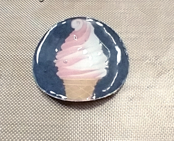 You can make your own flair-badge type embellishments. Punch out an image from some patterned paper and top with Morning Dew (clear!) Crystal drops for an epoxy-like finish.
 If you do the same thing with very small punches then you get a “fancy” style enamel dot look. Just be sure to put temporary adhesive down on a craft mat. Stick your punches to the adhesive and THEN cover with your drops. This will prevent your pieces from sliding around and requiring you to touch them. That just ruins the drop’s finish.
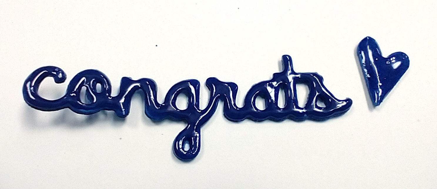 A further idea here is to replicate acrylic pieces. You need to punch or die cut three layers of cardstock. Glue the layers together and then top with your clear drops. The added thickness of the multiple layers makes it look more like acrylic.
 Go ahead and use your drops through various stencils. You can mix and match colors of drops, use a mask under the stencil to keep an open portion and even combine multiple ideas for added interest. Just don’t forget to wash your stencil immediately. If the Nuvo drops have a chance to dry and your stencils it will “clog” them up and ruin your stencil.
 Have you ever done a heat-embossing and ink resist technique? This is the same thing, only easier. Just draw/stencil/write an image onto your project. Let dry overnight and then apply water-based inks the next day. Be sure to buff your Nuvo shapes with a tissue just a bit to remove any excess ink. Then you are left with pretty, colorful designs.
 I know this is titled 10 ways, but here is a bonus 11th way. Just smear your products onto projects. This is much more mixed media vibe, but it can be oh so pretty. Here I’ve got a beach scene using opaque drops, glitter drops, and there at the bottom, stone drops. The stone drops have a sandy texture and when inked with brown will hold the color a little and actually look like sand.
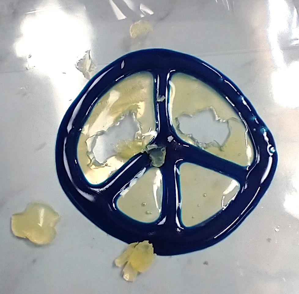 . I know I said I don’t share disasters, but this is a cautionary tale when trying these techniques. Let them dry ALL THE WAY before you mess with them. Otherwise they can stick to each other becoming inseparable blobs or they can stick to other things like the table and then pull themselves apart.