Adapt scrapbook sketches to cards

It is free sketch time!

I’ve got a new 12×12 scrapbook layout sketch up for you here on the blog. Normally I’d use this sketch to show you a take on it for a layout, but a few things happened that made me take this sketch into a card making direction instead.

  1. I’ve already done a process video for this sketch. (In fact I based the sketch off of this project to begin with!)
  2. I created that project as a scraplift of myself from several years ago
  3. I wanted to do something different.
  4. I took a card making class recently and was feeling inspired to make cards!

Thus this adaptation was born. First let’s take a look at the sketch and the supporting layouts that inspired this sketch.

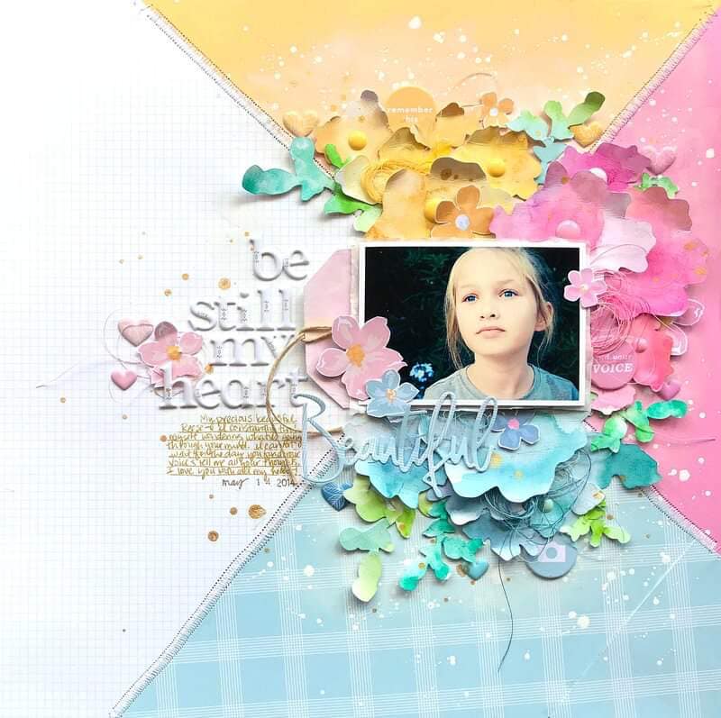
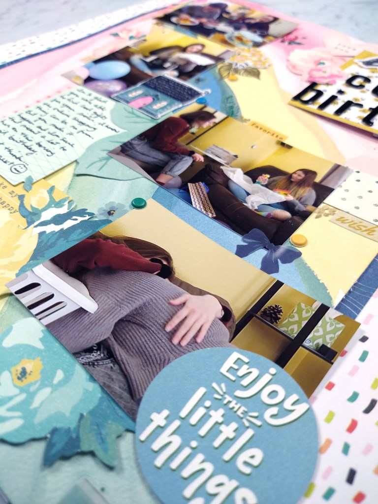
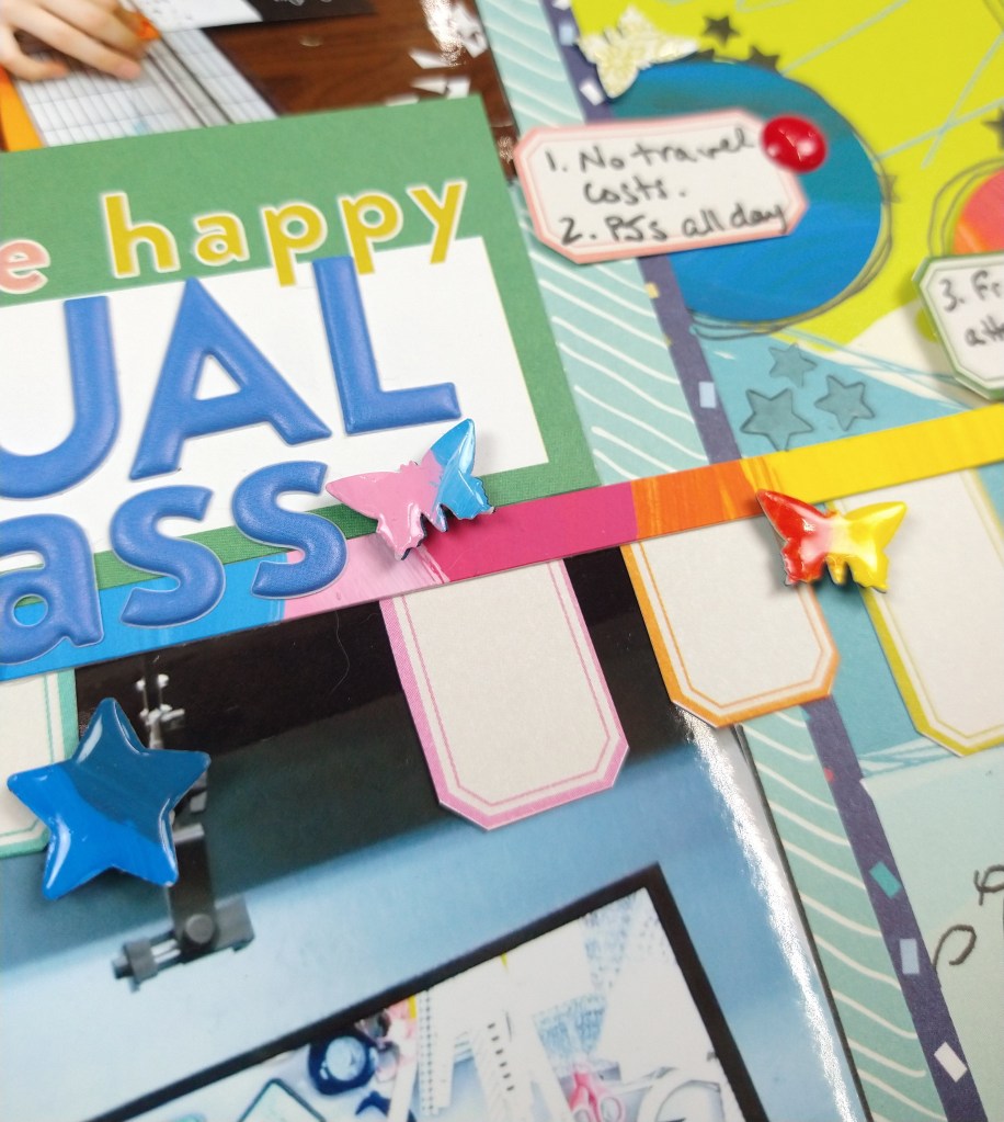
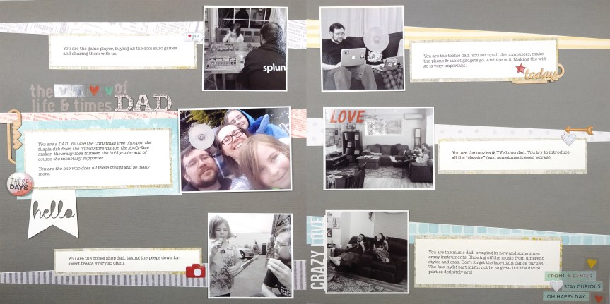
So here is the sketch you can download it directly here in a photoshop format or a printable pdf format or you can head to the Freebies tab above to see this and many more sketches available for download. This sketch came out of the layout below that I created for the ScrapHappy.org membership group blog post.

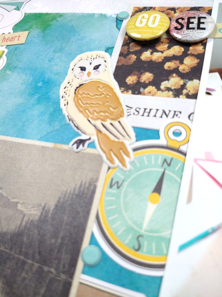
And in turn this layout was scraplifted from myself. I made the original layout below many years ago and it has remained one of my favorites.

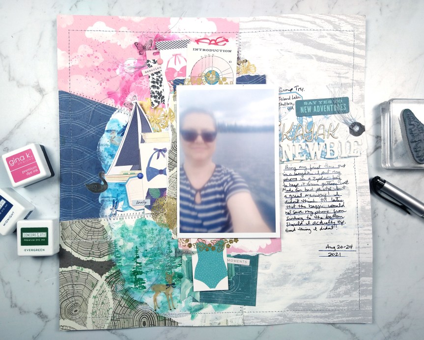
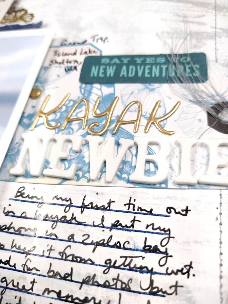
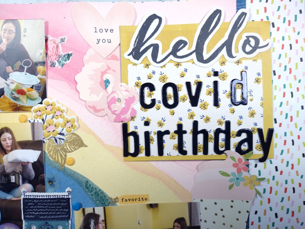
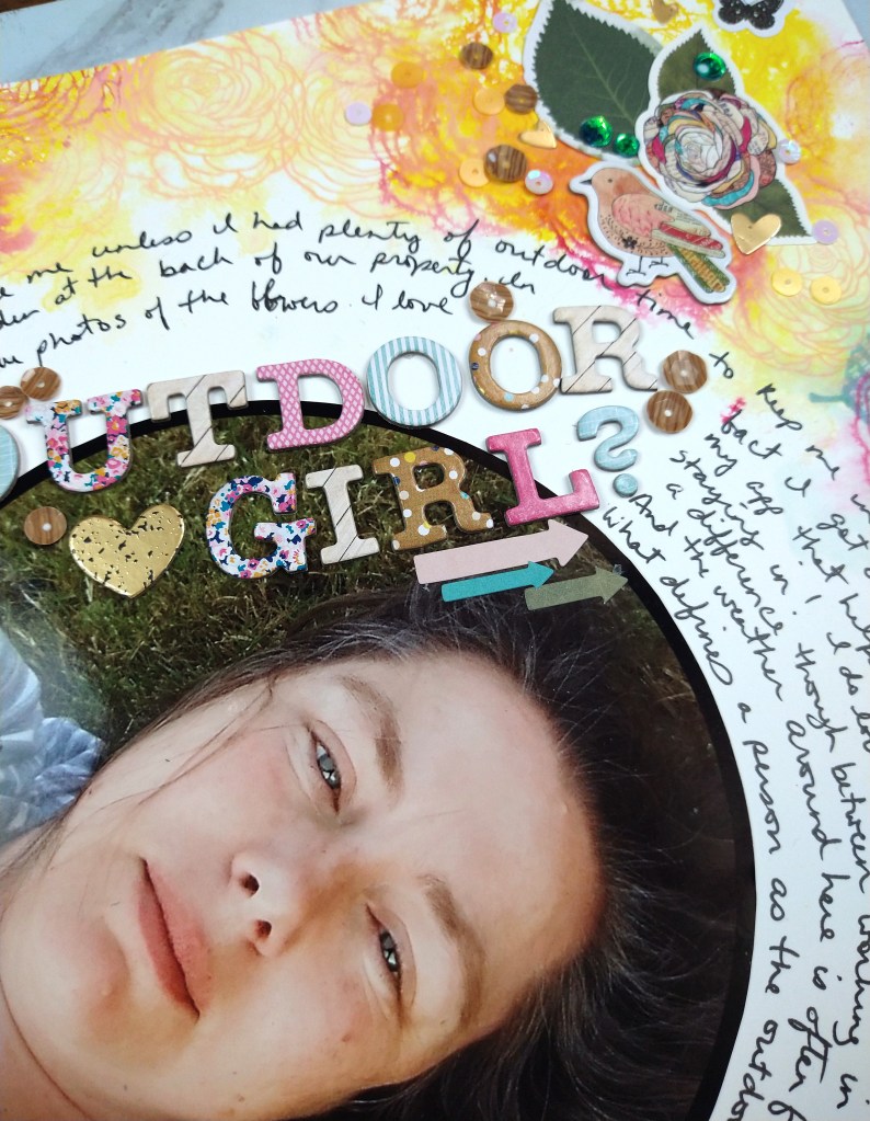
And here is the layout process for the most recent project.


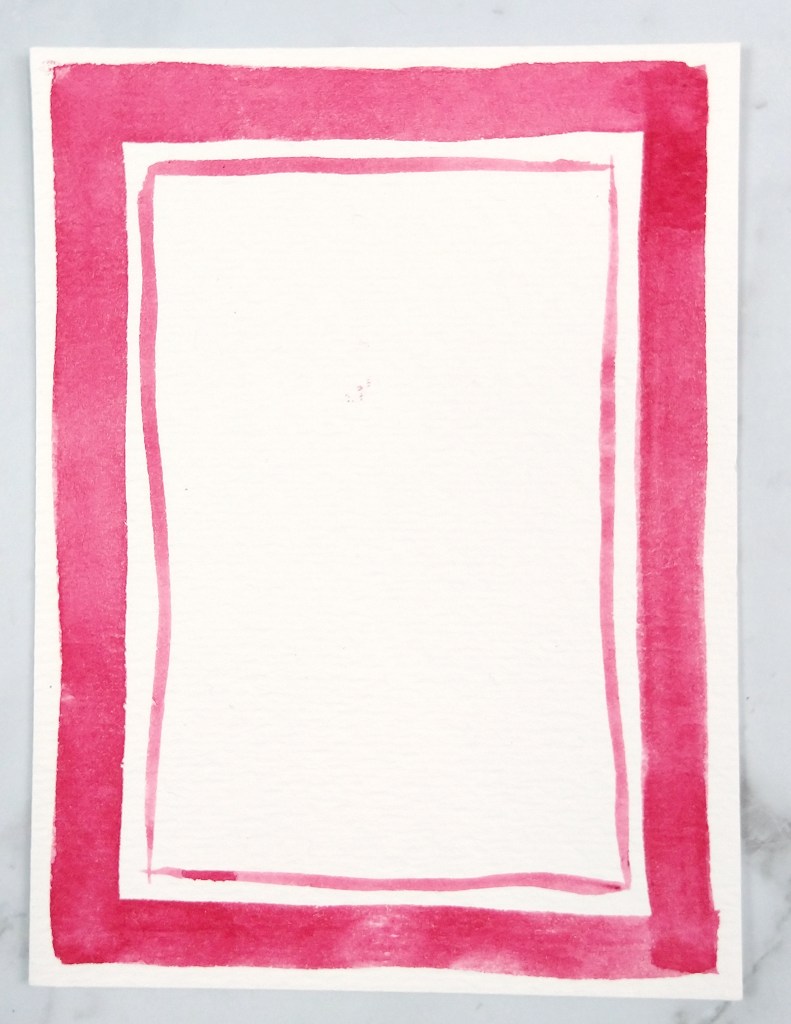
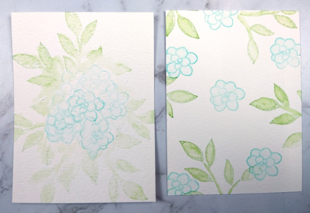
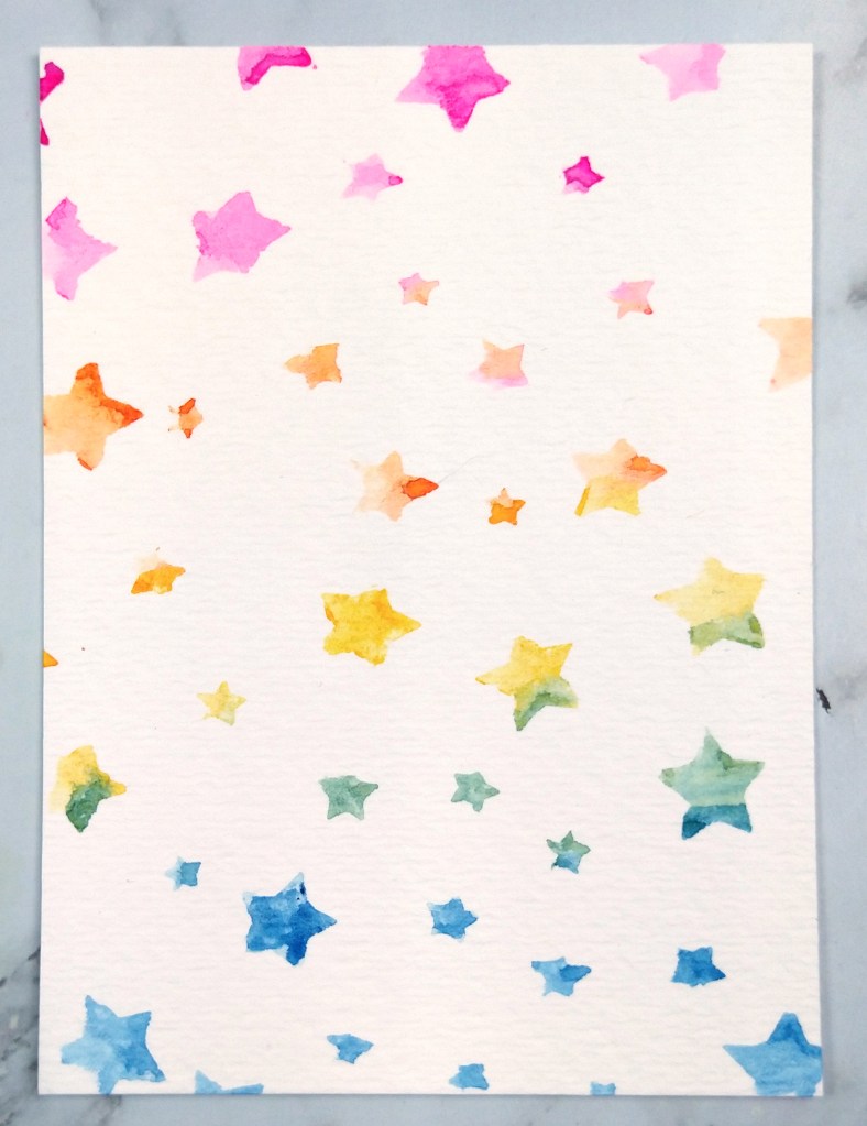
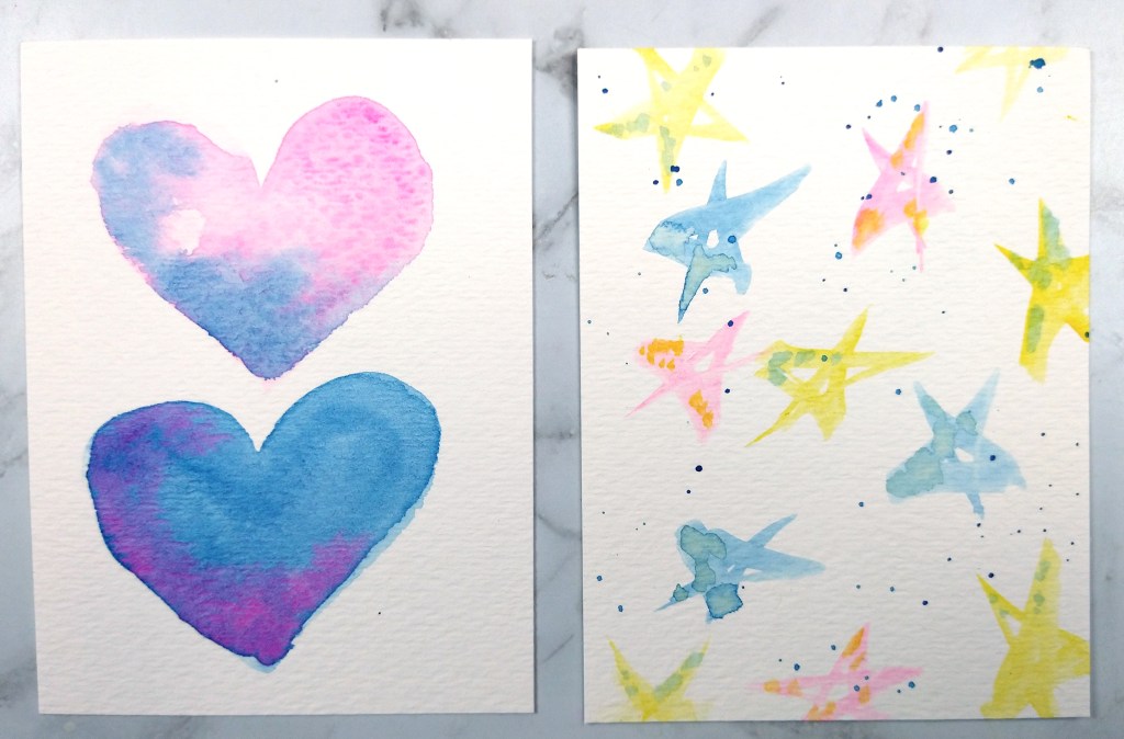
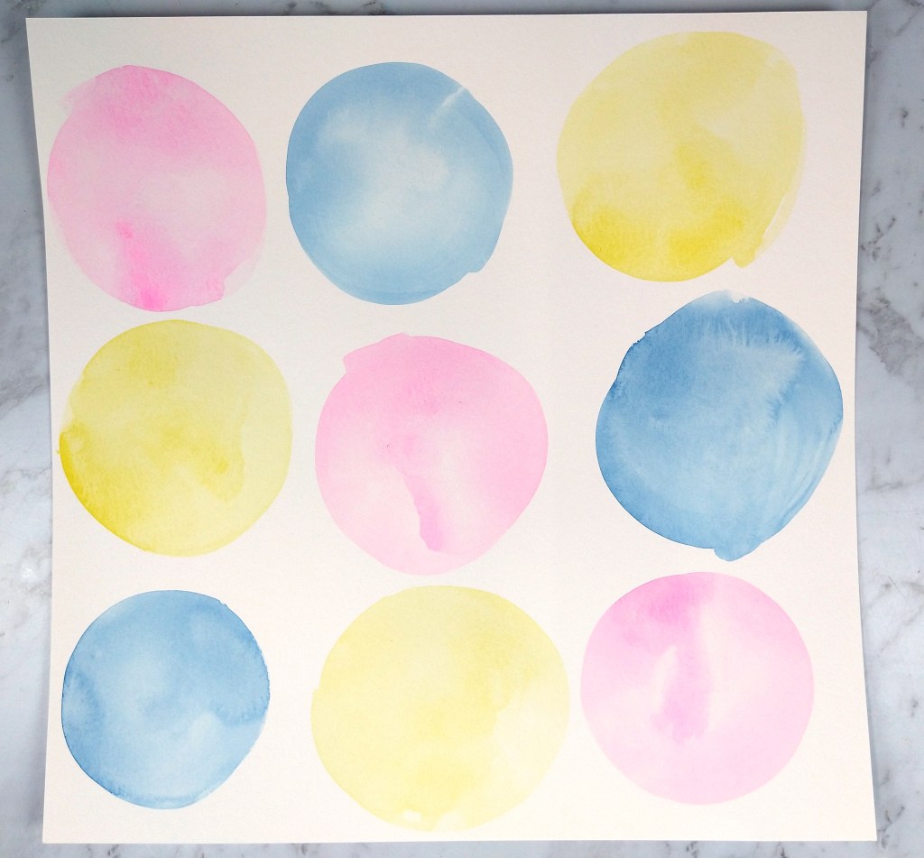
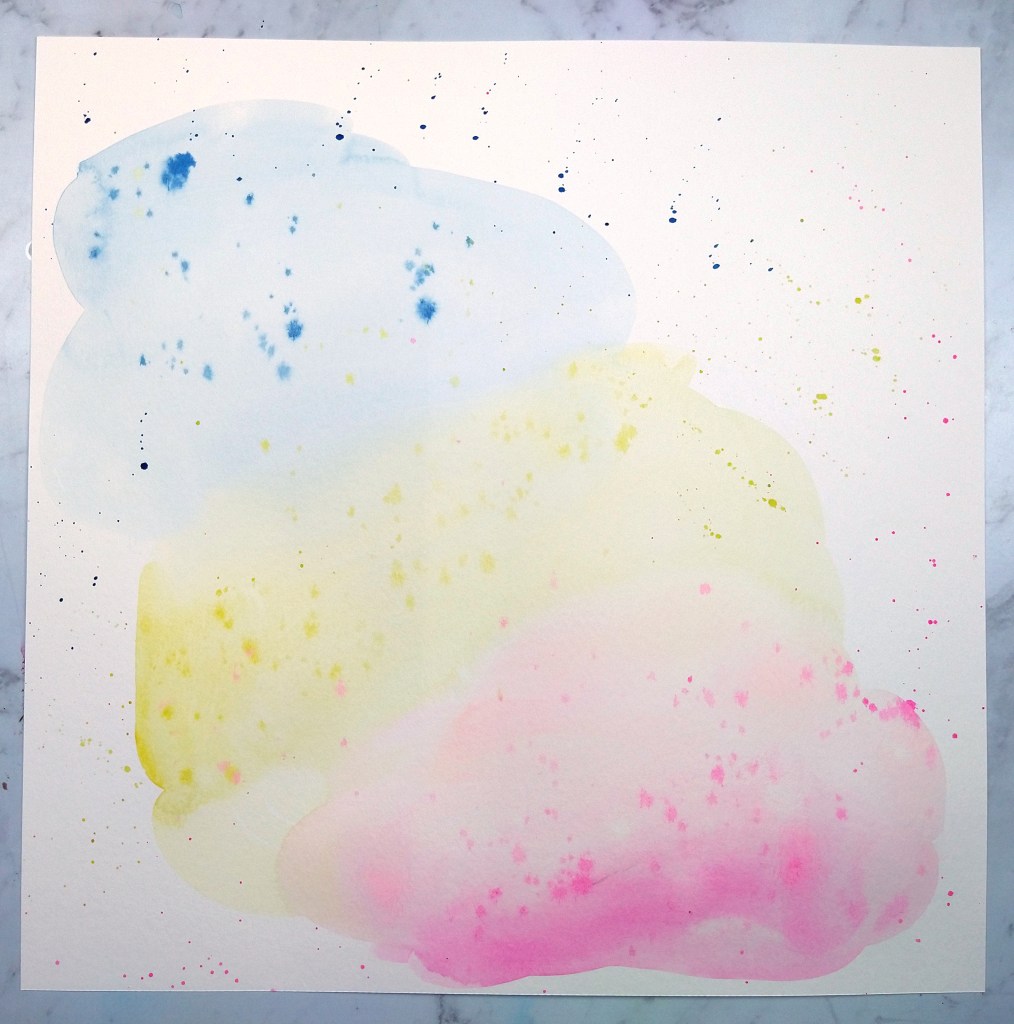
With that out of the way I wanted to move on to another project… adapting this sketch to card making. I used the same idea of angles, but inked and stamped them instead of using paper. I repeated the greeting instead of using three photos and I embellished with smaller items instead of layered clusters. And just like that, a card is born! Hope you enjoy a view of these cards and the products used are listed below.

Mixed Media Hop, 8/21

I’m back with the August ’21 Mixed Media Frenzy YouTube hop. The final Friday of each month the group invites all members to participate in a community hop. If you want to join in the fun, visit their Facebook group for inspiration and interaction. We were scrap lifting the image below, created by the very talented Missy Whidden. If you haven’t seen her videos I highly recommend them. She has so much patience for layering details onto her projects!

I had fun playing with plenty of ink (as paint!), stamps, and die cuts for my own interpretation. You’ll notice the photo is very fuzzy. That isn’t you, or my graphic, it is actually how the picture was taken! I was on my first kayak trip and my phone/camera was in a ziplock to keep it dry. I was too nervous about dropping it in the water to take it out of the ziplock. But do I let a bad photo stop me from scrapbooking? Never!

Check out the entire process over on my YouTube episode. And remember this is a hop! The video description box will lead you to each creator playing along. Check them all out and leave them all some love.

For the love of kits

It is no secret that I am a fan of crafty kits. I have subscribed to various kits over the years, largely scrapbooking. But I always end up cancelling. This is often for three reasons:

  1. On ongoing spending commitment. Many scrapbooking kits clock in anywhere from &25-40 per month.
  2. Stash overwhelm. I found I wasn’t using everything from those big kits every month.
  3. Shipping. Many boxes containing 12×12 papers cost $8-10 to ship. Imagine what I could by with the money spent on shipping.

And yet I still WANT the kits. I want the surprise. I want to try new things. I love getting goodies in the mail. I love digging into a fresh set of supplies and the inspiration that sparks excitement.

So what is a crafter to do when the pros and cons collide? I went on a search for smaller scrappy kits and couldn’t find what I was looking. Then somehow I realized that the SCT Sampler kit, put out by Scrapbook and Cards Today Magazine, was right under my nose. (And just to get this clear right now I do not in any way work for SCT. I simply use their kits and am happy to share my love of them.) The kits are packed with fun at a fair price point, between $14-17 per month including shipping. Longer commitment = lowers price. Yes there is still a commitment but that is why I like to show these kits off so you can decide if they are right for you.

Look at the goodies that come in a typical kit! Like the name implies these are samples of supplies. You get 6×6 papers cut down from 12×12 (no shipping fee on the “large” item boxes!). You get partial packs of die cuts, stickers enamel dots and other items from two different paper collections. You get a theme word embellishment (currently a chunky acrylic word). Plus there is a long-term reusable item that is often a stamp set but may otherwise be a stencil, storage pouch or other item to keep.

You can see the full unboxing on my YouTube channel. I even have a playlist of previous kits so you can see the things to expect from these kits.

When you watch my unboxing I also do a project to show you that these kits can pack plenty of possibilities. For this episode I created a Christmas layout using summer products!

CKC challenge #1

CKC helps you build pretty scrapbook kits, and we also help you use them! We give you challenges to kick start your crafting. Today’s challenge is about diagonal design. It just so happens that a pattern paper from the inspiration kit that I re-created in a forgery has a diagonal design. So I used that as the foundation for my project. If you struggle with the idea of diagonal design, why not start with a diagonal product! You can watch the full process or keep reading for the simplified version.

I started with this diagonal paper that I painted. It has a strong diagonal design already.

I laid out my photos in story order along that diagonal line.

I then used a variety of embellishments, matching their color up with the background color. This process is called color blocking and it can help you use embellishments up that you were having a hard time making work.

Multicolored embellishments like the cupcake down below can be color blocked in different ways. I chose to match it up with the color of the frosting.

How do you feel about diagonal designs? How about color blocking your embellishments? Leave me your thoughts!

Central Embellishment Collage

I am finally busting into my CKC kit for this month. You can always check out my kit build over on my YouTube channel. But this kit is inspired by some bright colors balanced with pops of rich color and themes of travel. While we have not been traveling (still) due to Covid, I’m putting that travel theme to use on an educational layout.

Notice how the words “adventure”, “seek”, and “go, see, do” all can play into my daughters college bound days. Just because a them “says” one thing doesn’t mean you can’t find commonalities to other themes. There are other good tips in the video so be sure to check out all the ideas there.

Forgery time!

One of the projects I love over at CKC is the Forgery on the 4th. This lets us get creative and really see what we can make happen with our supplies. The more we create the simpler our crafty room stash can become as we turn back to some basic supplies.

Today I’m recreating a sheeter of pattern paper with flowing bursts of rich color.

And here is how it came out? What do you think? Personally I’m super pleased. I will tell you honestly when things aren’t working and this time around I am just plain happy with how things came out!

It really is hard to capture this process in words, so watching the video is going to give you the most helpful tips.

DIY Thickers

I have a love/hate relationship with alphabet stickers. I love the texture and style that a good thick alphabet sticker can bring to a layout. But I am constantly running out of the most popular letters and then I’m left with 50% of the product (or more) as unusable. While I have come up with a few ideas on recycling and upcycling these items, I’m just a bit tired of the whole process.

So for the next few months I am on a quest to make all my own alphabet stickers. Since I like the dimension of foam letters I’m using that material for now. I’ll use die sets and my Cricut Maker1 to create my alphas and spruce then up with various techniques to get a variety of styles. Yes I will still have all the bits of foam left over from cutting out the letters. My plan for that is to use it to replace my foam dot usage. That way the material does double duty and hopefully I’ll have little to no waste to throw away. You can see what I have in mind with my latest video.

Since filming this episode I’ve decided on one more style I want to try. If I cover a foam sheet with double sticky adhesive and then lay a white sheet of cardstock over that I’ll have a surface that should be easily alterable in more ways that the plain foam is. That way the dye ink techniques I talk about in the video will work. This style will cut easily with die sets. But will my Cricut blade be able to handle the stickiness of the adhesive without gumming up my blade? I’ll let you know when I know!

***

Footnote 1: I do have to specifically use the Cricut Maker model for this and here is why. I have not had any luck using the fine point or deep point blade cutting foam simply because Cricut’s pre-set cutting features move too fast and the blades drag the material. When I use my Maker with the special knife blade and the Thin Garment Leather setting I can get the machine to slow down and cut very well. But that setting has it’s own drawback, which I won’t go into now. Instead, I’ll be brining a video on this topic soon!

July week 2 layouts

I’ve got two process videos up this week for you to check out.

First up I am playing with my Counterfeit Kit for July and using the very (overly!) bold painted paper I created in a previous video. Small doses make it more “friendly” to my senses! Plus you can watch a quick tip on creating DIY enamel dots. (Photos below)


Next up is a mixed media layout using a stamp ink bleeding technique. If you enjoy a bit of artsy ink on your pages, you should give this one a try. (Photos below)

So that is it for this week. I hope you have an artful weekend and I’ll be back soon with more crafty goodness.

Feature Friday

The first Friday of the month I pull out some type of crafty product and play with it. I show at least 10 ways to put that product to use. Here is a look at that video. And if you want the short and sweet version, you can see the photo gallery bellow. But trust me, some of these techniques you’ll want to see in action, like the inked circles with dripping.

Remember when viewing a gallery you can click on each image to see the full version. The gallery view does cut off some sides of the images and you may miss something important if you don’t see the whole picture!

Do you have a favorite? Let me know! Want me to show something you’ve been curious about? Let me know?

Until next time, have an artful day.

CKC Kit Reveal & Blog Hop, July 2021

I am thrilled to say that this is my first official blog hop as part of the Counterfeit Kit Challenge design team! And I am raring to go so let’s dive in.

First off, YouTube is my favorite platform so I will always start you off with a link to my “live” look at my kit build.

And for those of you who prefer text and photos, I have you covered too! First off lets take a look at the inspiration for this months kit. We are working from The Paper Person April 2021 kit called New Episode.

I always start by taking a good look at the kit and any close up photos I can find. This time around I noticed that Obed Marshall’s Buenos Dias collection plays a big role in this kit. That is going to make me dive a bit deeper, which we’ll get to. First I notice that this kit is on the smaller side, strongly features blue & green with orange pops, has a stamp set and enamel dots. Those are all things I can work with. But like I said, I have that Buenos Dias collection rattling around in my brain so I just have to go look more at that.

So what am I going to pick up from this bit of inspiration? Just that map print. I say “just” but that rainbow map is swoon worthy.

My final paper choices ended up including blues and greens but I subbed in red instead of orange as my accent color. I used the confetti kit paper as inspiration for my blue confetti paper choice on the left. I have a green map print there in the middle. That map included florals so I pulled the blue floral next. And the final three papers include my pops of red. That last paper also catches some of the artful energy of the Obed Marshall line.

Embellishments are up next. the inspiration piece had cut-aparts, labels, enamel dots, some die cut ephemera, and a stamp set. I included all of those elements. Plus I added some clear Nuvo drops in case I want to create more custom enamel style elements. I know the Obed Marshall enamels are more artistic, so I could get creative if I want. There was no alpha in the inspiration kit but I gotta have alpha, so I just picked colors I know I like. And then I threw in a few more bits of paper in my color palette that will be good for layering embellishment clusters.

So that is my base kit. The team has a tradition of naming their kits so I’m calling this one Chasing Blues. However, the kit is just shy of complete. CKC has a project called Forgery on the 4th. So I’ll be back in a couple of days to add a bit more into my kit. Any guesses as to what I’ll be forging?? Here is a hint… I like to do a bit of painting now and again. Join me on the 4th to see what I end up doing.

And don’t forget this is a hop. Go see what direction the other team members went with their kits. And a special shout out to the guest designer for this month, Antonia!

Be sure to share up your kit build with us. There are a couple of ways to play along…

โ€ข Join the CKC Facebook group
โ€ข Use Instagram to tags us @counterfeitkitchallenge or #counterfeitkitchallenge