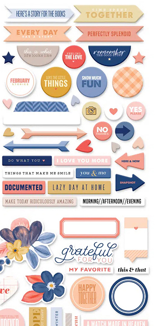
I love kit building and I am on the design team for the Counterfeit Kit Challenge project. We take an inspiration kit each month and proceed to replicate it, or as we say, counterfeit it. But sometimes it can be hard to get started. For example, what if you don’t like the color palette for a kit and you think, “that isn’t for me.” This month’s kit has plenty of pink and that may be off putting for some. Don’t give up; instead, dive deeper.
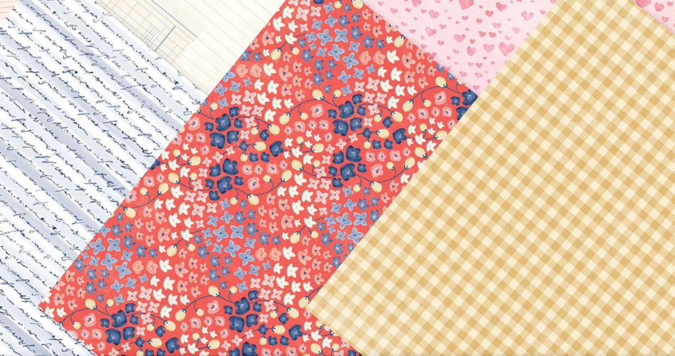
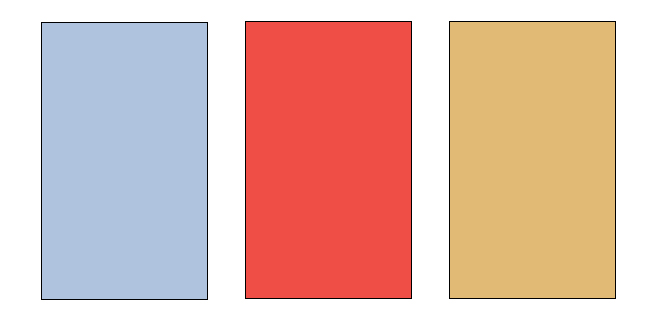
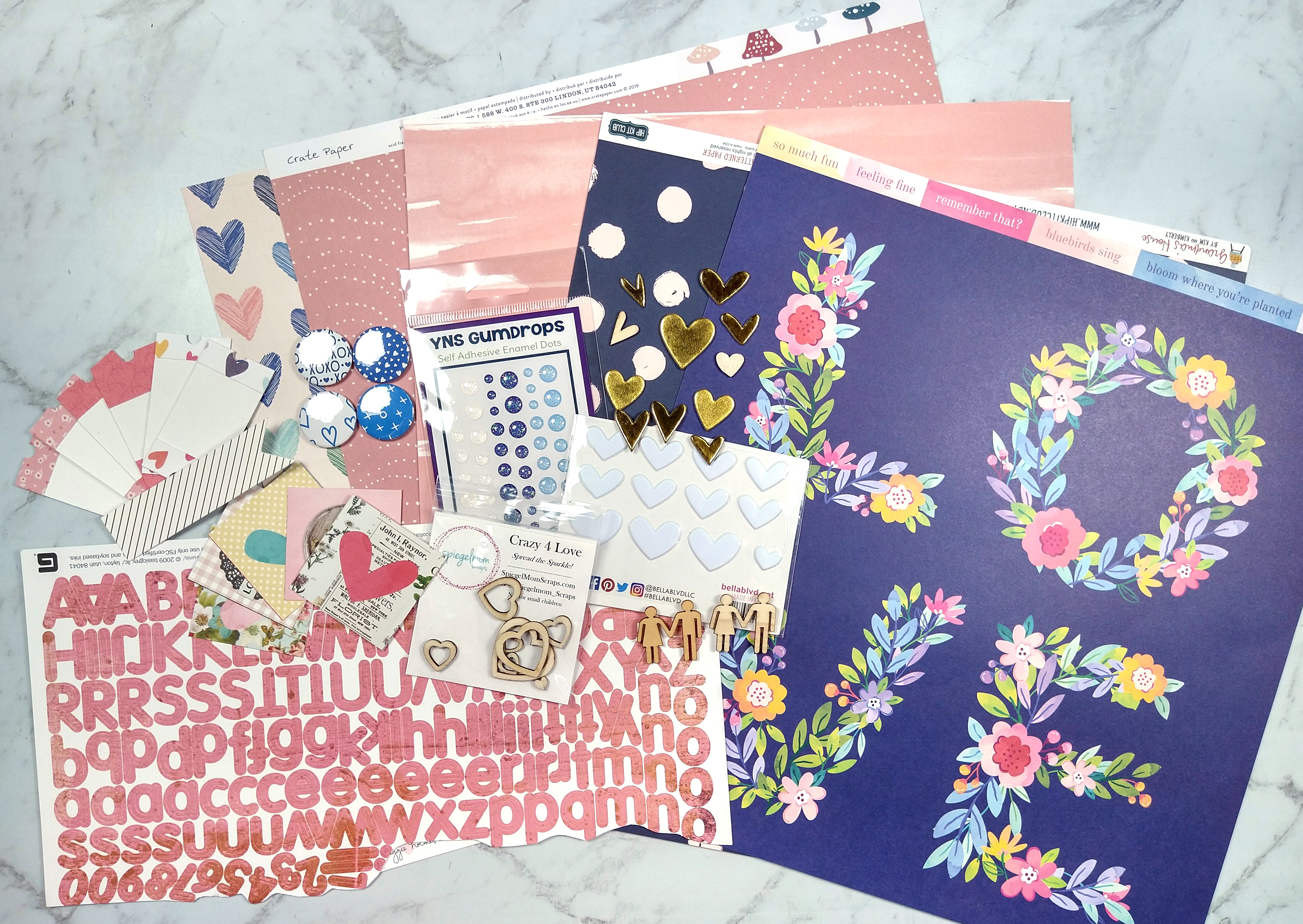
If we take a closer look at the embellishment cluster in the photo and these sheets of pattern paper, we can start to see something besides pink in this kit. We’ve got a coral red, a powder blue and a golden yellow.
So now we have a very different color palette.
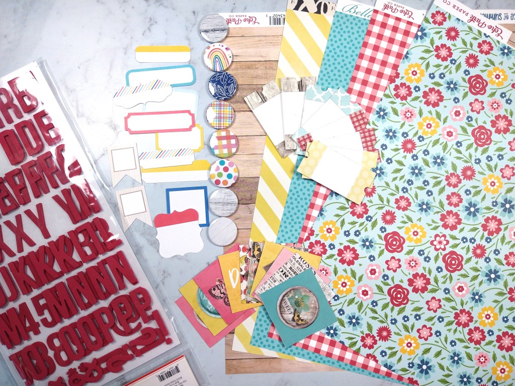
With that in mind I started pulling supplies from my stash. Here is what I ended up with
Admittedly, these colors are bolder than the updated color palette. However, those were the supplies I had in my stash that came close to the new colors, so I’m going to roll with it. That is the flexibility of the CKC group! Make it work for YOU!
Have fun kit building and don’t forget to show off your stuff over on the CKC Facebook group, or tag us on Instagram @counterfeitkitchallenge or use #counterfeitkitchallenge.
I love kit building and I am on the design team for the Counterfeit Kit Challenge project. We take an inspiration kit each month and proceed to replicate it, or as we say, counterfeit it. This is a free, friendly group that helps inspire you to use up supplies you already own. We are not about needing to buy the latest and greatest thing (though we won’t stop you if you enjoy new crafty goodies😉 ).
It is my turn to host a kit for the Counterfeit Kit Challenge team. This is my first time hosting so I’m pretty excited! Check out the inspiration kit I chose for this month. It is the Denim & Blush Modern Memory Keeping Kit from Coca Daisy for Feb 2021. I love this kit for the bold navy and softer blues, pinks and corals. Plus yellow. Don’t forget yellow! It has plenty of embellishments to inspire me and an ever so slight bit of Valentine’s goodness. And since this kit is sold out it gives us the perfect reason to counterfeit it!
As the kit host, I get to choose a guest designer for the month. I’m happy the Gretl Dixon agreed to play along with us this month! You can find her work on her blog. If you read the CKC kit reveal blog post then you can get to know Gretl a little bit by seeing her photo and reading her bio. Do leave her some love to make her feel welcomed!
When I chose this kit I thought I’d build one big kit. But as I was working I realized that this month is a LOAD month (Layout A Day challenge hosted over at ScrapHappy). Since LOAD leads me to tell a myriad of stories, I wanted products that would have different feels to them so things wouldn’t get repetitive. That is when I got the idea to create 5 mini kits! Yes, I could have thrown all this stuff into one giant kit, but by breaking it down this way it will help limit the choices I need to make when creating. Sometimes too many choices is overwhelming. If I make the choices ahead of time, then when I sit down to craft that part is already done!
So take a look at these 4 kits (yes I did say earlier that I have 5, but you’ll have to wait until tomorrow to see the final one, for, um, reasons 😉 ).
You can hear all my thoughts that went into each kit in my video.
I hope you can follow along with the other designers and see how they interpreted their kits.
Have fun kit building and don’t forget to show off your stuff over on the CKC Facebook group or tag us on Instagram @counterfeitkitchallenge or use #counterfeitkitchallenge.
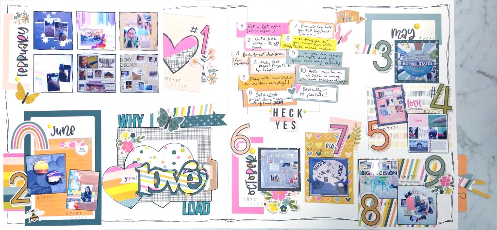
Last time I revealed the SCT Sampler Kit for the month of January. If I haven’t said it enough, I am in LOVE with the kit this month. The dies are to, well, die for. Not to mention the Simple Stories paper collection is super fabulous. So I have another project to share. Well actually, this was my first project, but I needed to hold it up until the DT post over at ScrapHappy went live! 😉
So my photography setup needs some work for doing double page layouts to get equal exposure across the entire image, but other than that I loved putting this project together. And notice that little tag sticking out on the right hand side? That is a pull out interactive element. I got 15 photos on this layout, but I just HAD to have one more photo, so I hid it and made it work!
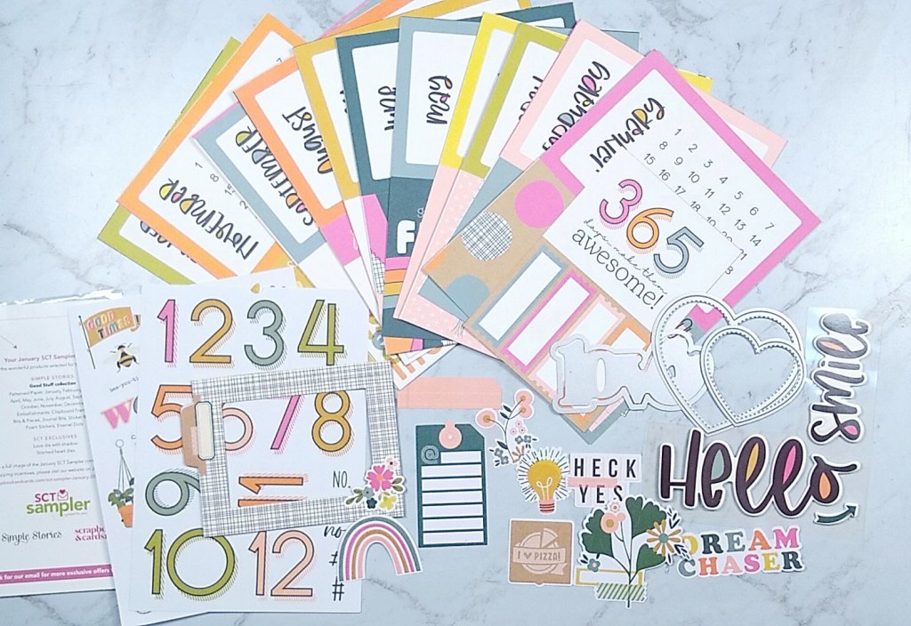
Oh how I love getting crafty surprises in the mail. I’ve subscribed to many scrapbooking kit companies over the years. In the end I usually cancel due to too many leftover supplies and too much ongoing expense. But the SCT kits are different! Since they are a sampler of current scrappy products, you don’t get too much to be used in a month. And the sample size of these kits also makes them affordable. Plus, there is always some reusable item that makes the value top notch—think stamps, storage pockets and this month… dies! Oh my heart did swoon when I opened my pack and found some generous love themed dies in the pack this month. Check it out on the right middle side of the photo.
Oh man I was so inspired by the supplies in this kit. It helps that Simple Stories is my jam for sure. I put the products to use right away. Oh, but I’m not showing you that project today! You’ll have to wait until next week for that. Rude. I know. 😉
Don’t worry, I have another project for you that I was almost as excited about. (Scrapbook layouts are not like children, I DO get to have favorites.)
I like this layout enough to let it be my produced sketch for the month. If you missed my previous post revealing my freebies for this month, be sure to check that out. Or you can download the sketches over on my Sketch Freebies page.
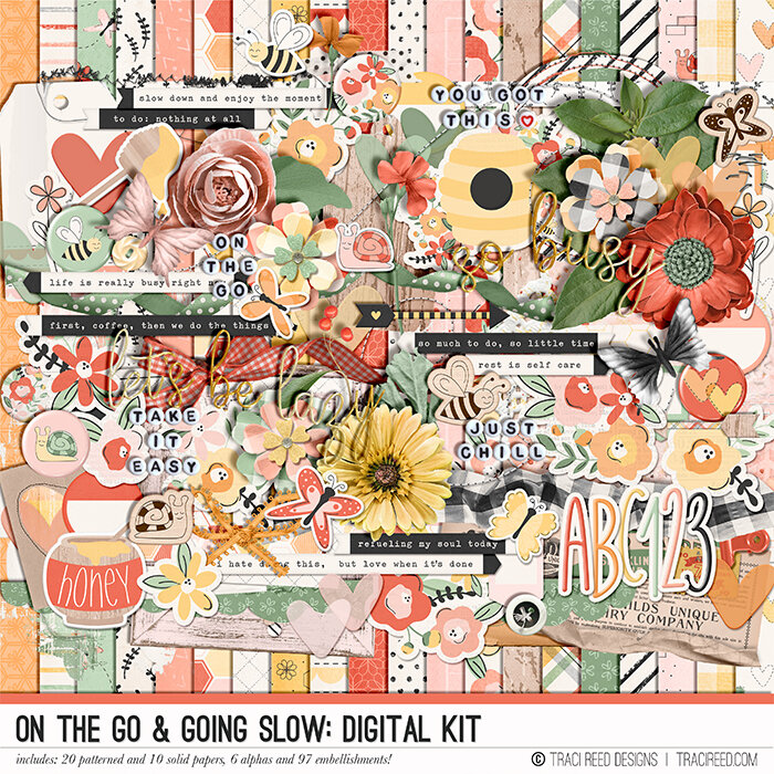
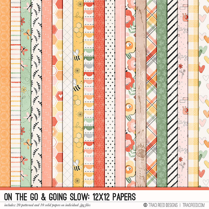
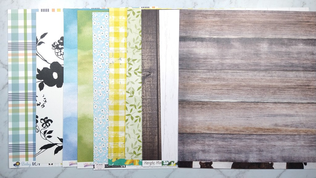
Each month on the 4th, Counterfeit Kit Challenges hosts a product forgery challenge. We select an item from the inspiration kit and create our own version. As a reminder our kit is On the Go and Going Slow by Traci Reed. Now in this version of the kit you can’t easily see the item I want to forge. So let’s take a closer look.
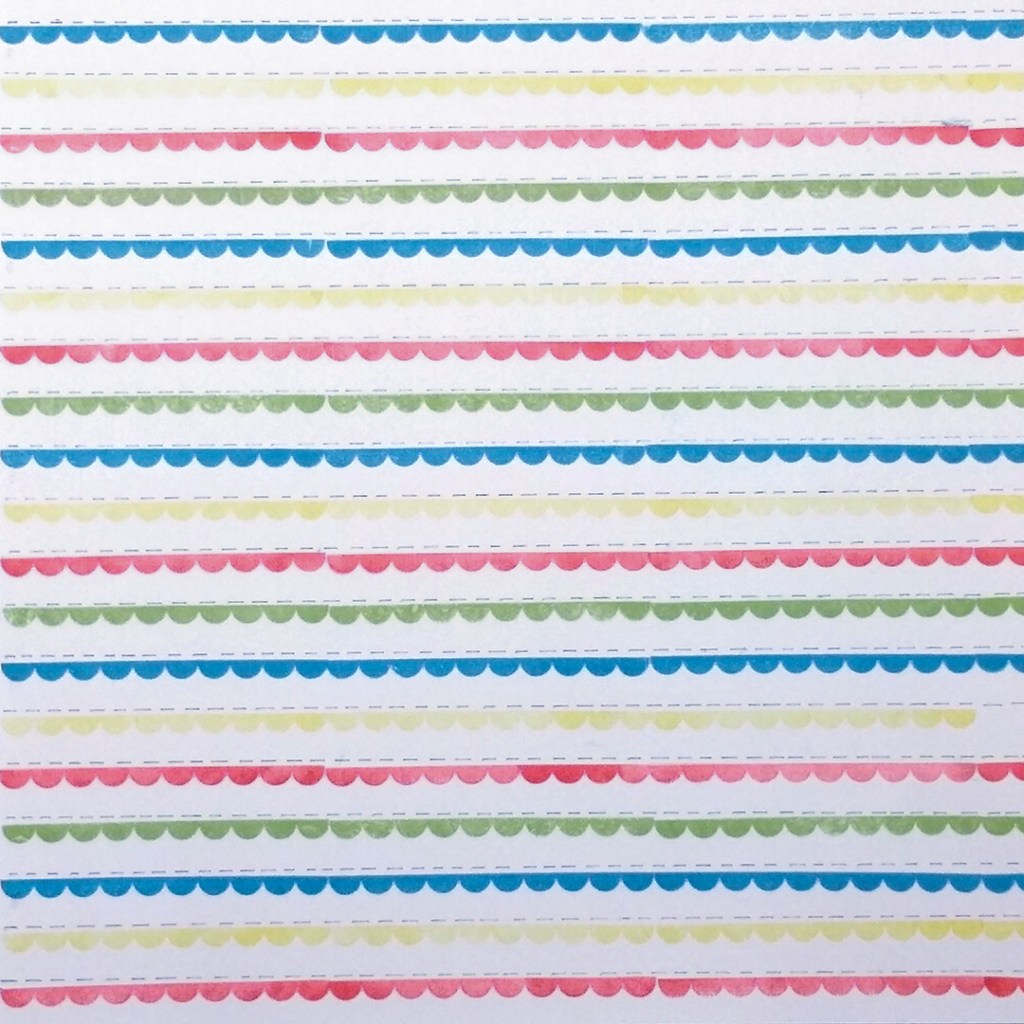
Here are just the pattern papers. The ninth paper from the left is the one I’m looking at. It is the multicolor scallop & dashed lines stripe print.
So I grabbed an old stamp set that has a short scallop border, a ruler, a black pen and some inks and I got to work.
Here was the final result.
I do go over in the video how to make your own scallop stamp if you don’t have a scallop border. So be sure to check out the video for that tip.
I’ll be back on the 12th and again on the 18th with the CKC layout challenges.
After taking some time off in December to reorganize and refresh, I feel a bit rusty to be back on my media game. But the best way to get over that is to just dive right in.
So I’m back with a brand new kit build for the Counterfeit Kit Challenge team. Our Master Forger Cindy brought us this digital kit from Traci Reed as our inspiration this month. The great thing about digi is if you like it, you can easily just buy it! And for me, the extra great thing about Traci Reed is that she includes printable elements for those of us who are hybrid scrappers.
You can see my whole kit build via YouTube as usual or keep reading for the blog version.
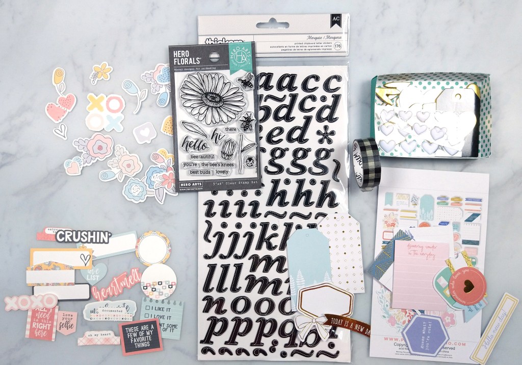
There is a lot going on in that image, but the things that caught my attention first were the pattern papers, and flowers, hearts and bees. So that is the direction I took my kit.
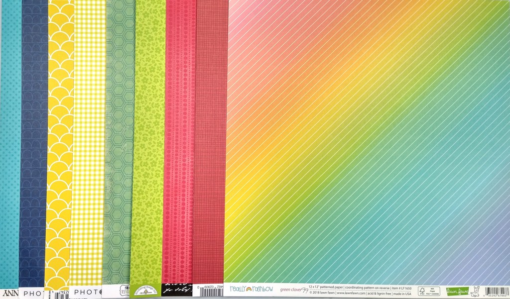
First Traci’s papers…
And my choices…
While not exactly the same I pulled a yellow gingham, some scallop prints, some hexagons, green floral, red pattern and something with colorful stripes. I tend to love Traci’s muted color palettes but my papers weren’t there this month. I wanted to keep pulling papers to help mellow the color scheme but I made myself stop because my kits have been too big lately and I need to calm down a big 😉
On to embellishments… I focused on the flowers, hearts and bees that originally caught my eye. I also used some printable Traci Reed products that I already had on hand from her “The Love List” collection. My embellishments also lead me to adding in pops of black and pops of gold. And that will complete my kit for this time.
I hope you can follow along with the other designers and see how the interpreted their kits.
I’ve been quiet here on the blog for a few weeks. It’s not that I haven’t been crafty, in fact it is because I’ve had too many things on my plate and something had to give somewhere. So let me take a few minutes to give a peek into what has been keeping me busy! I hope some of these projects will bring you a little crafty inspiration in some way.
Finishing C&C Projects
First up is a layout I created as part of the Crop & Create event from early October. I still have more layouts partially done, so I’m just sharing this one for now.
Making thank you cards
Next up, teacher thank you cards. I’m so glad for the teachers at my daughter’s alternative school. In fact, I was asked to teach this year and we decided due to our family needs, that the covid situation would not make it work. So… I am extra thankful for her teachers being able to handle this situation. And the school has done a great job with mitigation, so we are all as safe as we can be while still living a full life! I wanted to let them all know that their work is very much appreciated. I had to make 35 of these beauties! Whew!
Distress Ink Class
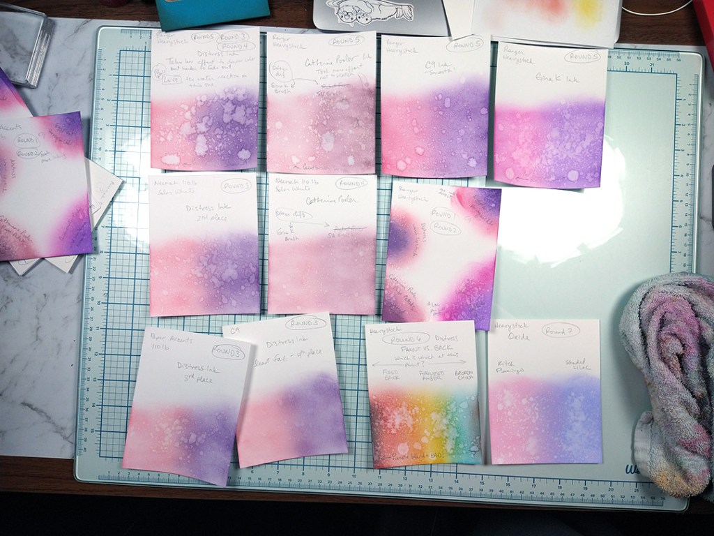
I love learning things as much as I love sharing things. So, I am often busy with classes of various types. This time I signed up for a Distress Ink class offered by Jenn Shurkus. I have used Distress inks for years but I’m fairly inexperienced with the Oxide inks, so I took that class to learn more about those. But I learned more about other things than I expected. Through trial and error I learned which papers work well for these techniques and which don’t. I have to say that Jenn may have convinced me that the Ranger Heavystock paper is the way to go for inky techniques; it had the most saturated color and the best reactivity with added water. I also experimented with various water-based inks and they were all workable but, again, the Distress is the best. I’m still playing, so I may have more to share on this later.
Holding my Heart… watercolor
Watercolor has been a favorite of mine for many, many years. However producing actual art, rather than abstract mixed media, has always been a calling and a challenge. This watercolor advent calendar has been so peaceful, challenging, and joyful that I just had to share. Oh my, is it stretching me in such good ways. Among other things, I realize I am very heavy handed with my paint and I need to back off quite a bit. Yet with all the things I know aren’t right in my paintings, I am so dang thrilled with the things that are right that I I’m just soaking up the beauty that I am really, truly making!! Of course, having a great teacher in Harriet de Winton, who is offering this event, makes a huge difference for success. You can simply join her YouTube channel, or you can buy the printable advent for a small fee over at Etsy and support her as an artist making a living teaching.
Christmas Cards
This is just as super quick, raw video clip of one batch of Christmas cards that I made. Notice the splotchy, mixed media watercolor look? It combines a couple of the above that I mentioned! I had started my cards long ago but didn’t finish enough, so I made these. And I still need a few more for those who live very close by; so I still have time to make more, right??
December CKC kit progress
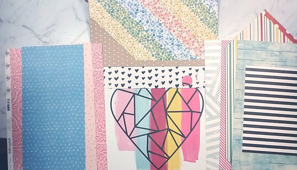
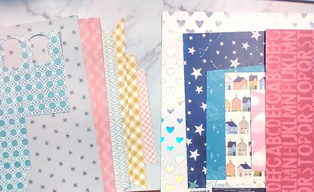
If you read my last post you’ll know that CKC this month is doing a advent calendar style kit build this month. Each day is a small prompt to add an item to a kit. By Christmas you should have a full kit of supplies to play with after the hustle of the holiday is over. My kit is all about putting together an art journal kit to use during 2022 instead of a Christmas related project. Here is what I have in my kit so far…
Photo on the left has:
Central Photo sets mood and color scheme.
Left papers are tone-on-tone prints.
Top papers are small motif prints
Right papers are stripes.
Photo on the right has:
Left papers are geometric in nature.
Right papers are medium motif prints. And that heart print is irridescent, so I’m starting to set a shiny metal-esque mood. (Day 1 asked us to choose a metal along with our color scheme, which I ignored. So now I am finding that direction.)
And that wraps up this update. I’ll be back in a week or two with another update for you. Enjoy your December activities as we head closer to the New Year!
Yep, it is that time again. I’m here with my Counterfeit Kit build for October. Joining us as Guest Designer this time around is Machelle Willing. Let’s give her a big welcome!
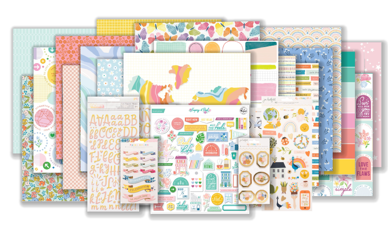
Diving in I expected our inspiration piece to be fall themes, but I was pleasantly surprised that it was more home and connection themed with a color palette right up my alley. This is the May ’21 kit + add-ons by Hip Kit Club. Let’s take a look…
Main Kit
Add-on embellishments
Add-on “color pack”
I ended up ignoring the inspiration kit theme altogether and built my kit around specific designers/companies that caught my attention! Ha! I was inspired by PinkFresh, Jen Hadfield and Paige Evans in the inspiration kit to pull from my own stash of papers from those designers/companies. And along the way Vicki Boutin made an appearance as well. The theme I ended up pulling together became the title of this kit build called Nature Study. You’ll see how it got that name and theme as you follow along here.
First up the video version. Keep reading for the short version…
As I was pulling all manner of anything that caught my attention I realized that I had two different feels going on in my choices, which you may notice above. To get specific, in the photos below you will see that I have a bold and graphic office/school vibe (photo directly below) and then a soft and flowing nature vibe (2nd photo below).
I am perfectly okay with that! This is my kit and I can do what I want. When you build your kit you can do what you want as well! That is the beauty of CKC. I did, however, make some choices that do help tie things together. My “solid” color paper choices are flexible enough that they can work with either vibe. And giving this kit the title Nature Study is a sneaky way to justify my disparate choices! LOL!
For embellishments I pulled some items directly from the kit inspiration and some items from designers, and tried to keep my newly developed theme in mind.
This kit is jam packed with embellishments which I know I will NEVER get to use all of this month. But choices are really nice and I will be doing quite a bit of scrapping this October as I’m playing along with the LayOut A Day challenge (aka LOAD) over at ScrapHappy.org. So we shall see how big of a dent I can make in these supplies.
Don’t forget that this kit reveal is a hop and you can go check out the other Master Forgers to see how their minds work in approaching this inspiration. And if you want to join in and play along, CKC is totally free and welcoming you can follow the blog below and join the Facebook group to share your work.
Hello everyone. I’m here with the Counterfeit Kit Club’s Mini Kit and project for the month of September 2020. You can quickly see my whole process in the video below or keep reading for the text and photo version.
Our inspiration kit (Vivid by {Not} Just for Boys kit club) shown below had a strong fall theme vibe.
When I was pondering this project I was in the process of cleaning my scrap space. While doing that I came across this bin that contained the extra photos, paper scraps and previous fall themed layout I had created a couple of month back.
Admittedly this gave me a huge head start on creating a page kit for this month’s mini. If you think I cheated, I promise all you would need to do to get to this same point is choose a base pattern paper or cardstock, plus 3-4 pattern paper scraps in various sizes. Then grab 6-10 embellishment pieces in various sizes to support your theme and you are done. Simple as that. Really.
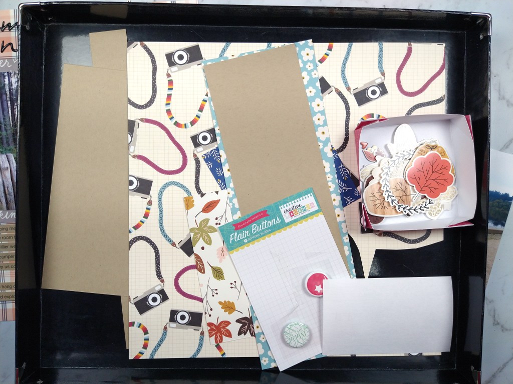
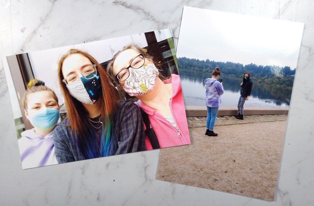
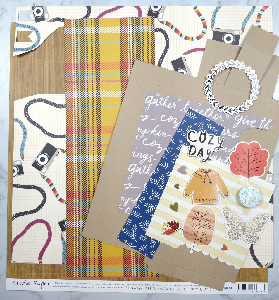
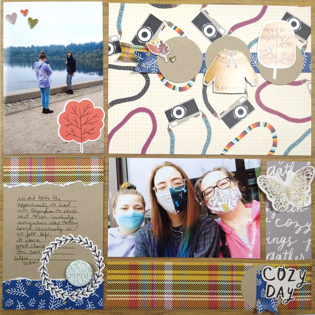
Here I chose a base woodgrain paper, 5 pattern paper scraps, 1 cardstock and literally 12 individual embellishment pieces. The woodgrain, plaid and use of blue comes from our inspiration piece. The other imagery I chose to support my page theme (cameras + together/cozy)
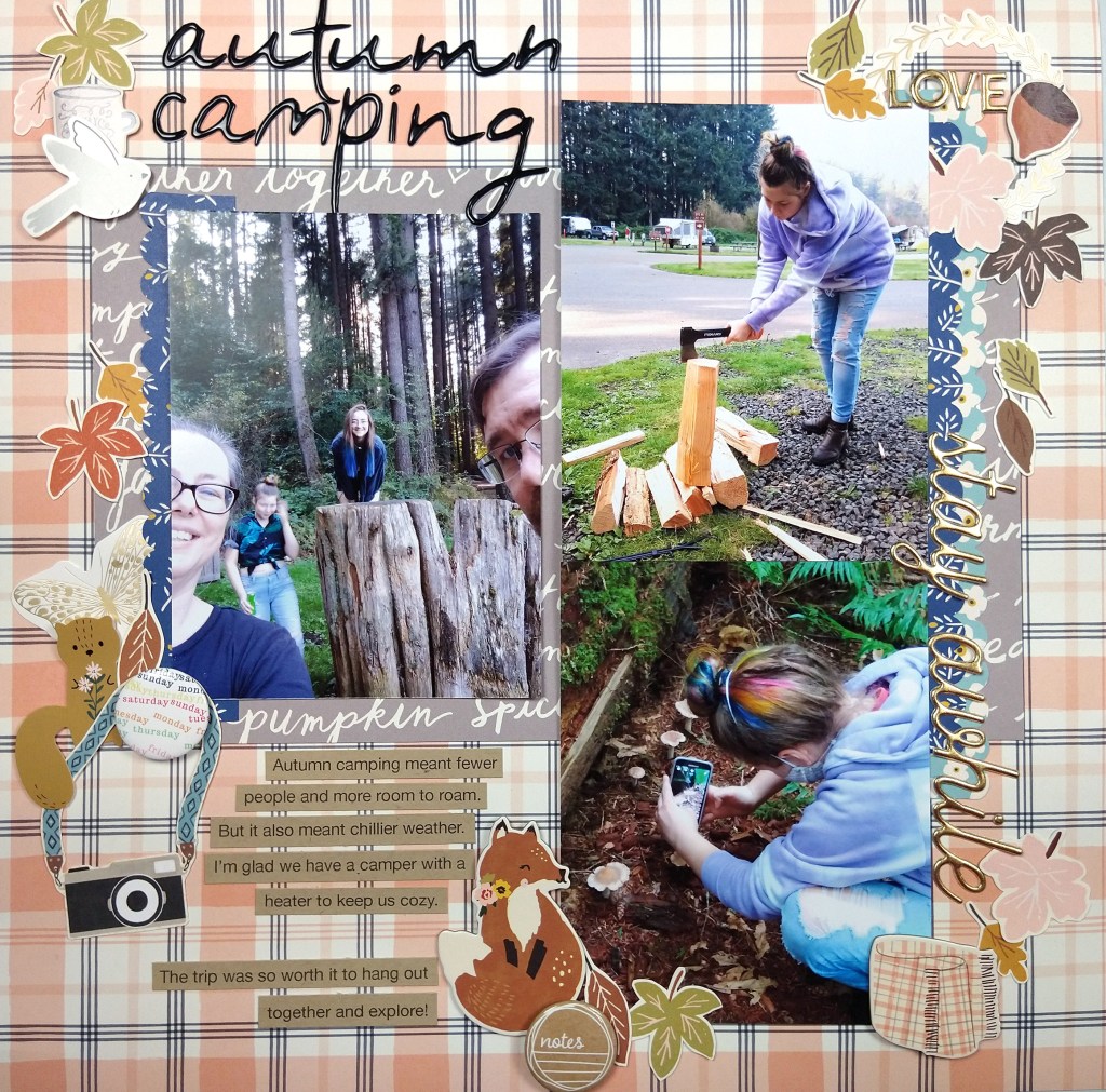
Once I had a narrow palette of supplies to work with, my layout came together quickly. I think about this style of layout as a “pocket page” layout without the actual pockets. (You could also just call it a grid layout). I love the idea of pocket pages for ease but I feel too constrained by the pocket numbers and orientations. So I started my layout with the base page + photos. I trimmed my photos, and in fact all the pocket elements, down by 1/4″ in both height and width to give that gap that pockets have.
The open areas around the photos now become other “pockets.” The top right was very large and could have been broken down into several pockets, but I left it large for more visual impact to those cameras since this layout is about selfies. The journal pocket on the bottom left is 6×4″ (or rather 5.75×3.75″ once trimmed down.) The gray strip started at 2×4″ before trimming and the lower plaid is 2×8″ before trimming.
Sprucing up each pocket with limited embellishments helps the whole page feel cohesive. I also repeat elements, such as circles, blue, and plaid, in a visual triangle to pull everything together. Approaching a layout this way is super straightforward. It gives you the ease of pocket pages without the constraints. And with this design you could include way more photos than I did! Just so much flexibility here.
I hope you were inspired by how easy it can be to put together a quick page kit as well as a quick layout!
Welcome to September 2021 everyone. For me this year has flown by despite all the continuing troubles with covid. I thought for sure this would be another year that crawled by. Yet here we are. I hope you have all stayed safe and healthy. I send you extra wishes for continued health as we head back indoors with the chill of fall weather looming.
Lets get on to crafting, shall we? This month Master Forger Tina is our kit host and she has invited Tori Gaines as our guest designer!
Tina has offered up this kit called Vivid from the {Not} Just for Boys kit club from September 2020 as our inspiration this month. Of course it is sold out at this point so counterfeiting this kit is a great option to get the vibe you are going for.
This kit includes
“Vivid” Paper:
1 piece 12×12 paper- Amy Tan-Late Afternoon “Make a Wish”
1 Pack of NJFB Exclusive Acrylic Embellishments and 3 Mini Tassels
24 “Vivid” Textured Buttons
1 “Tree Slice” cardstock cut by Sophie Gallo
For the whole process of my kit build you can check out the video I made for this month.
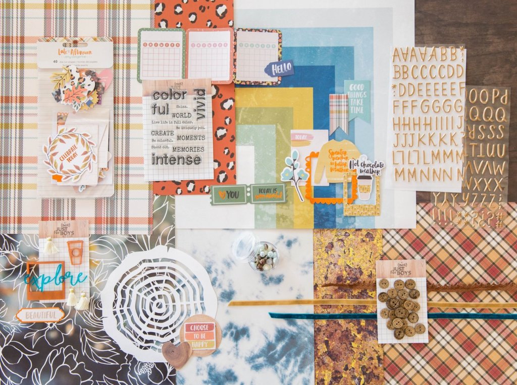
The first thing I noticed about the kit is the warm oranges and browns of the classic fall season imagery. Since these are not my favorite colors and I am just plain not ready for fall, I looked deeper at the kit for inspiration. The Heidi Swapp blue and yellow stripe/geometric paper caught my attention next. I know I have this paper in my stash… well at least I thought I did. When building my kit I just couldn’t find it. (I may have tucked it away in another project and since forgotten which project and where!) Despite not being able to find that paper I let the colors lead the way for me. And then I followed this inspiration kit’s path in terms of pattern. I found some plaids/checks, a bold floral, woodgrain and some watercolor textures. I then added a couple of supporting patterns to round out the choices.
Moving on to embellishments I was inspired by the leafy die cuts, ribbon texture, wood texture buttons, and the log cut file. I decided to pull wood and cork elements and add in plenty of floral die cuts. It worked out that some of my leafy ephemera also had gold, which was included in the alpha from the inspiration kit. I also found some floral acetate that can take the place of the acrylics in the inspiration kit. Toss in a few natural fibers and some alphas and that topped off my kit.
With this lighter, brighter take on this inspiration that clings to the remnants of summer, I’m calling this kit Last Hurrah.
Be sure to check out all the fun over at the Counterfeit Kit Club blog for challenges and inspiration to build and use your kit. Don’t forget to see the other design team members’ takes on this months inspiration. Be sure to leave extra love for Tori for being our guest designer this time around.