Valentine’s multiples

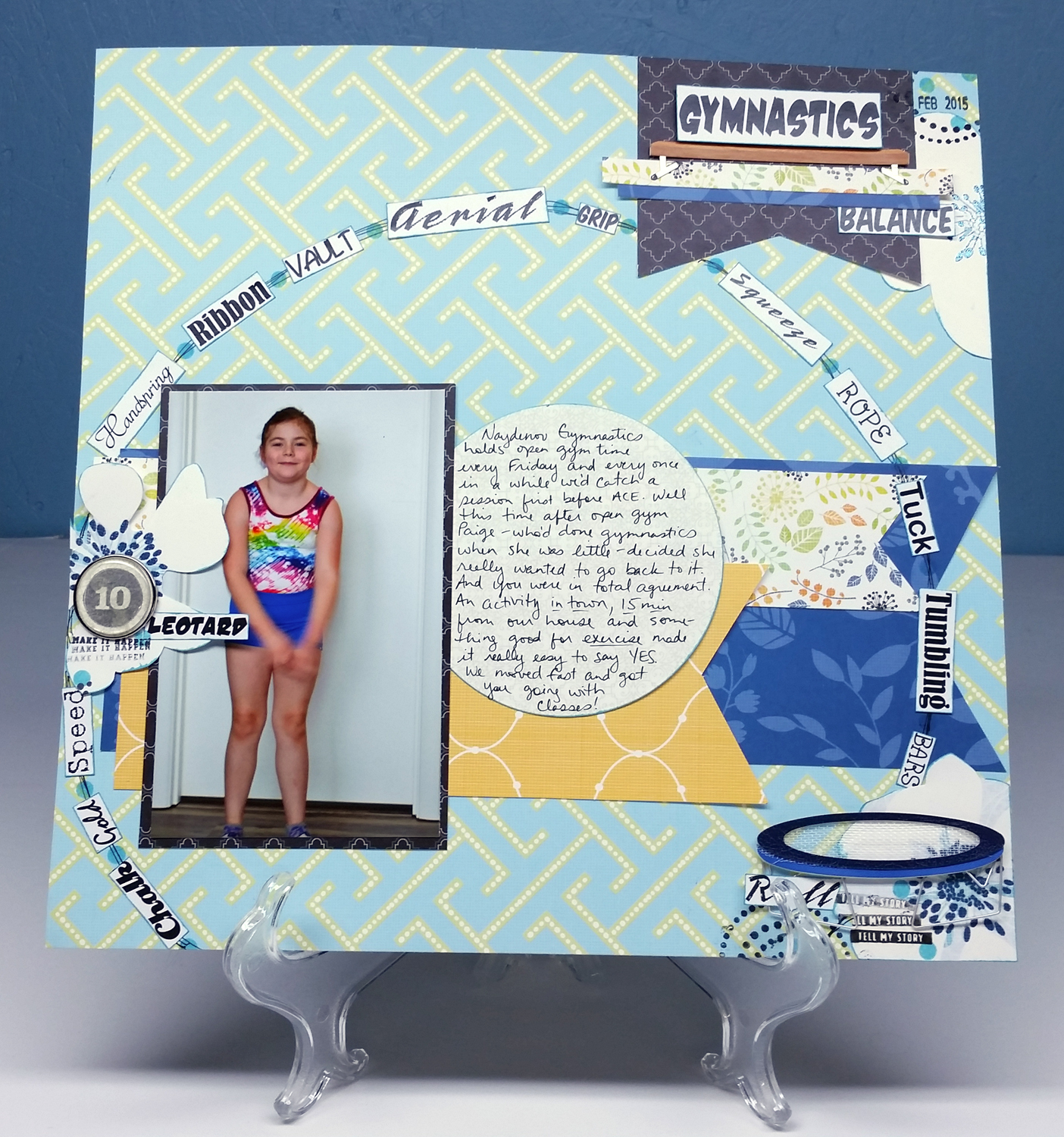
I teach a card making class for kids. We are having a Valentine’s Day party this week so they can exchange cards.  I decided to also give each student a Valentine from me. However, I didn’t get to work on them until the last minute since I wasn’t feeling well this week. I’m not entirely satisfied with the design or execution, but my 9 year old declared them “super cute”. The thought is what counts anyway, right? So the moral of today’s post is: just do it.

2016-02-10 21.09.51


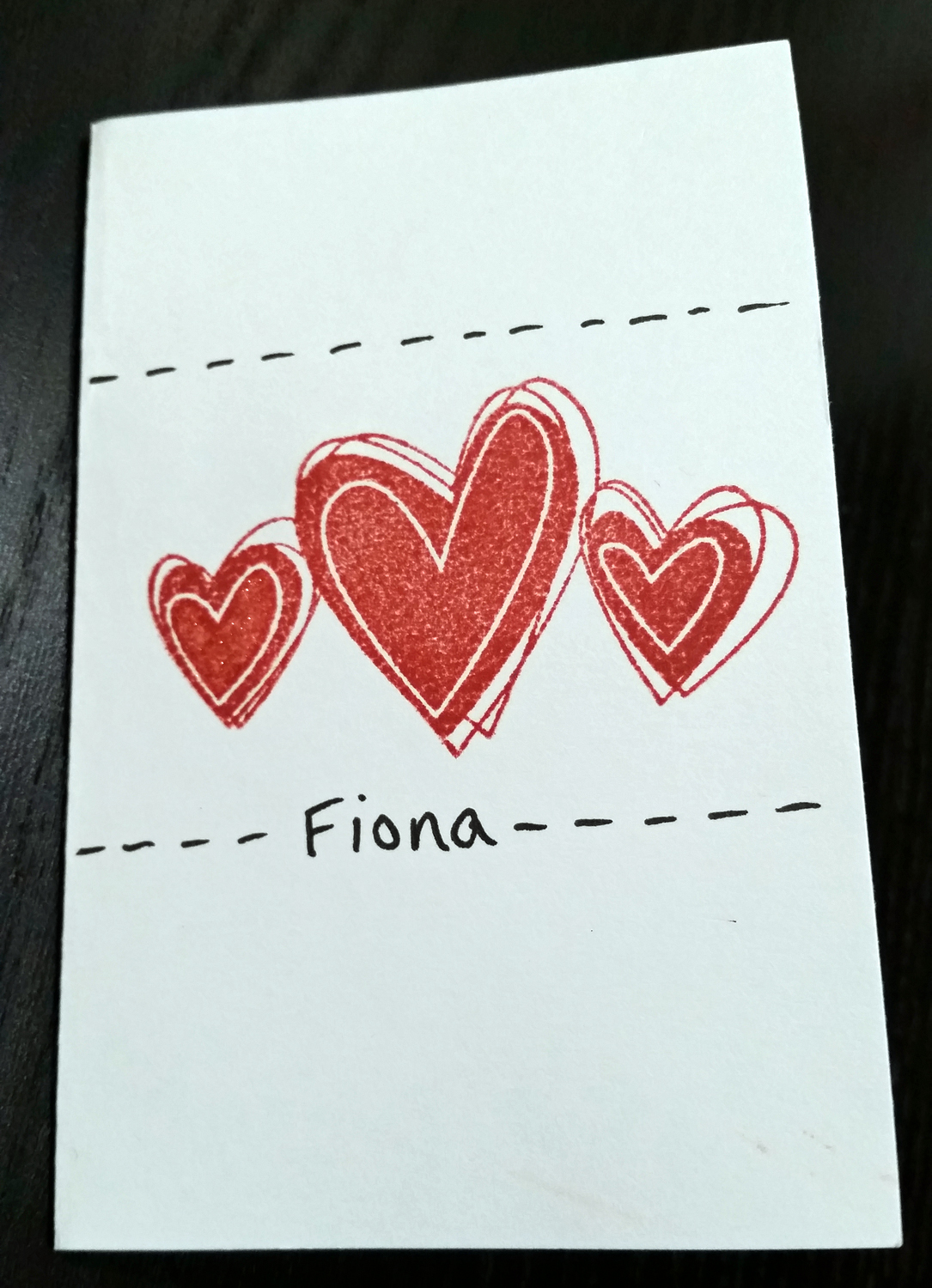
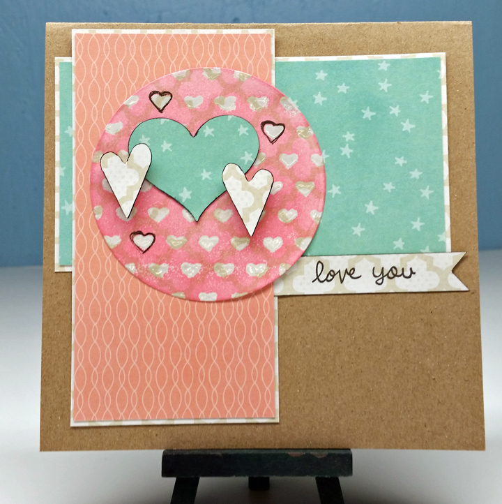
These cards measure 2.75×4.25 (I folded a card front size in half to make small Valentine’s).

2016-02-10 21.09.59


I added a little sparkle to one of the hearts with a Wink of Stella pen. Hard to show up in this photo. I only did one heart to mimic what is waiting inside…

2016-02-10 21.10.09

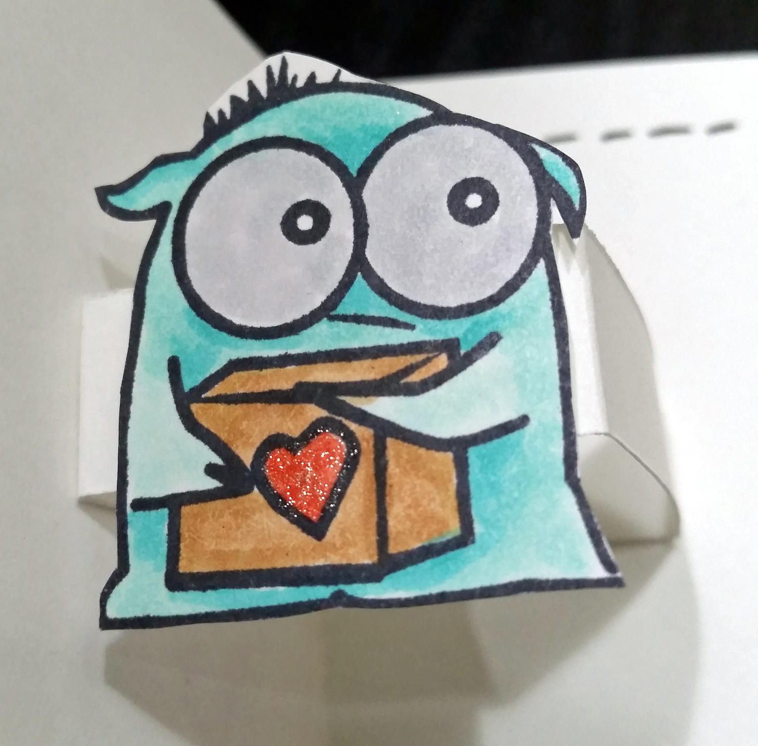
…this super cutie little monster (from the Monster Hugs stamp set from Simon Says Stamp). I don’t have the die set for this stamp so I just fussy cut this little guy out. The nice thick simple stamp outline made it easy. Adding the little sparkle to the heart made it just a little more special.

2016-02-10 21.09.14

I attached all these little guys on a strip of cardstock mounted to pop up this guy when the card is opened. I stamped the “Monster Hugs” sentiment and added some more sparkle to the words. The scribble hearts on the outside aren’t a design match to the simple line-drawn monster. This is the design choice I said I wasn’t satisfied with in the beginning. But adding the faux stitching inside and out helped pull things together just a little bit.

Hope you all have a lovely Valentine’s day.

DCWV Feb challenge

After the busy holiday and CHA season, DCWV is back with their monthly challenges. There is the usual layout and card sketches to give your crafting a design base. Check these sketches out.

Feb. Layout Sketch
Feb card sketch

And here is my take on the challenge.

2016-02-03 22.05.13

I used the DCWV Blue Citrus stack, plus some gymnastics paper and embellishments I’ve been hanging on to for years. My older two kids took gymnastics when they were younger and I never scrapped any of that adventure. Now that my middle & youngest are (back) into gymnastics, I can pull that product back out!

My least favorite paper in the Blue Citrus stack was that geometric paper I used for the background. I thought it an odd addition to such a floral driven collection. But I think it worked perfect for a page. The hard geometric lines remind me of the  structure of the gym equipment, especially the balance beams. The florals and curves soften out the layout with the idea of grace and music that gymnastics incorporates.

And now, I have one tip for you on this layout. One of the gym embellishments I pulled out was this “Perfect 10” brad.

2016-02-03 20.10.32

But the color and distressed look was too harsh for this layout. So I took the idea, and parts of the embellishment, and altered it to fit my needs. I pulled off the epoxy top layer & sticker. I punched a circle from the same paper I used for my journaling and stamped a “10” on it in a lighter ink. I added this back onto the brad and found in my stash an epoxy circle that just fit over to make the brad look almost exactly as it was to begin with. It just has a new toned down color that fits a bit better.

2016-02-03 21.48.23


And now on to the card…

heart card small

I used the Stencil DIY stack for this one. Even the card base is kraft paper from the stack, cut to create a large 6×6 card. To create the circle, I heat embossed the little hearts over a white pattern paper (using the heart stencil and clear embossing powder). I then inked over that with pink ink. You can still see the pattern even under the ink. I then used a pen to outline a few hearts to add extra layers to this simple card. It is a nice effect. Add a few more hearts and it is done.

Heart Challenge

Shimelle has a new weekly challenge up… use hearts. When I sat down to scrapbook tonight I didn’t intend to work on this challenge but them two things happened. 1) There were a pile of hearts on my desk from a previous project and 2) The papers I pulled for this page happened to have a small pink heart print on the B side. Guess hearts is where I needed to go!

2016-02-09 20.55.19


(Just FYI I blanked out faces for privacy.)

I didn’t have any plans for this page in mind when I started. I just had my photos printed in 4 2×3 prints and one 2×3 plus a border print. So those sizes lead to the page design. I knew the focal photo with the border needed to be up higher on the page near the title and the other photos would be in a block to continue the story. The focal photo placement made for a good place to add a large vertical block and it would serve as my journaling space also.

This brought the hearts into play. One of my go-to journaling tips is to number each photo and then number my journaling to match each photo. What better way to number my prints than with popped up hearts? Plus the Shimelle roller date stamp has little hearts and numbers that I used to print on the journaling “tabs”.

2016-02-09 21.32.34


The heart theme led to another benefit to my page. It helped me with my title. This page is just different things that my daughter did for the month of March 2015. And what “love”ly little things they were. See what a did there, hearts, love. Get it? Ha!

2016-02-09 21.32.46

I filled in some empty space with more hearts and some stickers and called it done.

This lead to part two of scrapping tonight. I’ve been on a mission to get a bunch of pages done so I can get “caught up”. (Yes, I still have the mind set, but I’m happy with it, so don’t worry). In order to get things done I need to work fast and work simple. So for this second page I used many of the design elements from the first page to just make life simple. I kept the small block of photos, the large vertical strip and the numbering of the photos. Only this time the numbering is a sequence of events. See how that numbering could work in more than one way? I love it.

2016-02-09 20.55.51

I used up leftover papers from what I pulled for the first page. Made the page all about the story. I even needed more space to add more story. So I just added some note sheets that came with a Shimelle roller stamp to finish my journaling. Throw on some of my favorite embellishments, wood veneer and cork shapes, and called it done.

Hope you can use the heart challenge and also use your own design to keep going to make more pages.

Adult Ballet

I got involved in an adult beginning ballet class through a friend. I do like to dance but ballet was never my thing. I’m not a classical music lover, I’m not dainty and I’m not elegant. Dancing isn’t something I’m good at in general so I usually keep it at home. But the chance to hang with a friend, get some exercise & toning and try something new was interesting so I gave it a try. And liked it enough to stay for a year and a half. Now that class has come to an end due to scheduling issues I’m ready to move on to other things but I’m very glad I gave ballet a go.

When Shimelle posted a “scrapbook a selfie” challenge over on her blog, I knew I had the perfect story to tell. This wasn’t a typical selfie. Instead I propped up my smart phone in a pile of laundry in my bedroom and posed in front of the closet doors. Took a few tries but I got a photo I was satisfied with in the end. Converting it to black and white made it more elegant!

2016-02-03 23.05.21

I used mostly Shimelle True Stories collection products. I didn’t have  plan for this page at all besides the 6×8 size to fit in my personal album. Then I just started grabbing product that I liked. Having a black and white photo meant that I didn’t have to worry about colors clashing and I just let the collection do the coordination for me. With this just grab-and-go design, my elements turned out to be quite large on this size page and I was left with lack of  journaling space, something I usually budget for ahead of time. I looked at the white space in my photo and debated if that was the best place for journaling. But in the end I just did it because as the saying goes, “done is better than perfect.” I love how I found little phrases in this collection that supported my story so well, especially that “give it a whirl” sticker.

Happy to have this page ready for my album. I suggest if you want to tell a story, print a black and white photo and just grab a paper collection and GO. Don’t think, just go. It is freeing and fun. And you get things done.

Color “wheel”

I’m back with another day of Watercolor Intermediate techniques for card makers class offered by Online Card Classes. The pre-class assignments are all geared to get to know your watercolor mediums. I’ve decided to focus on tube paints, just because it makes me feel more like an artist ;). But this could work for markers, watercolor pencils, ink pads and other water soluble mediums.

Last time I showed you color swatches. This time I am using just the primary colors (all I own of a “pro” quality paint) to create color wheels and what is called a glazing chart (a new concept for me!). I’ve used Winsor & Newton Professional line of paints. I have a set of “cheap” paints but bought primaries of these professional paints just to see what the difference is. All the samples in this post are used just with these paints.

wnpaint

Sorry about photo quality but I’ve decided that documenting the process is more important than perfection of presentation! And now you can see what I’ve managed to do with them.

colorwheel

Here is my color wheel using Strathmore paper (left) and Arches (right). I like how the paint floats on the Strathmore but once it dries, I’m not happy with the blotchy results. The Arches just sucks up water so I feel the need to use less pigment in order to save money. But perhaps creating art is not about saving money. Hmm.

Well, the next couple of pictures shows the difference between my pigment use. Both are on Arches paper. I’ve decided to save the Strathmore for simple projects only. The first is the heavy pigment, which felt “right” when I was mixing but in the end came out way darker than what I really wanted. The second photo used a more dilute solution. Honestly it seemed so watery when I was mixing it. But when it dried, the results were soft and lovely. I guess less really is more.

glazing1

glazing2

So if you are experimenting with watercolors, really do try different papers and different concentrations of color to see what is good for you.

Watercolor Class

I will be starting the Intermediate Watercolor class for card makers over at Online Card Classes here in a few days. As part of that class I have purchased some new papers, a few new paints and have been experimenting. So far the type of paper has made a huge impact on my results. I have a 12 tube set of “cheap” watercolors and 3 primary colors in a professional grade watercolor. I did some color swatching and the paper seemed to matter more than the paint at this point.

h20papers


Here I have 3 papers. The bottom being Arches hot press, which I haven’t played with yet. The middle is Strathmore 300 series cold press (a student grade paper) and the topmost is Arches cold press 140lb. The color of the papers are different as you can see. But what you can’t see is that the textures are quite different as well. The Arches has a finer tooth, with almost a sandpapery feel. I honestly don’t like the way it feels. But as you can see from the color swatches in the next photo, the paper behaves how you would expect a watercolor paper to behave. The Strathmore paper ended up very blotchy for nearly all of my color swatches. I just showed a few of the worst samples below.

colorswatches


In each of the samples the Strathmore is on the right and the Arches on the left. Notice how solid and smooth the color is on the Arches and how blotchy it is on the Strathmore. I’ve heard the term granulating in the watercolor world recently and I thought this splotchiness was what they meant. Now I know it is the paper that is doing that and not the paint! (All of these colors are from my cheap set of paints.)

I think why this is happening is that the Strathmore is a less absorbent paper. The water would float on top of the paper and swirl around as I was using it. The Arches just sucks water and color into the paper. It was a little disconcerting since I was used the the Strathmore and the very fluidness that I’ve come to associate with watercoloring. The Arches, I had to mix up large pools of color and keep reloading my brush to get good coverage. I feel like I’m using way more paint on the Arches, which means more money. But for prettier results, I guess that is the price you pay!

I’ll be back tomorrow with some more progress on my watercolor explorations, so stay tuned.

CHA 2016 Projects for DCWV

I am so excited to say that I was invited to submit projects to DCWV for their CHA 2016 booth! I ended up submitting 5 projects. I was provided with the products to use for their “existing product” displays. While I was was compensated for these projects, I happily use their products anyway and was glad to showcase what I could do with some of their products I haven’t used before.

toothfairy

This was probably my favorite. I used the DCWV Insta Photo Fun paper stacks (4×4 in size!). I had a white + foil stack and a kraft + white-print stack. Using the back side of the kraft paper gave me some rest from all the pattern. I used my punches for the circles and fairy wings and my silhouette for the title and fairy dress. I also used some ink to change the white paper into colors that worked for the layout. The foil resists the ink, so you get lovely colorful foiled papers.  Add in some some silver thread to the fairy’s dress and that finishes it off.

5x5card

The second project used the DCWV 5×5 notecards. Just using punches and layering, I used DCWV cork and foiled vellum 6x6x stacks to bring a focal to the card. I punched the card edge and added more layering with the vellum. This allowed the sentiment on the inside to peek out for added dimension. Add in some twine, gold thread and Blue Moon seed beads and the card is nicely finished.

burlapcard

As soon as I was asked to use the pre-made burlap cards, I knew I wanted to add in stitching! And what better way to accent stitching than to add in some Blue Moon seed beads. I had some DCWV white-core cardstock out on my desk from another project, so I sanded it down and ran it through the printer. I sanded it both to get some texture of the white core peeking through and to get the ink to adhere to the cardstock! Cut out and back that sentiment tag with a little vellum. Punch some holes in the layered tag and tie it with a bow to the project using the loose thread ends from the stitching. Pretty.

yourockcard yourockcloseup

I used the DCWV 5×5 kraft pre-made cards, vellum, cork and printed kraft, and stencil stacks to pull this card together. While it used a number of differing stacks, you can see how all these products work nicely together. I used white acrylic paint for stenciling the stars and hand lettering the sentiment. I used ink to change the kraft color of the printed stack to create a “washi” tape look. A bit of gold thread and gold ink spray was used for a sparkly pizzaz of a finish.

flowercloseupflowerframe

And the final project gave the most oomph out of just cardstock! The frame I painted with white acrylic paint giving it a white wash then a layer of stenciling using the DCWV stencil stack. Punches and the Silhouette, gave me many lovely flower petals. Then it was just layering, layering, layering. A strong glue (Ranger matte multi medium) made the flowers sturdy. Add a little bling with the Wink of Stella pen and some Ranger Stickles gave a nice final touch.

Watercolor backgrounds

Also known as using leftover paint.

I add color mediums to waterproof surfaces often to allow me to pick up the color easily with paintbrushes. There is always color leftover when I’m done using it. So I spray extra water over the color and basically mop it up with a scrap of watercolor paper. I learned this a while ago from someone. And I’m glad I did. The results are always different and unique. I save these pieces to create other items out of, like punched or die-cut shapes. Often my scraps are small. But this time I found a couple of pieces large enough to be card front layers for some birthday party invitations I made. They gave a perfect dreamy background to go with the floating balloon card.

h2oinvitation


Make sure you use every last bit of color


Painting Christmas gift

Watercolor, watercolor, watercolor. I think I am obsessed.

My husband likes lighthouses, so instead of buying him a Christmas gift, I made one instead. I wanted to play with a freehand drawing, which quite honestly scares me. I don’t consider myself a “fine” artist, meaning I can’t do representational drawing very well. I’ve done a little practicing here and there with different things but I still have a long way to go. And you know what. That is okay. Everyone starts somewhere. Here I am at 41 starting something new. You can too!

lighthouse

I used a pencil to sketch out the drawing first. Erasers are your friend, let me tell you. I used markers to go over the pencil once I was happy with the composition. Double ended markers made this job easier. I used the broad tip for larger areas like the rocks, and the fine tip for details like the roof tiles, railing and grass. The fine tip left enough detail to give the hint of structure without leaving harsh lines. Once the color is in place, use a wet brush to pull and move the color. Don’t work two different colors near each other while they are still wet as this will cause colors to bleed into each other. Luckily, this simple marker technique drys fairly quickly and you can just move around the piece working here and there.

I wasn’t sure how to achieve a nighttime sky for the lighthouse so I skipped it and went with daytime. That presented another challenge. Blue for the ocean and blue for the sky. I just played with the markers I had and made a decision. I was happy with the cool blue ocean water (I did touch in a hint of violet also for some depth on the crests of the waves). The warmer more vibrant blue of the sky I think is too much of a mismatch in tone. But it is what it is and I learned plenty.

If you want to learn more about watercoloring (aimed at card makers) I highly recommend the Online Card Classes website. They have 2 self-paced workshops (for card makers and exploring mediums) on their site as well as an upcoming intermediate watercoloring class beginning at the end of January. I’ve taken the first two and will be in class for the third. Maybe I will see you there.

Happy 2016

2016

I hope you all had safe & happy holidays. I wish you many good things as we move into 2016. I started off my year with watercoloring of course. I realized after I photographed this painting I hadn’t actually finished it. I intend to add spatters onto it, because everything is better with spatters!

Here is a little closeup of the work.

2016side

In real life it is shiny and sparkly from the foiled DCWV paper and the Prima gold mist I used. A festive start to the year.

Every year I start by printing out my letter size calendar pages. I journal on these throughout the year. One for each kid plus one for the family. Each month I create a layout for each kid’s scrapbook and tuck the month’s journaling behind the page. Here is a peek at the binder I use to store all these pages for the year. The binder sits by my bed so I can make some notes before I go to be.

calendarbook

calendarbook2


Maybe this system will work for you too. I will post .pdf files soon for you if you’d like to print them to use.