
I’m back with another day of Watercolor Intermediate techniques for card makers class offered by Online Card Classes. The pre-class assignments are all geared to get to know your watercolor mediums. I’ve decided to focus on tube paints, just because it makes me feel more like an artist ;). But this could work for markers, watercolor pencils, ink pads and other water soluble mediums.
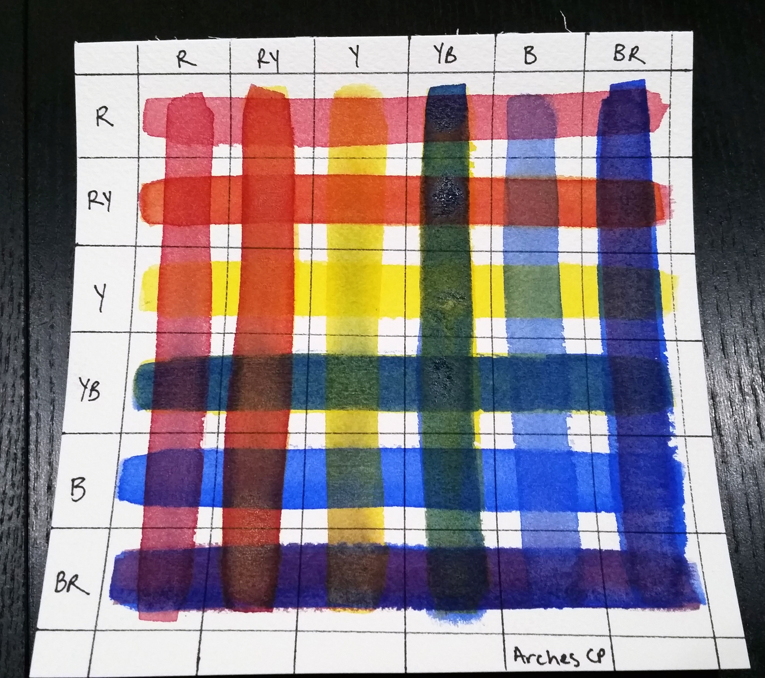
Last time I showed you color swatches. This time I am using just the primary colors (all I own of a “pro” quality paint) to create color wheels and what is called a glazing chart (a new concept for me!). I’ve used Winsor & Newton Professional line of paints. I have a set of “cheap” paints but bought primaries of these professional paints just to see what the difference is. All the samples in this post are used just with these paints.

Sorry about photo quality but I’ve decided that documenting the process is more important than perfection of presentation! And now you can see what I’ve managed to do with them.

Here is my color wheel using Strathmore paper (left) and Arches (right). I like how the paint floats on the Strathmore but once it dries, I’m not happy with the blotchy results. The Arches just sucks up water so I feel the need to use less pigment in order to save money. But perhaps creating art is not about saving money. Hmm.
Well, the next couple of pictures shows the difference between my pigment use. Both are on Arches paper. I’ve decided to save the Strathmore for simple projects only. The first is the heavy pigment, which felt “right” when I was mixing but in the end came out way darker than what I really wanted. The second photo used a more dilute solution. Honestly it seemed so watery when I was mixing it. But when it dried, the results were soft and lovely. I guess less really is more.

So if you are experimenting with watercolors, really do try different papers and different concentrations of color to see what is good for you.
