It is forgery time over at CKC. That means we are inspired by crafty items that already exist and we take our turn at recreating them. First let’s have a reminder of what the kit is that we are drawing inspiration from.
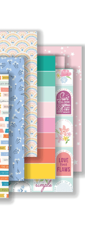
I was drawn to these two papers from the inspiration kit. The First one is all about the butterflies for me and the second is that striped paper.
My versions were much softer of a color palette, but that fit better with the mood I was going for.
I didn’t completely recreate the inspiration, but rather, approximated it. And that is my typical way of going about things. So if you like something you see, but wish it were a different color, maybe you’ll think of recreating it to fit for you.
Yep, it is that time again. I’m here with my Counterfeit Kit build for October. Joining us as Guest Designer this time around is Machelle Willing. Let’s give her a big welcome!
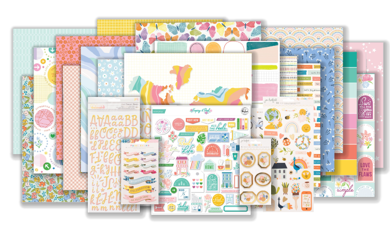
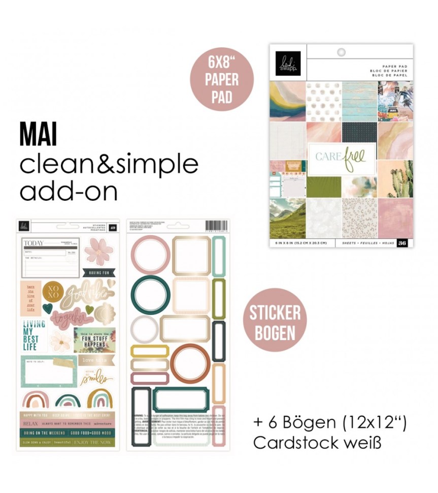
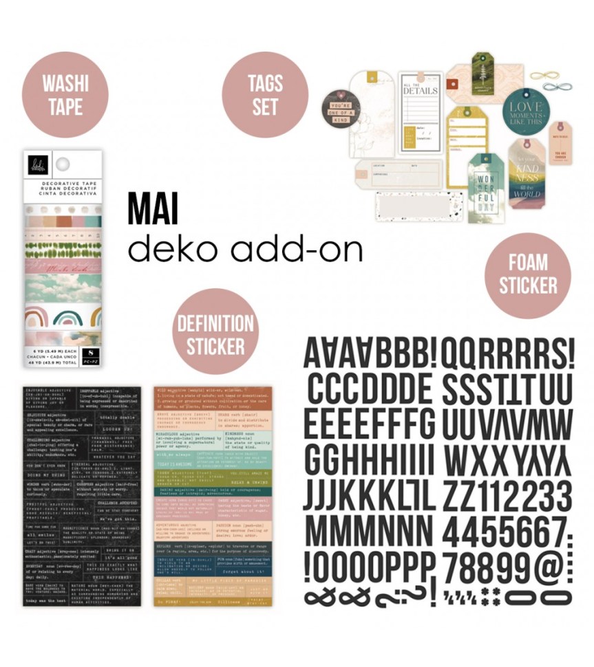
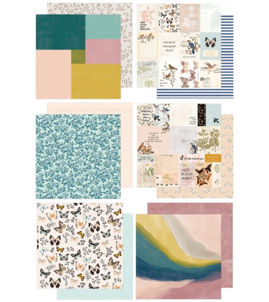
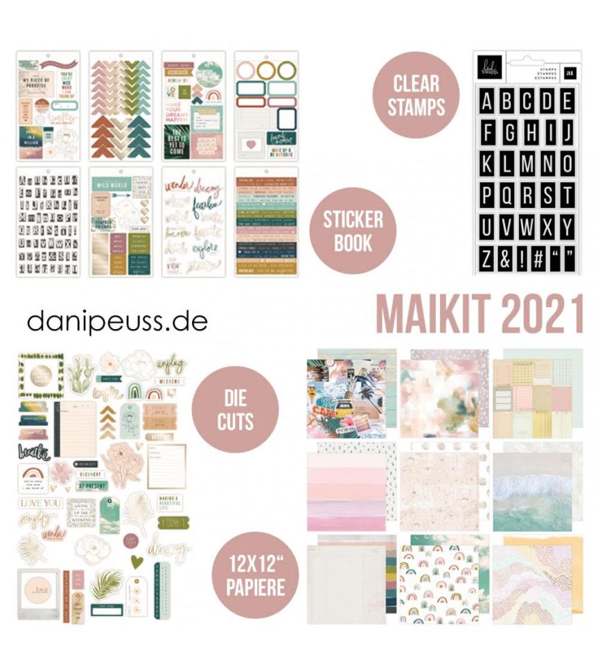
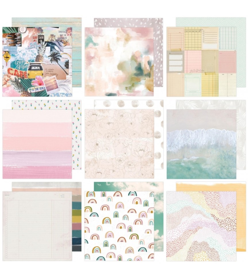
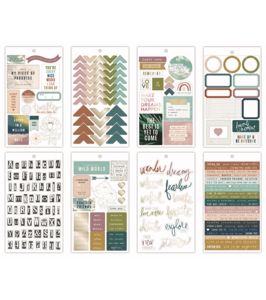
Diving in I expected our inspiration piece to be fall themes, but I was pleasantly surprised that it was more home and connection themed with a color palette right up my alley. This is the May ’21 kit + add-ons by Hip Kit Club. Let’s take a look…
Main Kit
Add-on embellishments
Add-on “color pack”
I ended up ignoring the inspiration kit theme altogether and built my kit around specific designers/companies that caught my attention! Ha! I was inspired by PinkFresh, Jen Hadfield and Paige Evans in the inspiration kit to pull from my own stash of papers from those designers/companies. And along the way Vicki Boutin made an appearance as well. The theme I ended up pulling together became the title of this kit build called Nature Study. You’ll see how it got that name and theme as you follow along here.
First up the video version. Keep reading for the short version…
As I was pulling all manner of anything that caught my attention I realized that I had two different feels going on in my choices, which you may notice above. To get specific, in the photos below you will see that I have a bold and graphic office/school vibe (photo directly below) and then a soft and flowing nature vibe (2nd photo below).
I am perfectly okay with that! This is my kit and I can do what I want. When you build your kit you can do what you want as well! That is the beauty of CKC. I did, however, make some choices that do help tie things together. My “solid” color paper choices are flexible enough that they can work with either vibe. And giving this kit the title Nature Study is a sneaky way to justify my disparate choices! LOL!
For embellishments I pulled some items directly from the kit inspiration and some items from designers, and tried to keep my newly developed theme in mind.
This kit is jam packed with embellishments which I know I will NEVER get to use all of this month. But choices are really nice and I will be doing quite a bit of scrapping this October as I’m playing along with the LayOut A Day challenge (aka LOAD) over at ScrapHappy.org. So we shall see how big of a dent I can make in these supplies.
Don’t forget that this kit reveal is a hop and you can go check out the other Master Forgers to see how their minds work in approaching this inspiration. And if you want to join in and play along, CKC is totally free and welcoming you can follow the blog below and join the Facebook group to share your work.
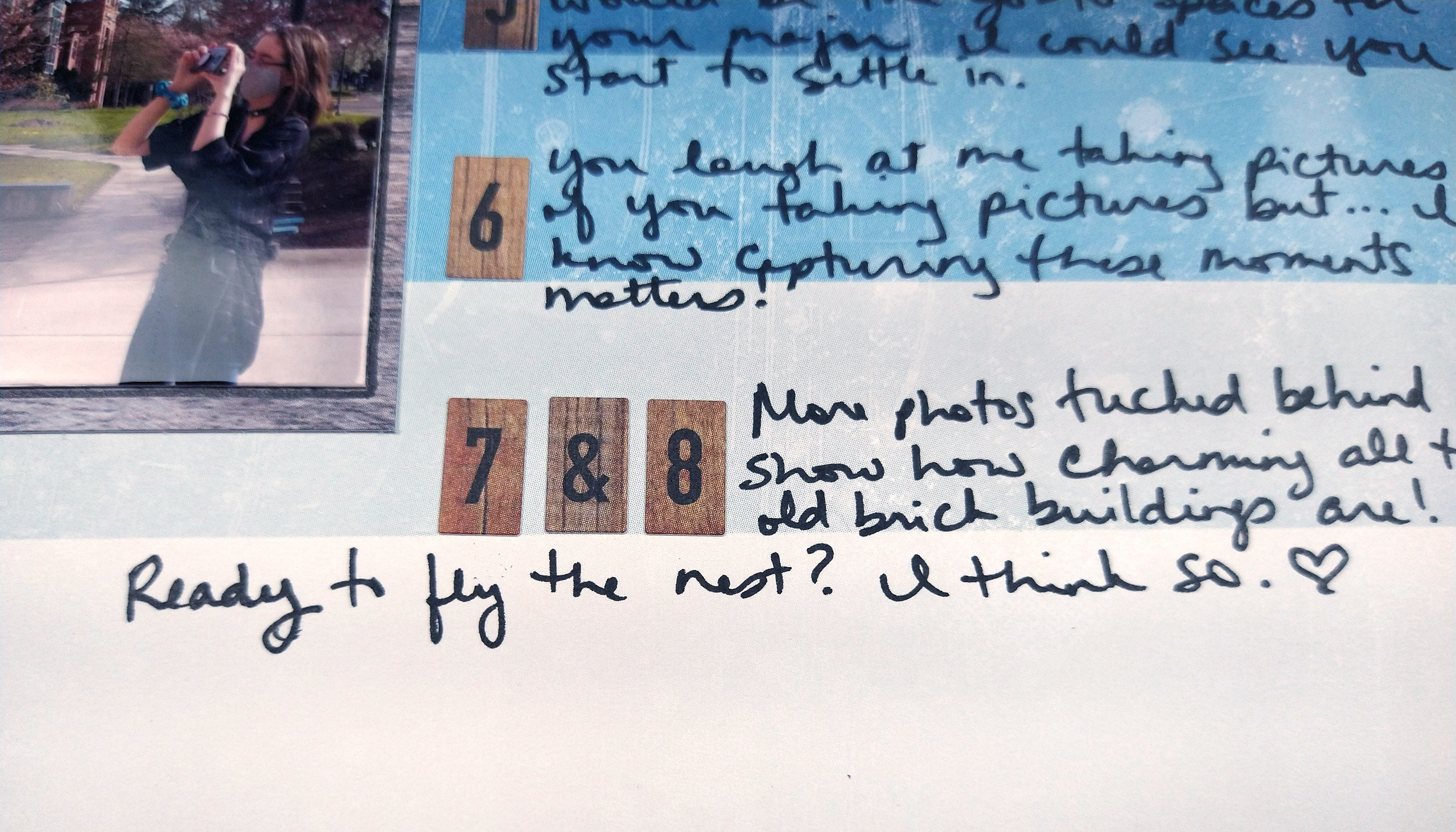
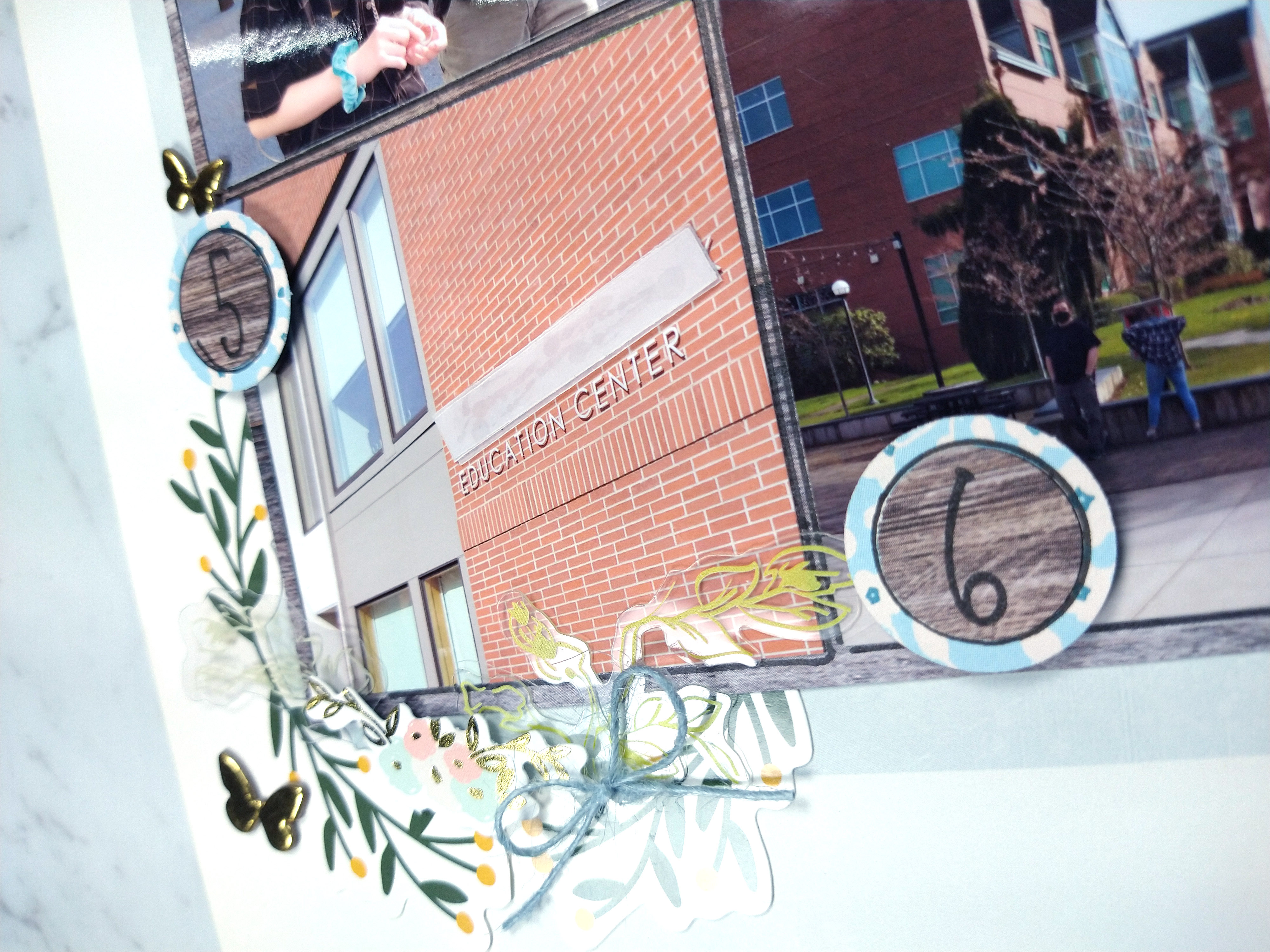
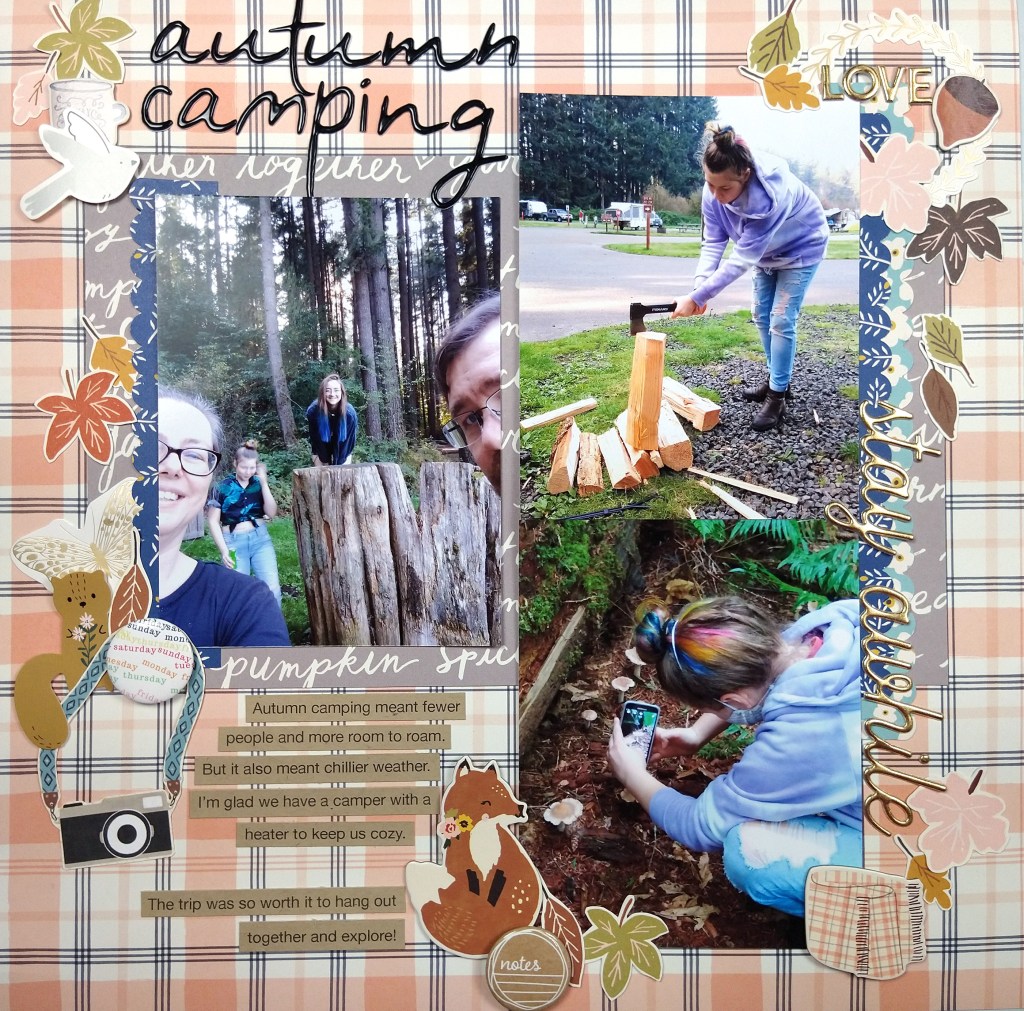
It is the first challenge of the month over at the Counterfeit Kit Challenge! This time our kit hostess set us a challenge inspired by the tractors used in many fall festivals. No you don’t need to include a tractor; you can be inspired by the idea of transportation! I took it in a very metaphorical level and talked about my daughter being ready to fly off to college (no she isn’t flying, she’ll be driving since campus is about 2 hours a way!)
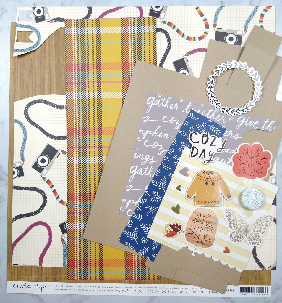
Hello everyone. I’m here with the Counterfeit Kit Club’s Mini Kit and project for the month of September 2020. You can quickly see my whole process in the video below or keep reading for the text and photo version.
Our inspiration kit (Vivid by {Not} Just for Boys kit club) shown below had a strong fall theme vibe.
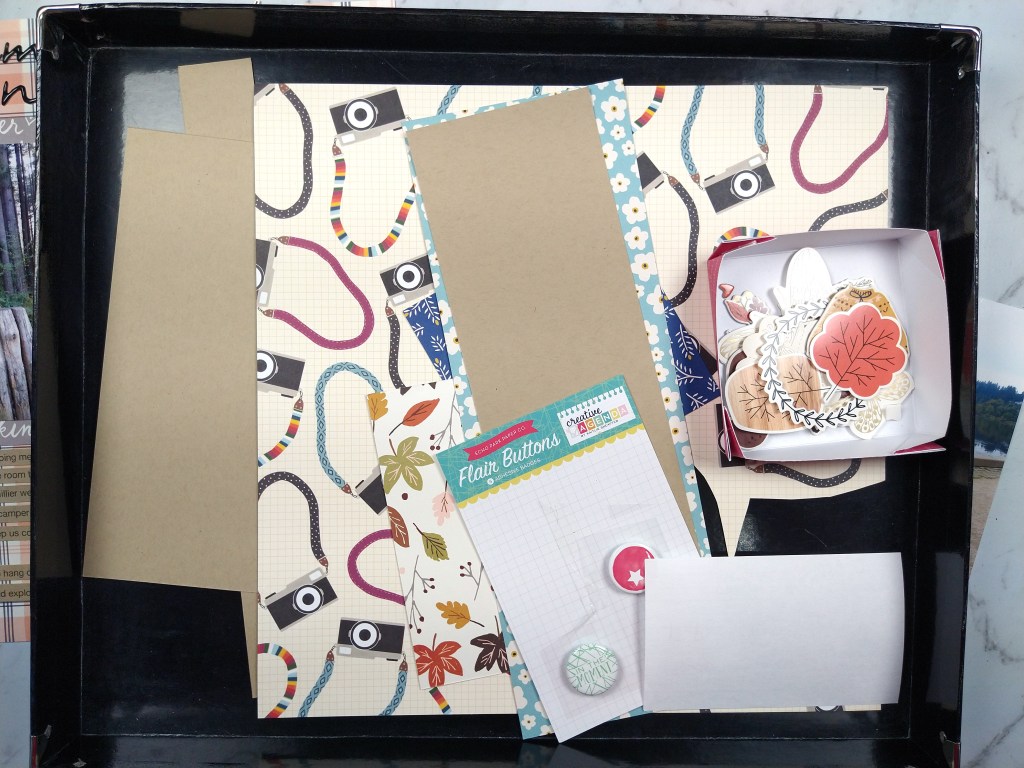
When I was pondering this project I was in the process of cleaning my scrap space. While doing that I came across this bin that contained the extra photos, paper scraps and previous fall themed layout I had created a couple of month back.
Admittedly this gave me a huge head start on creating a page kit for this month’s mini. If you think I cheated, I promise all you would need to do to get to this same point is choose a base pattern paper or cardstock, plus 3-4 pattern paper scraps in various sizes. Then grab 6-10 embellishment pieces in various sizes to support your theme and you are done. Simple as that. Really.
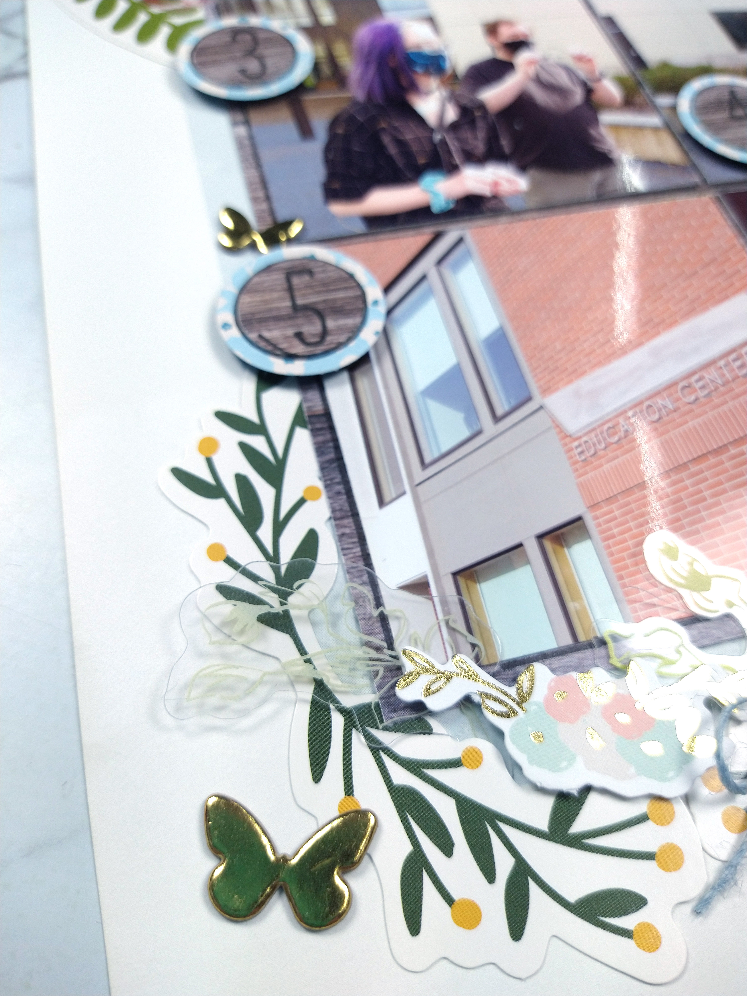
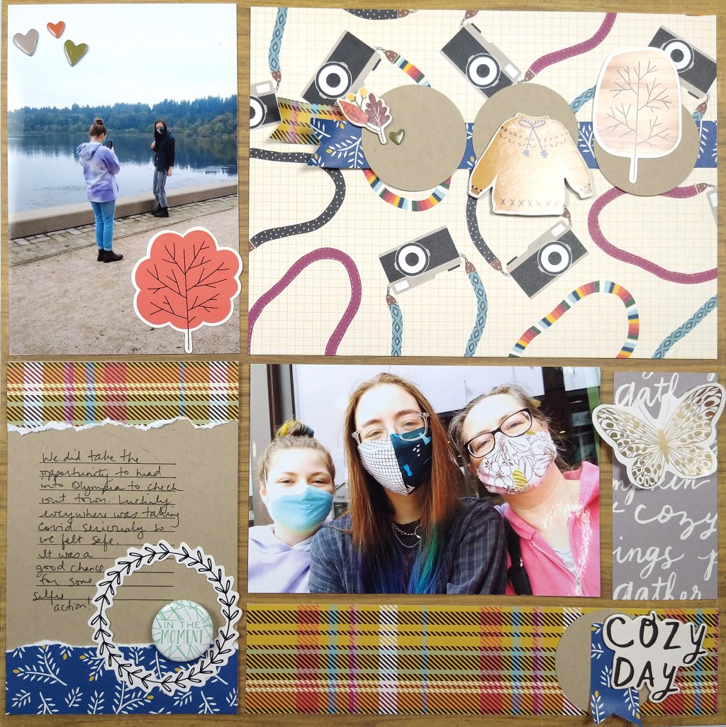
Here I chose a base woodgrain paper, 5 pattern paper scraps, 1 cardstock and literally 12 individual embellishment pieces. The woodgrain, plaid and use of blue comes from our inspiration piece. The other imagery I chose to support my page theme (cameras + together/cozy)
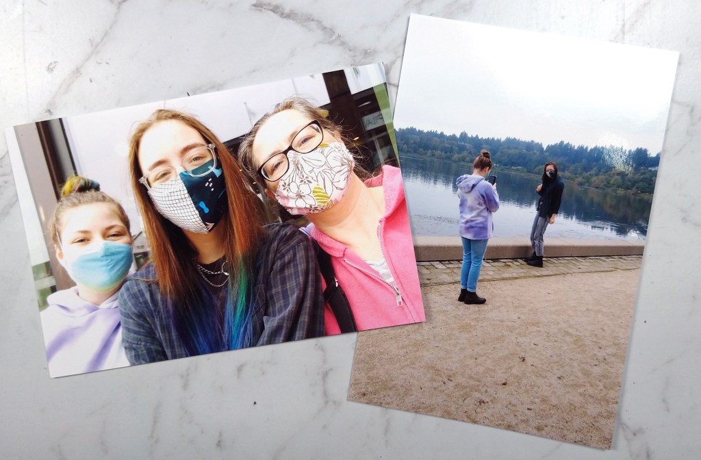
Once I had a narrow palette of supplies to work with, my layout came together quickly. I think about this style of layout as a “pocket page” layout without the actual pockets. (You could also just call it a grid layout). I love the idea of pocket pages for ease but I feel too constrained by the pocket numbers and orientations. So I started my layout with the base page + photos. I trimmed my photos, and in fact all the pocket elements, down by 1/4″ in both height and width to give that gap that pockets have.
The open areas around the photos now become other “pockets.” The top right was very large and could have been broken down into several pockets, but I left it large for more visual impact to those cameras since this layout is about selfies. The journal pocket on the bottom left is 6×4″ (or rather 5.75×3.75″ once trimmed down.) The gray strip started at 2×4″ before trimming and the lower plaid is 2×8″ before trimming.
Sprucing up each pocket with limited embellishments helps the whole page feel cohesive. I also repeat elements, such as circles, blue, and plaid, in a visual triangle to pull everything together. Approaching a layout this way is super straightforward. It gives you the ease of pocket pages without the constraints. And with this design you could include way more photos than I did! Just so much flexibility here.
I hope you were inspired by how easy it can be to put together a quick page kit as well as a quick layout!
Welcome to September 2021 everyone. For me this year has flown by despite all the continuing troubles with covid. I thought for sure this would be another year that crawled by. Yet here we are. I hope you have all stayed safe and healthy. I send you extra wishes for continued health as we head back indoors with the chill of fall weather looming.
Lets get on to crafting, shall we? This month Master Forger Tina is our kit host and she has invited Tori Gaines as our guest designer!
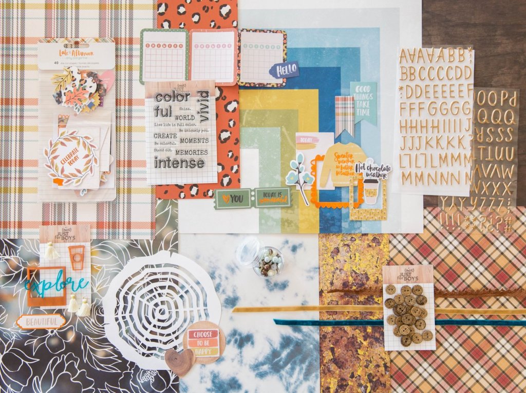
Tina has offered up this kit called Vivid from the {Not} Just for Boys kit club from September 2020 as our inspiration this month. Of course it is sold out at this point so counterfeiting this kit is a great option to get the vibe you are going for.
This kit includes
“Vivid” Paper:
1 piece 12×12 paper- Amy Tan-Late Afternoon “Make a Wish”
1 Pack of NJFB Exclusive Acrylic Embellishments and 3 Mini Tassels
24 “Vivid” Textured Buttons
1 “Tree Slice” cardstock cut by Sophie Gallo
For the whole process of my kit build you can check out the video I made for this month.
The first thing I noticed about the kit is the warm oranges and browns of the classic fall season imagery. Since these are not my favorite colors and I am just plain not ready for fall, I looked deeper at the kit for inspiration. The Heidi Swapp blue and yellow stripe/geometric paper caught my attention next. I know I have this paper in my stash… well at least I thought I did. When building my kit I just couldn’t find it. (I may have tucked it away in another project and since forgotten which project and where!) Despite not being able to find that paper I let the colors lead the way for me. And then I followed this inspiration kit’s path in terms of pattern. I found some plaids/checks, a bold floral, woodgrain and some watercolor textures. I then added a couple of supporting patterns to round out the choices.
Moving on to embellishments I was inspired by the leafy die cuts, ribbon texture, wood texture buttons, and the log cut file. I decided to pull wood and cork elements and add in plenty of floral die cuts. It worked out that some of my leafy ephemera also had gold, which was included in the alpha from the inspiration kit. I also found some floral acetate that can take the place of the acrylics in the inspiration kit. Toss in a few natural fibers and some alphas and that topped off my kit.
With this lighter, brighter take on this inspiration that clings to the remnants of summer, I’m calling this kit Last Hurrah.
Be sure to check out all the fun over at the Counterfeit Kit Club blog for challenges and inspiration to build and use your kit. Don’t forget to see the other design team members’ takes on this months inspiration. Be sure to leave extra love for Tori for being our guest designer this time around.
I was not on official design team duty over at CKC for this challenge, but I love to play along anyway when time allows. So for this sketch challenge I knew I had to play. I love sketches almost as much as I love kits! Put my CKC kit together with a good sketch and I’m a happy camper.
This old sketch we are working with comes from the much missed Basic Grey company. At the point in time when Basic Grey was hot I was more of a double page scrapper. But crafty styles shift and I’ve moved into being more of a single page scrapper. So that is where I started in this challenge.
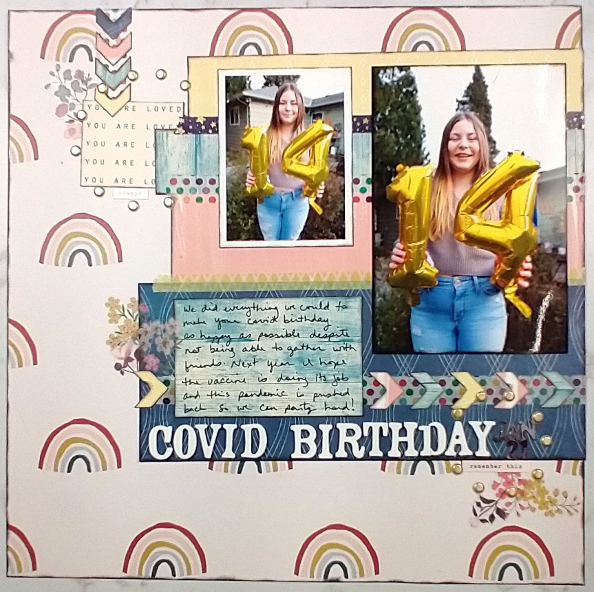
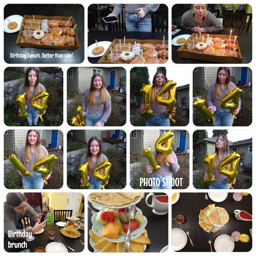
I pulled out photos of my daughter and her 14th birthday and a cheery rainbow print since they felt so right together. And then I realized I had a Project Life layout that I had done on my phone with all the fun pictures we took during her photo session. So I pulled arrows off the right page of the sketch and included them near my title on the left page layout. That way it leads the story into this accompanying layout. I ended up with a two-pager after all!
CKC helps you build pretty scrapbook kits, and we also help you use them! We give you challenges to kick start your crafting. Today’s challenge is about diagonal design. It just so happens that a pattern paper from the inspiration kit that I re-created in a forgery has a diagonal design. So I used that as the foundation for my project. If you struggle with the idea of diagonal design, why not start with a diagonal product! You can watch the full process or keep reading for the simplified version.
I started with this diagonal paper that I painted. It has a strong diagonal design already.
I laid out my photos in story order along that diagonal line.
I then used a variety of embellishments, matching their color up with the background color. This process is called color blocking and it can help you use embellishments up that you were having a hard time making work.
Multicolored embellishments like the cupcake down below can be color blocked in different ways. I chose to match it up with the color of the frosting.
How do you feel about diagonal designs? How about color blocking your embellishments? Leave me your thoughts!
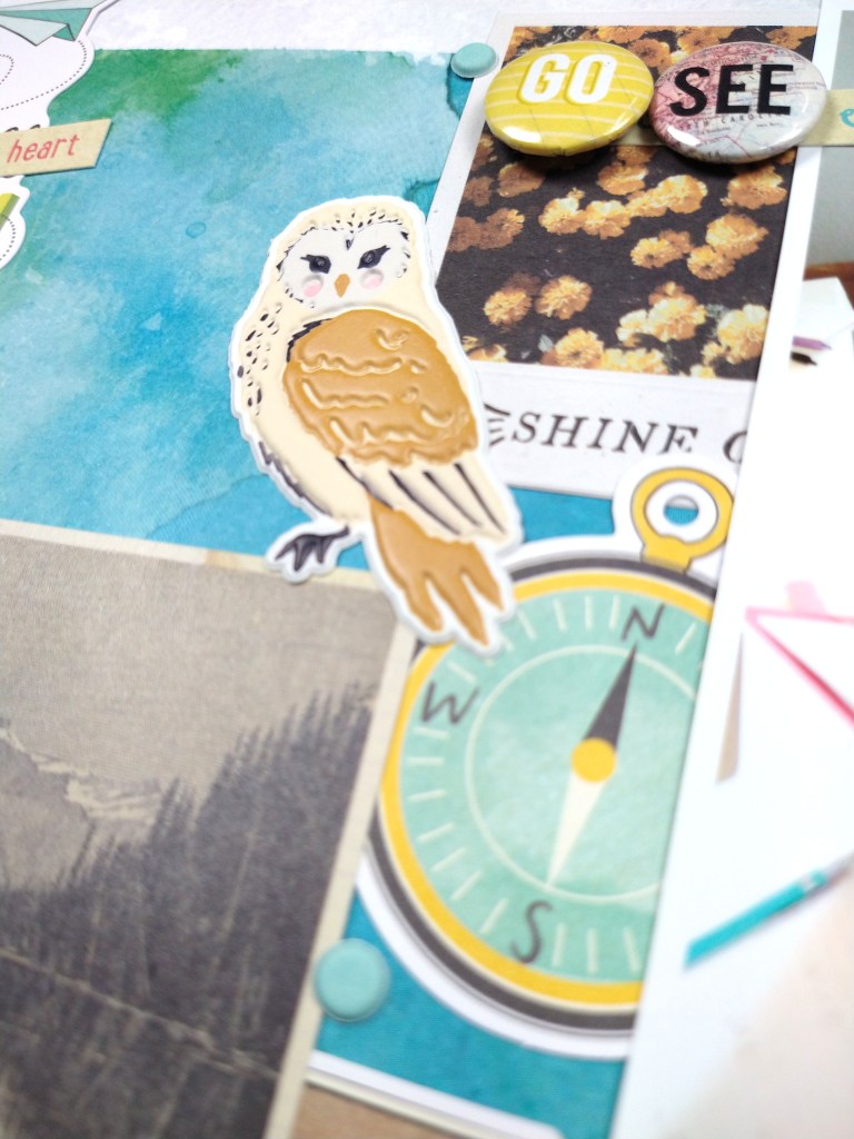
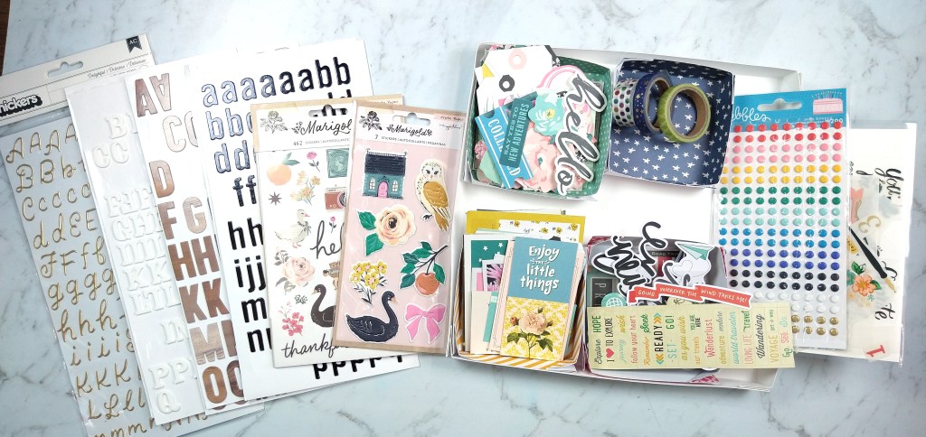
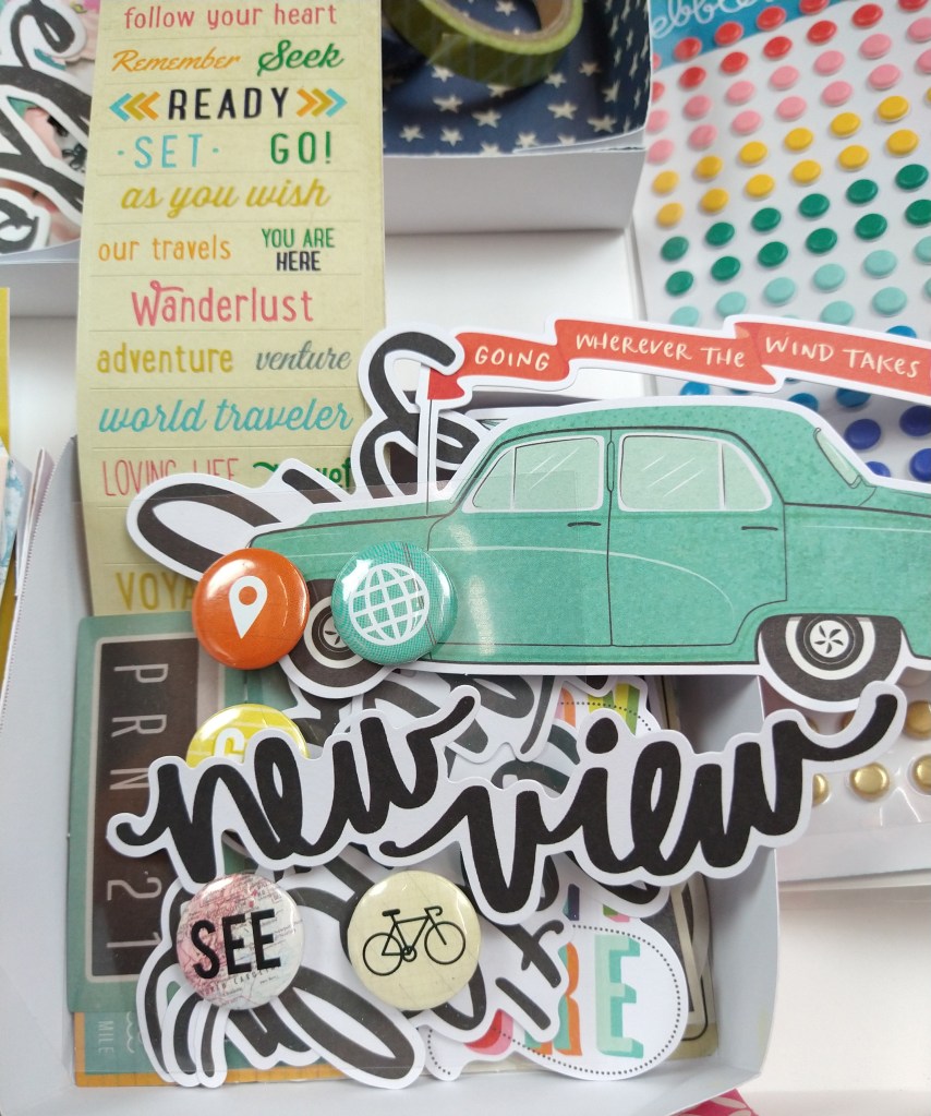
I am finally busting into my CKC kit for this month. You can always check out my kit build over on my YouTube channel. But this kit is inspired by some bright colors balanced with pops of rich color and themes of travel. While we have not been traveling (still) due to Covid, I’m putting that travel theme to use on an educational layout.
Notice how the words “adventure”, “seek”, and “go, see, do” all can play into my daughters college bound days. Just because a them “says” one thing doesn’t mean you can’t find commonalities to other themes. There are other good tips in the video so be sure to check out all the ideas there.
Welcome to August. The summer seems to be slipping away quickly despite not having done any of the things we thought we would do this summer. That has meant that I’ve had more time in my scraproom though, so that is a good thing. I did manage to use up most of my kit from last month. So this month I have a bigger kit again. I seem to waffle between to big and too small. Some day I’ll find that Goldilocks spot with my kits! For now, too big is better since it gives me more options for storytelling.
Let’s talk about Counterfeit Kit Challenge for August. It is full of a mix of rich and subtle colors, a bit of a vacation vibe, and plenty of embellies to pull ideas from. I’ll have a process video for you later, but let’s take a peek at things first. Our inspiration is from a German kit company called https danipeuss.de which may be impractical for non-Germans to order from. That is a good excuse to counterfeit a kit! So, here is the inspiration. The first three images are of the various add-ons and the final three images show the main kit.
Be sure to head over to the CKC blog to get the entire scoop, including info on our Guest Designer Sara Rice. She is active in the group and always shares lovely projects.
For the pattern papers I picked up on elements of sky, rainbows, and water in a color palette of aqua, navy, light and dark pink and golden yellow. I also threw in a few woodgrains and that open book paper (from Vicki Boutin) because I just love them 😉
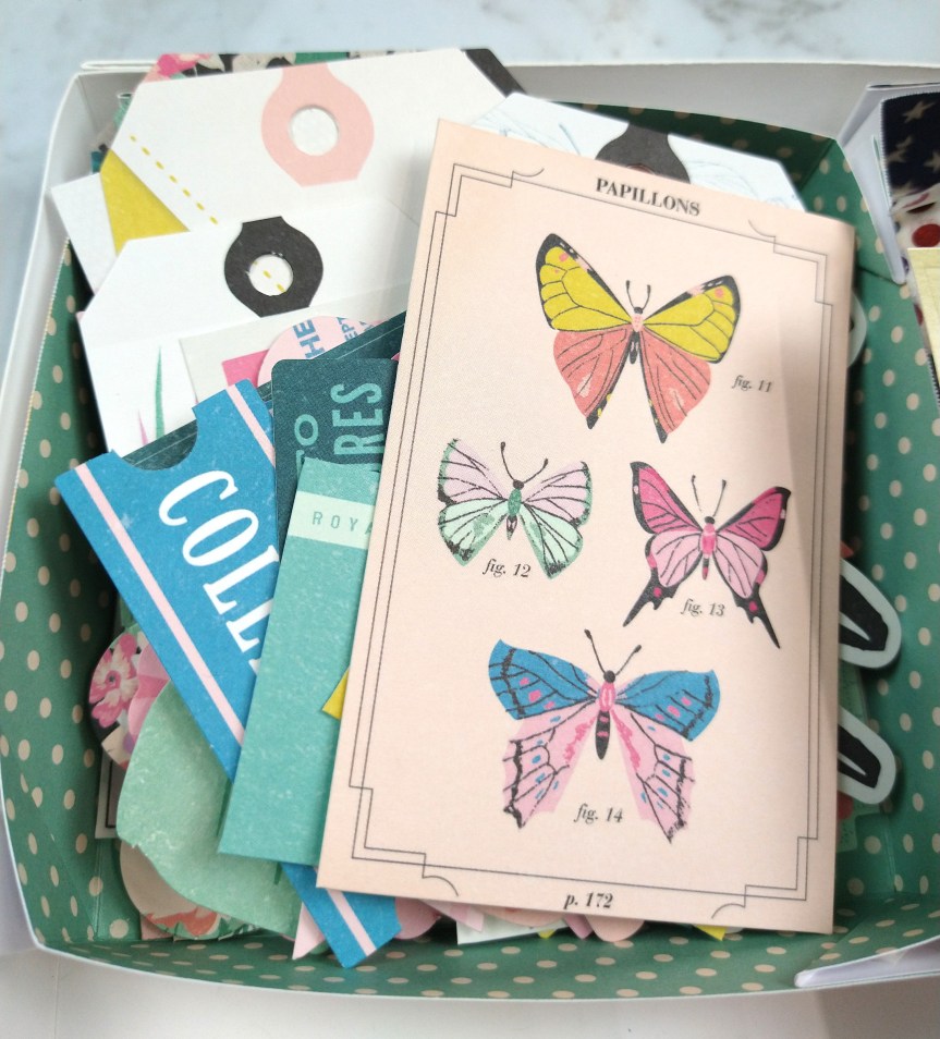
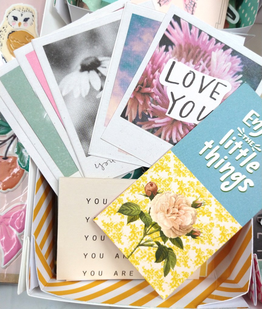
Turning to embellishments I’ve got plenty of die cut ephemera, photo-frame style journal cards, and motifs that work for summer and vacations. I thought I would make more use of the vacation items this month but like I said we didn’t do what we thought we would this summer. Oh well. I can always re-file things away in my stash if they don’t get used.
So that is the quick overview. If you want to see more of my thought process you can check out the video.
Here is our hop list for this month. Don’t forget to check out CKC’s blog for all future August inspiration and be sure to head over to the Facebook group for community chatter & sharing.
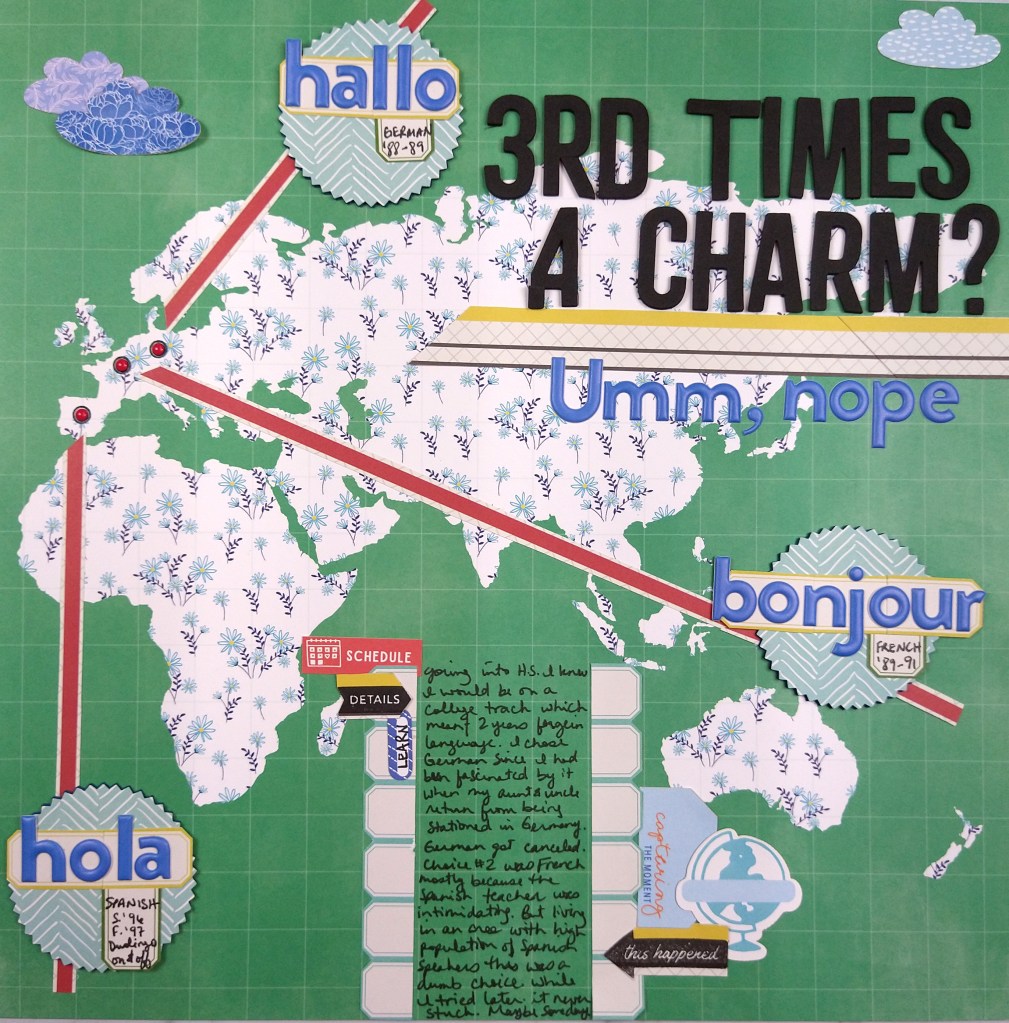
It is the 18th, which means it is time for scrappy challenge number two over at the Counterfeit Kit Challenge blog. Todays challenge is to use foreign language somehow on your page. I took that prompt and just rolled with it! I used it as the main focus of my page to talk about how I tried at three different times to learn foreign languages and none of them really stuck.
Notice that there are no photos on this page? Well I didn’t have any photos about this story. But I didn’t let that stop me. The pattern papers and the design is enough visual to help tell the story.