
I love kit building and I am on the design team for the Counterfeit Kit Challenge project. We take an inspiration kit each month and proceed to replicate it, or as we say, counterfeit it. But sometimes it can be hard to get started. For example, what if you don’t like the color palette for a kit and you think, “that isn’t for me.” This month’s kit has plenty of pink and that may be off putting for some. Don’t give up; instead, dive deeper.

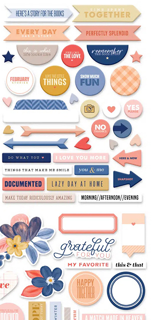
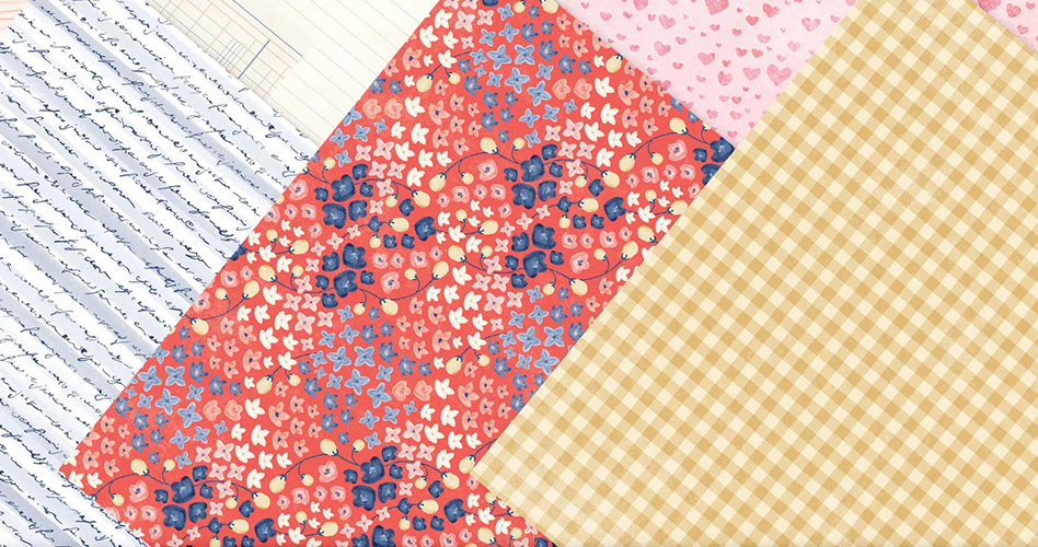
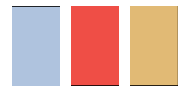
If we take a closer look at the embellishment cluster in the photo and these sheets of pattern paper, we can start to see something besides pink in this kit. We’ve got a coral red, a powder blue and a golden yellow.
So now we have a very different color palette.
With that in mind I started pulling supplies from my stash. Here is what I ended up with
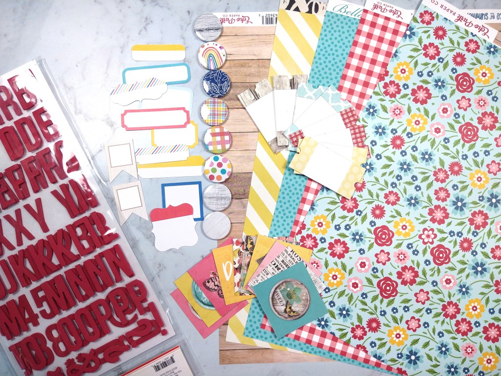
Admittedly, these colors are bolder than the updated color palette. However, those were the supplies I had in my stash that came close to the new colors, so I’m going to roll with it. That is the flexibility of the CKC group! Make it work for YOU!
Have fun kit building and don’t forget to show off your stuff over on the CKC Facebook group, or tag us on Instagram @counterfeitkitchallenge or use #counterfeitkitchallenge.

Another awesome kit, I love the addition of the woddgrain.
LikeLike
I LIKE IT! glad you made it your own with what you had!
LikeLike