CHA 2016 Projects for DCWV

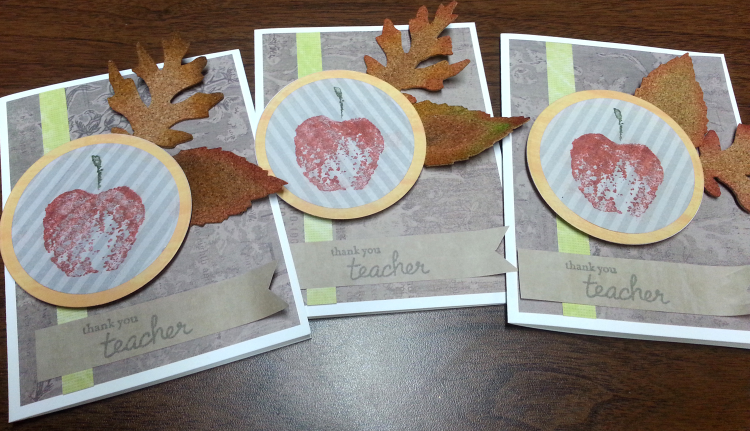
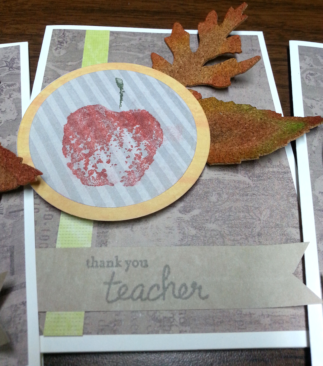
I am so excited to say that I was invited to submit projects to DCWV for their CHA 2016 booth! I ended up submitting 5 projects. I was provided with the products to use for their “existing product” displays. While I was was compensated for these projects, I happily use their products anyway and was glad to showcase what I could do with some of their products I haven’t used before.

toothfairy

This was probably my favorite. I used the DCWV Insta Photo Fun paper stacks (4×4 in size!). I had a white + foil stack and a kraft + white-print stack. Using the back side of the kraft paper gave me some rest from all the pattern. I used my punches for the circles and fairy wings and my silhouette for the title and fairy dress. I also used some ink to change the white paper into colors that worked for the layout. The foil resists the ink, so you get lovely colorful foiled papers.  Add in some some silver thread to the fairy’s dress and that finishes it off.

5x5card

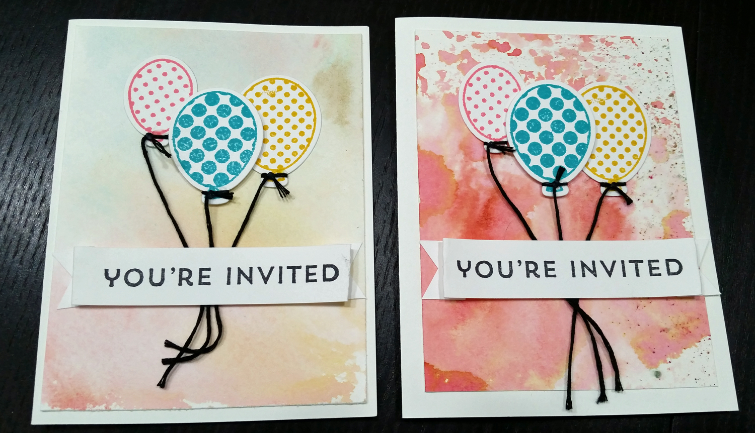
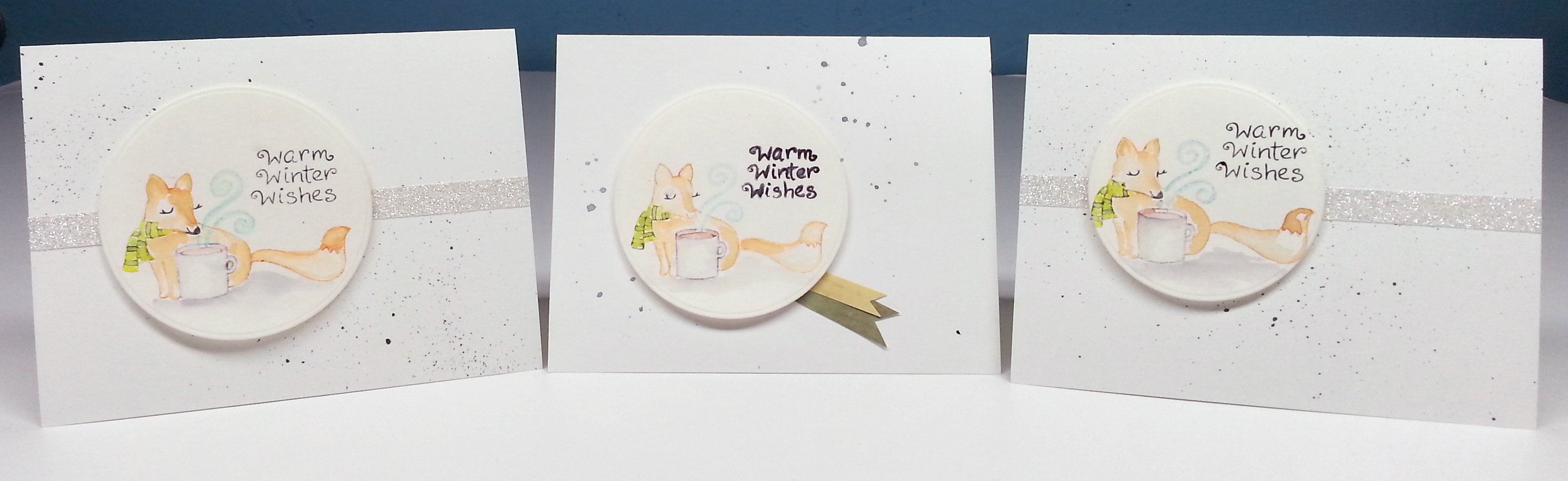
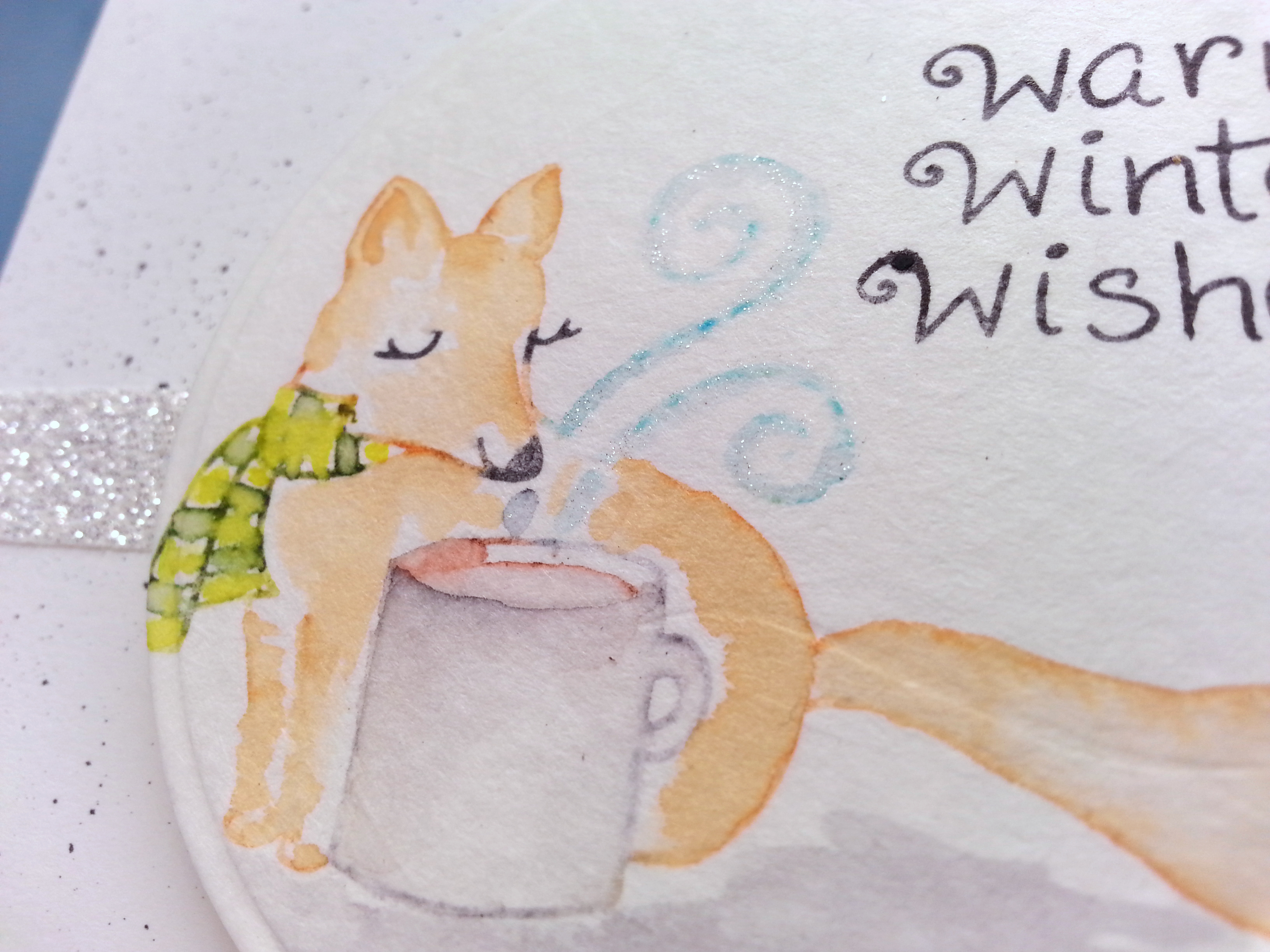
The second project used the DCWV 5×5 notecards. Just using punches and layering, I used DCWV cork and foiled vellum 6x6x stacks to bring a focal to the card. I punched the card edge and added more layering with the vellum. This allowed the sentiment on the inside to peek out for added dimension. Add in some twine, gold thread and Blue Moon seed beads and the card is nicely finished.

burlapcard

As soon as I was asked to use the pre-made burlap cards, I knew I wanted to add in stitching! And what better way to accent stitching than to add in some Blue Moon seed beads. I had some DCWV white-core cardstock out on my desk from another project, so I sanded it down and ran it through the printer. I sanded it both to get some texture of the white core peeking through and to get the ink to adhere to the cardstock! Cut out and back that sentiment tag with a little vellum. Punch some holes in the layered tag and tie it with a bow to the project using the loose thread ends from the stitching. Pretty.

yourockcard yourockcloseup

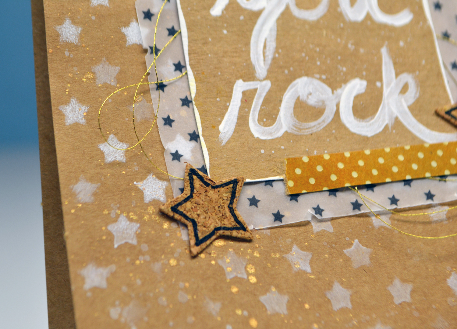
I used the DCWV 5×5 kraft pre-made cards, vellum, cork and printed kraft, and stencil stacks to pull this card together. While it used a number of differing stacks, you can see how all these products work nicely together. I used white acrylic paint for stenciling the stars and hand lettering the sentiment. I used ink to change the kraft color of the printed stack to create a “washi” tape look. A bit of gold thread and gold ink spray was used for a sparkly pizzaz of a finish.

flowercloseupflowerframe

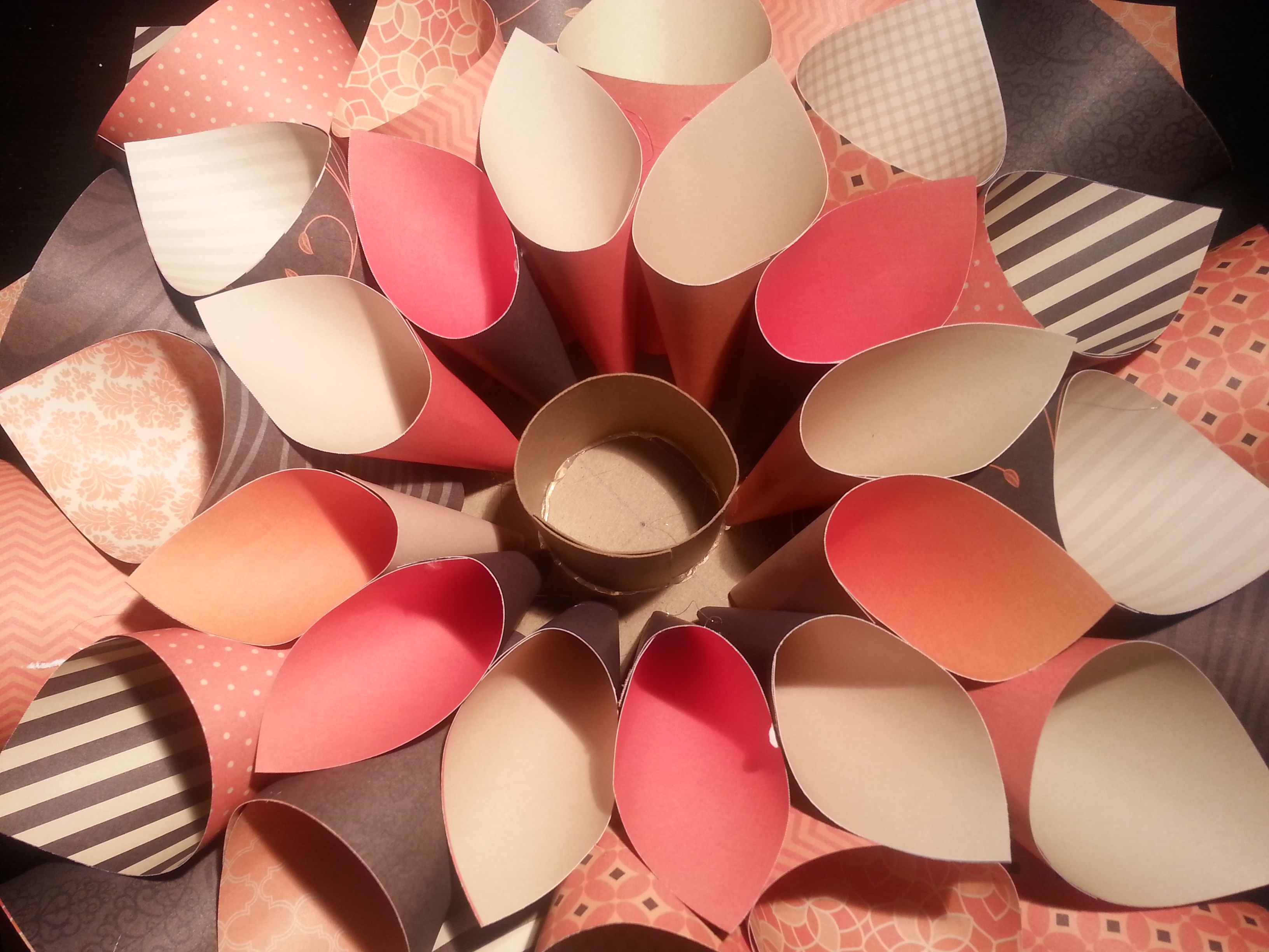
And the final project gave the most oomph out of just cardstock! The frame I painted with white acrylic paint giving it a white wash then a layer of stenciling using the DCWV stencil stack. Punches and the Silhouette, gave me many lovely flower petals. Then it was just layering, layering, layering. A strong glue (Ranger matte multi medium) made the flowers sturdy. Add a little bling with the Wink of Stella pen and some Ranger Stickles gave a nice final touch.

Watercolor backgrounds

Also known as using leftover paint.

I add color mediums to waterproof surfaces often to allow me to pick up the color easily with paintbrushes. There is always color leftover when I’m done using it. So I spray extra water over the color and basically mop it up with a scrap of watercolor paper. I learned this a while ago from someone. And I’m glad I did. The results are always different and unique. I save these pieces to create other items out of, like punched or die-cut shapes. Often my scraps are small. But this time I found a couple of pieces large enough to be card front layers for some birthday party invitations I made. They gave a perfect dreamy background to go with the floating balloon card.

h2oinvitation


Make sure you use every last bit of color


Painting Christmas gift

Watercolor, watercolor, watercolor. I think I am obsessed.

My husband likes lighthouses, so instead of buying him a Christmas gift, I made one instead. I wanted to play with a freehand drawing, which quite honestly scares me. I don’t consider myself a “fine” artist, meaning I can’t do representational drawing very well. I’ve done a little practicing here and there with different things but I still have a long way to go. And you know what. That is okay. Everyone starts somewhere. Here I am at 41 starting something new. You can too!

lighthouse

I used a pencil to sketch out the drawing first. Erasers are your friend, let me tell you. I used markers to go over the pencil once I was happy with the composition. Double ended markers made this job easier. I used the broad tip for larger areas like the rocks, and the fine tip for details like the roof tiles, railing and grass. The fine tip left enough detail to give the hint of structure without leaving harsh lines. Once the color is in place, use a wet brush to pull and move the color. Don’t work two different colors near each other while they are still wet as this will cause colors to bleed into each other. Luckily, this simple marker technique drys fairly quickly and you can just move around the piece working here and there.

I wasn’t sure how to achieve a nighttime sky for the lighthouse so I skipped it and went with daytime. That presented another challenge. Blue for the ocean and blue for the sky. I just played with the markers I had and made a decision. I was happy with the cool blue ocean water (I did touch in a hint of violet also for some depth on the crests of the waves). The warmer more vibrant blue of the sky I think is too much of a mismatch in tone. But it is what it is and I learned plenty.

If you want to learn more about watercoloring (aimed at card makers) I highly recommend the Online Card Classes website. They have 2 self-paced workshops (for card makers and exploring mediums) on their site as well as an upcoming intermediate watercoloring class beginning at the end of January. I’ve taken the first two and will be in class for the third. Maybe I will see you there.

Happy 2016

2016

I hope you all had safe & happy holidays. I wish you many good things as we move into 2016. I started off my year with watercoloring of course. I realized after I photographed this painting I hadn’t actually finished it. I intend to add spatters onto it, because everything is better with spatters!

Here is a little closeup of the work.

2016side

In real life it is shiny and sparkly from the foiled DCWV paper and the Prima gold mist I used. A festive start to the year.

Every year I start by printing out my letter size calendar pages. I journal on these throughout the year. One for each kid plus one for the family. Each month I create a layout for each kid’s scrapbook and tuck the month’s journaling behind the page. Here is a peek at the binder I use to store all these pages for the year. The binder sits by my bed so I can make some notes before I go to be.

calendarbook

calendarbook2


Maybe this system will work for you too. I will post .pdf files soon for you if you’d like to print them to use.

CASEd Chritmas cards

I subscribe to the Splitcoast Stampers YouTube channel. Most of the time the projects over there are not my cup of tea. But this recent video had me so excited. Mix watercoloring + technique tips. And bam. I’ve just CASEd (Copy And Share Everything) my Christmas cards for this year. The presenting artist’s skills are certainly more advanced than mine, but I think I I’m learning quite a bit as I go. Check it out.

ornament1

ornament2

I used twinkling H2O’s watercolor paints for the ornaments to add some sparkle. Picking up glimmer on camera can be tough and my photography skills aren’t at that level anyway. So just imagine the subtle shine these ornaments have!

Check out the video and see if you can level up your watercolor painting skills.

DCWV cone wreath

I received some paper stacks from DCWV to make projects, including one to make seasonal cone wreaths. As Thanksgiving approached I decided to quickly try to put together the fall wreath.

cone wreath 3

I had to cut my own circle base from chipboard. There is one base included but knowing I will need to make 4 wreaths total I just started this one with my own chipboard. I trimmed all the papers from the stack into their rectangle shapes. After a little playing around, I figured out how to quickly fold each rectangle of paper into a cone and hot glue it together. Each layer uses slightly smaller rectangles. I found the center to be rather deep and didn’t want to decorate down in that hole so I took some leftover chipboard and created a platform to fill in the hole.

cone wreath 2cone wreath 1

And that is as far as I got. Why you ask? The project wasn’t hard and it was starting to shape up to look lovely. But in the end I decided I just didn’t like the colors for Thanksgiving. Too much black. Too much orange. I will save this wreath for Halloween next year. I may try some other papers in greens and browns and golds to make a Thanksgiving wreath some other time. But for now, this project remains unfinished.

And that is okay. Go ahead and try things; and then decide you don’t like them. It is all part of the creative process.

I will give the winter wreath a go soon and see if that one fits my color ideals better!


Teacher Thanks in bulk

Remember when I posted my teacher thanks cards? As a reminder here is what I did.

card

This card was a challenge entry but it was also intended for my middle kid to give to her teacher. Only problem? She wanted 5 exactly like them to give to all her teachers. I didn’t have 5 more apple wood pieces or more leaves or more…

What to do? Adapt the idea to something duplicatable (and this original card gets saved for another time). Here is how we made cards in bulk.

teacher2

We kept the circle atop a green vertical strip. But we scaled our card to fit a single circle with the die cut leaves (Tim Holtz tattered leaves) and apple stamp (older Stampi’ Up image). Ink was added to the cork leaves to add some color and dimension. Simple adaptations to satisfy a little perfectionist tendency!

teacher1

Go thank the teachers in your life!

Thanksgiving Place settings

Okay, I realize that Thanksgiving was yesterday. I thought I would share anyway. Go ahead and adapt these and use them for Christmas instead. No biggie.

I used Core’Dinations envelopes and tags, my cutie little Lawn Fawn Turkey stamp and my kiddo to complete these table name tag/place settings/gift “box” (for the ornaments I made earlier here and here).

1supplies


Envelopes were simply inked using Tim Holtz distress inks to add color to the background. Tags were decorated with a watercolor marker technique (Art Impressions have good YouTube videos on how this works).  Once the turkeys were done, we inked the edges for a little more depth and threw on some twine. The final touch was to add each person’s name. I was going to use a rotary text stamp at first but decided to go with hand written names. Then I remembered I had some new India ink that I haven’t played with much. This further reminded me that a young friend had shown me her art marker that was really a water brush filled with ink. Bingo. I pulled out an extra water brush and filled it with my ink to make my own calligraphy brush.

1inkpen

And the results really were pretty. I’m not an expert hand letterer but practice makes perfect and here is a good place to practice.

1done


And here it all is put into action.

placeset1

placeset2


placeset3


Hope you enjoyed.

Caring Hearts Card Drive

Last year I started sending in card donations to the Caring Hearts Card Drive. This event is put on in part by Jennifer McGuire. She and some other lovely ladies collect holiday cards and organize their distribution to nursing homes in the U.S., Canada and Australia. These cards are used to bring cheer to the elderly in nursing homes who don’t have any family to visit for the holidays. I can’t imagine being so lonely and my heart aches. I’m glad that I can do just a little bit of something for someone else. I know when my kids are grown I will spend more time volunteering in person, but for now this is what I (and the kids!) can do.

My students from the card making class I teach helped out with this project too. Together we made 22 cards to send in. Take a look at the lovelies that I just put in the box.

foxcards

foxclose

foxextraclose

I used the wonderful Lawn Fawn Winter Fox stamp set. This is one of their small format (read affordable!) stamp sets and it is so friggin’ cute. I went with a watercolor technique for this. I inked up the stamp using markers of various colors and with a water brush I started softening the outline and pulling the color into the image. I scribbled a bit of extra ink onto a plastic sheet and picked up that extra color with my brush when needed. I used that extra color to add dimension to her nose, inside her left ear and under her chin. I also added more color to the rim of the coffee mug to make it pop a bit more. I got it a little too wet and my brown coffee color bled a little. But oh well. That is life with watercoloring.  Notice the white around her mouth and each eye, next to her scarf and in between her legs? That white space actually adds dimension and makes the image less flat looking. When going with watercolor, less can sometimes be more. And just to show you what I mean, here is the original cutie.

See how one dimensional it is by itself. But adding water color is like magic! Plus adding some sparkle. That is like magic too. Did you notice in the last photo there is just a hint of sparkle in the steam? I used a Wink of Stella clear glitter brush pen to add that little touch. It is hard to photograph but in person is is just a little detail that adds so much fun.

And now for a serious message…

I encourage you to make some crafty goodness to brighten someone else’s day. You don’t have to donate here, but some ideas include: your local nursing homes, Meals on Wheels program, senior center, homeless programs, Ronald McDonald House (they provide cards to families while children are in the hospital), Boys and Girls club and many more. Take a look around and see where some happy mail can make a little difference in someone’s life. Cards are certainly great, but go one step further. Cards don’t fund these programs to provide all the help these folks need. When you drop off some craftiness also consider making a cash donation. Even just $5. These programs can’t do all they do without good old fashioned money.

I hope you all are surrounded by love and family, warmth and safety as the holidays approach!

Thanksgiving cards

I really liked this month’s DCWV card sketch challenge. I’ve used it for a couple of different projects so far. As a refresher, here is the sketch.

When the sketch came out I first made a teacher thank you card. Then I moved on to Thanksgiving cards. I put together cards to send of to friends and family with some little Christmas ornaments tucked in the package to kick of the winter holiday season. So here is how those came out.

turkey card

I pulled out more DCWV papers and went to work. I took the idea of the three circles and lined them up. The design included a vertical strip to ground the circles and I just turned my strip horizontally. The original sketch had the sentiment stamped on a small banner flag. I made my banner jumbo size. I used a subtle pattern to keep it from overwhelming the card while still letting the small sentiment shine.

Aren’t those turkey’s cute? They are a Lawn Fawn stamp and die set. I’ve been playing with copics again and went to work on those turkeys. I wanted them to have color, not just brown turkeys. In looking at photos on Google Images I was reminded that some turkeys actually have blue heads that lend nice contrast to their bright red snoods (that long flappy skin coming off their faces). I tried to capture that here using tip to tip blending between the red and blue markers. Some of them came out better than others with more distinct colors and less purple over blending. I’m still learning and it was sure fun.

In playing with colors I stamped plenty of turkeys to try different color schemes. I drew the colors from the head into the tail for balance. In blending out these colors it was hard to decide if I should blend them more and make them more subtle or keep them bold. I ended up going with somewhere in the middle of that top left turkey and the bottom right turkey. Doing lots of turkeys gave me the chance to choose my favorites when die cutting them all out.

turkey2


I hope you can go play with some color blending and turkey snoods. It’s fun to say and fun to color 😉