More challenges for NSD 2016

I decided to combine two challenges for this next layout. Shimelle had the use woodgrain challenge and SCT Magazine had the use a card as a template challenge. Both of those things make me happy so here we go…

2016-02-24 19.58.06

Here is a card I made back in February (for one of my kid’s teachers whose mom passed away). I loved how this card came out so I decided to use it as the template for my layout.

2016-05-15 19.23.16

Recipe

  • Shimelle = pattern papers
  • Simple Stories = wood grain pattern paper, stickers, letters
  • Stampin’ Up = stamps, white ink
  • random supplies = wood veneer, floss

Shaped clips

I didn’t think I owned any shaped paper clip products. While I like the idea of them I’ve never purchased any because I didn’t think I would really find uses for them. I happened upon a couple that came in a kit-club kit that I had stashed away. This is the second time for this years NSD that I accidentally found the products needed to complete a challenge. (Life is weird sometimes!) So that meant I could actually complete Shimelle’s challenge to use shaped clips.

2016-05-15 17.07.06

Here they are emphasizing my son in these photos. I still don’t know if I am a fan. They add a weird bulk that I’m not sure I like. But it was good to give something newish to me a try. You should try something new. As mom used to say “How do you know you don’t like it if you haven’t tried it?”

Pocket page products

I’ve talked about this before, but I never use pocket scrapbook pages (well almost never). Yet I love the products. Last year I took at CKC class based on pocket page products determined to try using these on regular layouts. I haven’t much. But I still love the idea. So here I am, inspired by SCT Magazine’s (7pm) and Shimelle’s challenges for NSD to use pocket sized cards on a layout. I loved the results.

2016-05-15 15.27.58

I kept it very simple. My small embellishments were make from a few punches and leftover pocket cards. Easy! I will try to keep using this idea in the future. You should too.


Six photos, single page!

Think you can’t get a lot of photos on a single page layout? Well, think again. I often use multiple photos on my layouts. Even so, six did turn out to be a stretch for me. This was the task I accepted by SCT magazine in my continuing quest to work on NSD layout challenges. I started with one focal 4×6, one sub-focal 4×4 and 4 3×3’s. I then further cropped down two of the 3×3 to fit the space well on the layout. To make the photos all fit and not overwhelm I used a few tips…

  1. Keep pattern papers mellow and minimal.
  2. Use a generous amount of black inking on the photo edges to read as a mat without the space needed for an actual mat.
  3. Journal directly on the photos or onto labels to add directly to the photos.
  4. Fill in the gaps left in a grid layout with your embellishments.

2016-05-14 21.59.59

Hair Changes

My kid decided she wanted really short hair over a year ago. Not only that but an array of colors were in store for us (I dye her hair for her). This page shows the first of those color changes.

The page design was inspired by two factors

  1. my continuation of NSD layouts from the SCT challenges, this one to use a grid
  2. and Shimelle’s new weekly challenge to use square photos.

2016-05-11 22.36.32


Using a grid does not mean that everything has to be clean and graphic. I started with my square photos in a tidy row and added lots of layers. Keeping the layers symmetrical keeps the geometric feel of a grid without keeping the rigid structure of a grid.

Of corse square photos fit perfectly with a grid layout. I use squares often. I will use them at 4×4 or 3×3. When I choose and edit photos, I decide which photos could benefit from a square cropping. Once I have my photos cropped, then I look to layout options. I thought these two photos would benefit from a third element for a line/grid layout. Making my own title/embellishment treatment filled in the gap nicely. It also works to read the subtitle stickers as “before and after”. This is a much different title treatment for me but I quite like it.

Go try a symmetrical layout yourself.

Colorful title

I had the previous layout in mind when I saw the prompt by SCT magazine for a colorful title. But since I used that page for the tag challenge I created this page with a colorful title.

2016-05-07 23.05.26


I chose these photos for this prompt since they lacked much color themselves. This gave me a way to add color to my layout despite a fairly monotone subject. The colors I did draw from were…

  1. my daughters shirt
  2. memory of all the colorful seastars in photo #4 (even though the photo is pretty  mild–and in this shot just covered by glare)

For embellishment on this simple page I pulled out these beachy bits that have been in my stash for a very long time. That bird was the perfect piece that I needed. All that empty space between title and photos felt wrong. But when I added the bird starting to swoop into that space it changed the whole layout for me. It created a place for the imagination to fill in the thought of the bird flying around in the sky. Happy dance for just the right embellishment!

Tags, tags and more tags

Coincidence is a funny thing. I was searching through my stash looking for doilies for my last layout when I happened upon a package of tags that I forgot I had. Then up comes the challenge to use at least 6 tags by SCT magazine. Bingo!

2016-05-07 21.56.45

I started by laying out a photo grid and building a landing place for the title with my first set of tags. Then I tucked a tag with journaling next to each photo. Next it was time to decorate. I pulled colors from my title to just build color blocking embellished clusters using DCWV pattern papers and random tidbits of stash. I used red by the focal photo as it is a stronger color that draws more attention and balances the heavy title. I kept balance in mind again by using the dark pink in the bottom corner to draw the eye across the page from one “heavy” color to another almost as heavy color. I dropped the balance ball a bit (so much alliteration) with the trapped space under the photo grid. Looking at it now I think I would pull in more of the pattern paper from under the title to bring down and fill in that trapped space.

This was very fun and something new that I haven’t really done before. That is what challenges are all about, right?

Fabric fringe

Another of Shimelle’s challenges for NSD2016 was to use fabric on a page. I went with some fringe (in a fabric I might not have chosen but is what I had on hand). It mimics the story about my daughter dying her hair with Kool-Aid. Inspired by the fabric I added in other textile type elements with lace ribbon, twine, buttons and (paper) doilies.

2016-05-07 21.55.54


Cardstock by DCWV. Word tags by Shimelle True Stories. All else are random older supplies from my stash.

Painted background

When I saw that Shimelle and SCT Magazine both had painted/messy background challenges I knew right away what I wanted to work on.

2016-05-07 21.51.25

I used Tim Holtz distress stains to add “photo mats” to my images and messy splatters. I used a strip of pattern paper to draw the color inspiration from. Some colorful bling and titling and the page is quick and easy!

Masculine travel page

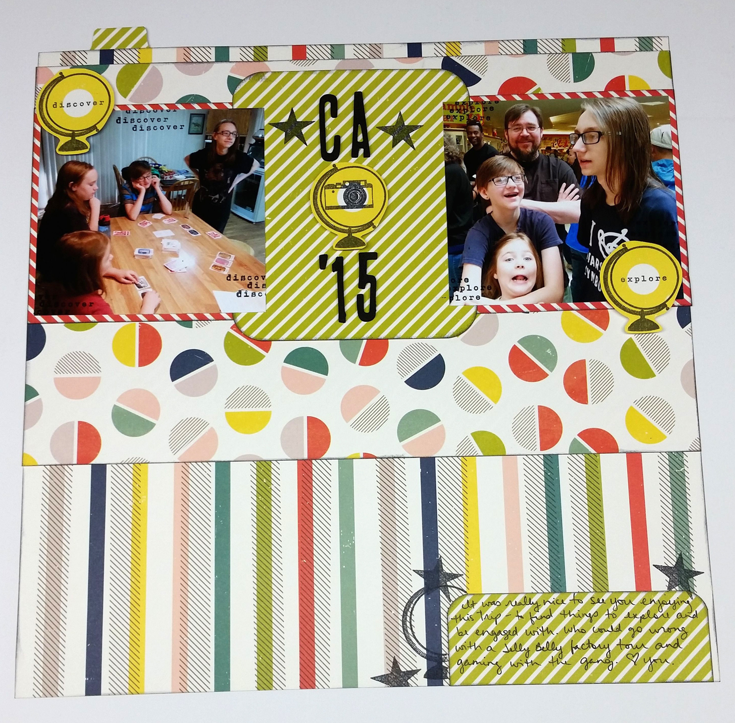
I’ve got photos of a vacation we took to California. I’m putting these pages in each of my kids albums. So I have similar photos that are being scrapped in differing styles. This one goes in my then-16 year old son’s album. While I don’t believe that guys automatically shun flowers and sparkle, it is true that my son tends to the simpler, less flashy elements. So for this I can stay with a traditional “masculine” style. Honestly scrapbooking really doesn’t hold any interest for him so I could sticker sneeze on it and he wouldn’t care. However, perhaps someday these albums will mean something to him, or perhaps to someone else he loves, and so I continue.

Elements for this page were inspired by

  1. Shimelle’s repeating stamps challenge
  2. and of course the SCT’s 3pm challenge of going masculine

2016-05-07 16.39.17


For the repeat stamping, I did cut out stamped elements (the globe) but I went a little further. I used the text, which is a separate stamp, from each globe and repeat stamped that directly on each photo. I liked the texture it added to the photo.

2016-05-07 16.40.32

All supplies are from the Shimelle True Stories collection.

Try stamping straight on your photos (as long as they aren’t one-and-onlys).