
Where to start when you don’t know where to start? That is the problem I had with this next set of photos. I’m at a crop with a limited set of supplies and I don’t know what I want to use to capture the mood of these photos. Even at home with a whole craft room you may find yourself in this situation. Do you wait and go buy something new that fits or do you just make some choices and go with it. I decided to just make some choices!
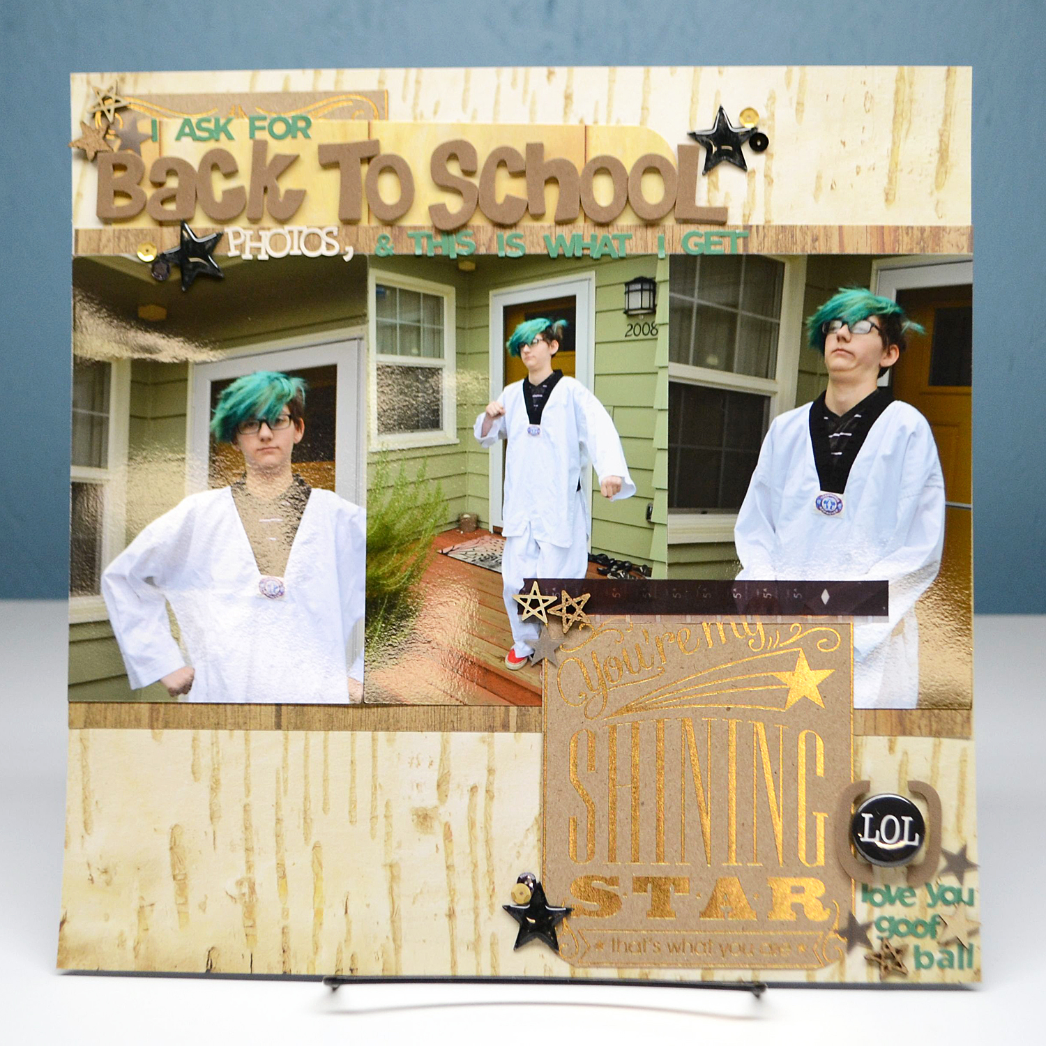
As I’m looking at my photos and looking at my supplies on hand I decided more neutral would work and the neutral I had was wood grain. Sure that could work; it would mimic the idea of siding on a house. Plus the DCWV “The Guilded Paper” stack offered enough contrast in papers to mat my central photo group. When I was flipping through that paper stack I found a journalling card that reads “you are my shining star.” I just laughed at the contrast of the photos and the sentiment, so I knew I had an angle. A bit snarky, just like the photos. I grabbed this LOL flair button as soon as I saw it and the basis for my page was there.
The black button gave me an addition to the color scheme. The “star” sentiment gave me a way to go literal with embellishments; I chose stars in wood grain and cork to match paper textures and sentiment. More black stars in epoxy and vellum to match my black button add more texture. Then a few gold sequins, again to match the gold sentiment, finish it all off. The design reads as elegant, but diving into the photos and title leads to the snark.
I did something different here with title and journaling. I made them both the same thing. By using a mixture of large and small fonts with a mixture of colors the words can be read in multiple ways.

The scale of the brown font reads as a title with the contrast of the white font adding into that tile. The green font (chosen as a contrast to the paper but a match the hair!), can then wrap it all together to create the journaling. Repeating a bit more journaling in the bottom right corner both enhances the green letters as the journaling words and creates flow from left to right, top to bottom across the page.

It did take a while to get all those tiny letters organized but it was worth it. The rest of the page was pretty simple so keeping my focus on the words made the design what it is. To make this easier I used a leftover scrap of clear packaging from an embellishment. I drew a line on the plastic with a sharpie and a ruler right near the edge. Letting the letters hangover the top and aligning them to the drawn line gave me a place to hold all the words as I spelled them out. Then I could just line the letters up where I wanted on the page and press them in place as I pulled the plastic away from underneath them.
I will try and get a post organized on more details of this technique. A video perhaps? I’ve done just a couple of videos and I find the learning curve steep but this may be a good way to jump back in. Now that I said it, can I hold myself accountable? We’ll see.
RECIPE
- paper: DCWV “The Guilded Paper” stack
- large letters: Hobby Lobby
- sequins: Doodle Bug (black), Hazel & Ruby (gold)
- vellum tape: BasicGrey
- vellum stars: Studio Calico
- wood grain & cork shapes, flair button, small letters: random stash
